Christmas cards

Analysis of Someone Else's Christmas Cards by Sasha Ward

This should be year 9 of my Analysis of the Christmas Cards series where I think of as many different ways as I can to categorise the cards we receive then choose and photograph my favourite ones before chucking them all away and saying goodbye to Christmas before it rolls round again. But the number of cards we get is on the decline, and either I’m getting bored of them or the cards themselves are becoming more boring - less homemade, disfigured by ugly written slogans (for example season’s greetings) with even a couple of duplicates or repeats from previous years. I’d already decided I wasn’t going to bother with the analysis when I visited my Aunt Gillian’s house and saw a christmas card display that was better than any I’d seen for ages and therefore worth counting up then quickly sorting into some basic categories.

Around the sitting room, birds on the mantlepiece.

The cards, already sorted into loose categories, stand on every surface in the sitting room. There are so many, about 100, that they spill out into other rooms. I missed a whole group on the windowsill (the curtains were drawn) that excitingly included a triangular card, there is also an octagonal one in the religious corner (shown below left). These have been included in the final shape statistics which are as follows and roughly as usual: 55% square, 22% portrait, 22% landscape, 2% other.

The religious corner, small ones on the bookshelf.

Two more chests in the sitting room.

Into the hall and the kitchen where we find some of Gillian’s favourites (I think her number one is the hare staring at the moon).

I had to choose a favourite quickly, and went for the Selwyn Image mistletoe, oak and robin design displayed on the mantlepiece and shown below. Gillian said she liked all the bird cards, which make up 25% of the whole collection, with other favourites on the card display bar in the kitchen. These include two wonderful buildings shown below and the ever popular mysterious Christmas hare.

My favourites: two buildings and two robins by Selwyn Image and Gertrude Hermes (the last two are Ashmolean Museum cards).

Christmas Cards - Year 7 by Sasha Ward

For seven years running, when I take down my christmas cards in early January, I have counted and sorted them into different categories. We get 50 to 70 cards, with not much change over these years, and the statistics are not very different this year from the last one ( you can see the analysis of 2020 cards here ).

I sort them into shape - square cards continue their rise and now account for more than 50%, homemade - a steady 34%, charity cards - 32%, and various subject categories including the ever popular trees, birds and animals in snow scenes. Some of the images are very similar to each other and some cards are ones I have been sent in previous years (I’ve no idea if from the same people). This christmas card analysis habit has made me look at them differently, when I open the envelope I am hoping for either a high quality, well designed example of the classic snow scene/nativity or for some originality.

This (above) is what I mean by classic, it is big (200mm across), bright and shiny and has an inner page glued in with the writing on it.

And these (below) are what I mean by original, they are all christmassy and also a surprise - the strong colours look good when on display.

There was an unwelcome trend that I noticed this year, writing on the front of cards - 30% of them. As you can see from a selection of these below, some of the writing is on the best homemade card variety, while some just disfigures pretty standard or really badly designed cards. I continue to be amazed at how awful and drab so many of the commercial card designs are, something I’ve never dared mention before as I still love and hope to continue receiving them.

Christmas Wishes by Sasha Ward

It’s not that I’m getting bored with the Analysis of the Christmas Cards, now in its fourth year, but the statistics are getting repetitive. Home made or designed is at a steady 34% (31%, 34%, 35%) and square still the most popular shape at 32% (48%, 34%, 38.5%). Landscape format is on the increase now at 30% (26%, 12%, 14%) - in the brackets are the previous years’ percentages.

This year (scraping the barrel!) I also looked at the backs of the cards to see where they came from: 28% of the cards supported a variety of charities, The Dogs’ Trust being the most popular, while only 9.5% were bought from museums or galleries.

cards 3.jpg

The look of this year’s cards was mainly monochrome (22.5%) or muted, as in the selection above. “Winter landscape” is a vague, welcome and glitter-strewn category, it was the most popular at 32%. 17% of the cards included animals or birds, see some tasteful muted ones from this category below.

cards 2.jpg

I have fun linking cards by shapes, colours and imagery like this line of my top three below - a home printed card, an Edward Bawden and a 3D layered glittery winter landscape. This year I have a winner which is the tree below left because it is bigger, brighter and simpler than all of the others.

cards 1.jpg

Analysis of The Xmas Cards Part 3 by Sasha Ward

This is the third consecutive year of my Christmas card analysis, see the previous results here and here. Thinking about it, I've realised that some of my categories are a bit arbitrary - the only certainty is the shape of the card itself. This year the square ones have leapt up to 49% as shown in the chart below. 

graph.jpeg

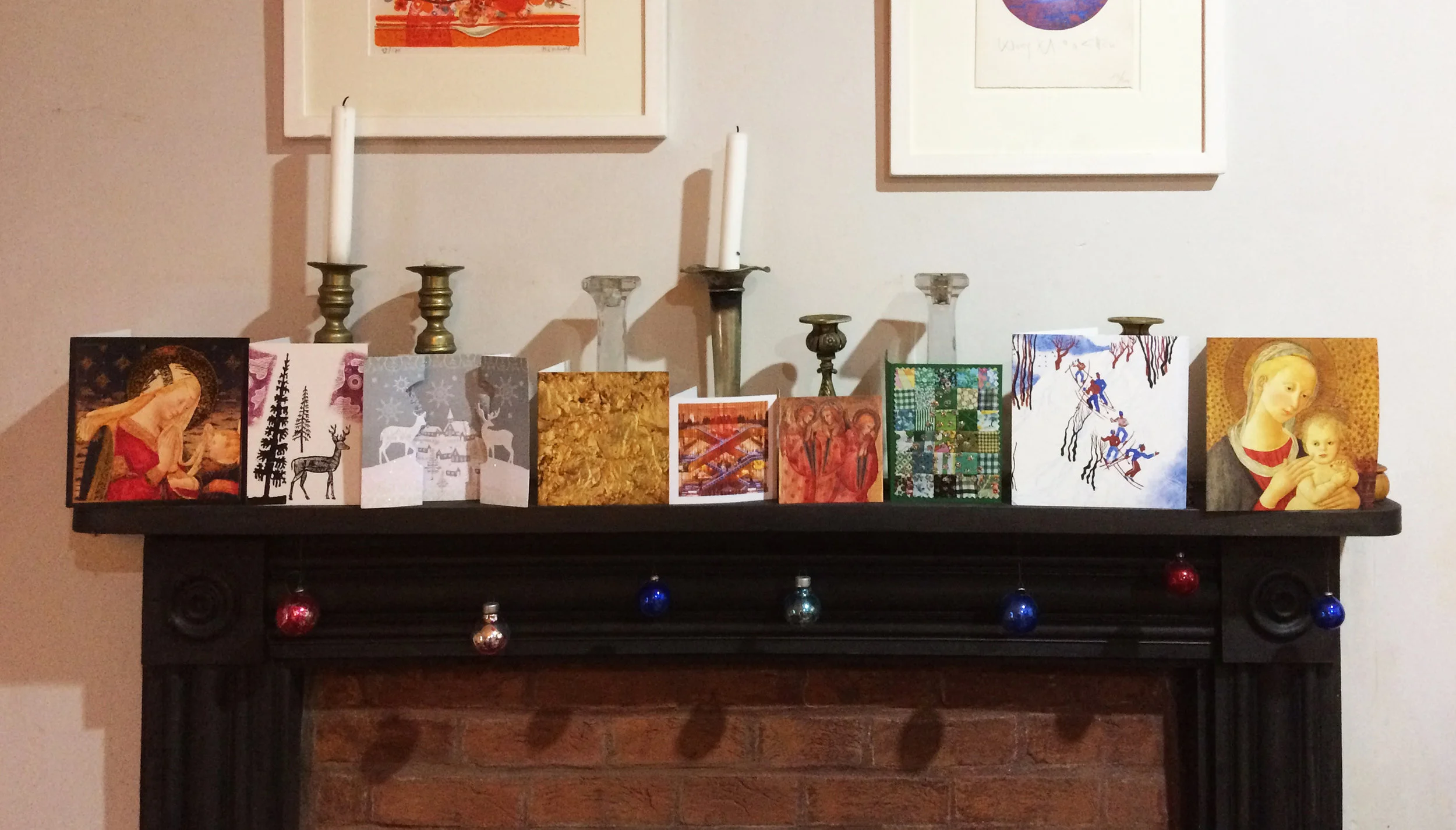
Portrait shaped cards look the best on the mantlepiece, but they were in the minority this year.

Some good ones on the mantlepiece, in case you're in doubt - square, portrait, other, sq., sq., sq., portrait, sq., sq.

Some good ones on the mantlepiece, in case you're in doubt - square, portrait, other, sq., sq., sq., portrait, sq., sq.

Cards go sideways on the walls.

Cards go sideways on the walls.

Last year, I was sad about the dropping off of home made cards, as opposed to home (digitally) printed cards. This year I've stopped being so picky and the category title is "a card made by the person who sent it" (31%), not must change over the survey period for this homemade category.

Twin robin cards and some pigeons

Twin robin cards and some pigeons

In terms of subject categories, there were more birds than ever (11 including 4 robins) and 6 cards that included pictures of deer. Only 1 with angels, 2 of the virgin & child and 2 nativity scenes - one of them in stained glass - hurray! But, as I said, my categories are getting confused. In the past I've had "reproductions of well known artworks" and "snow scenes". There are some obvious category-straddlers here, with the robin in the snow (above) & the Edward Bawden deer (below). 

I hate to choose an overall winner, although I don't think there is a big overlap between people who send me cards and those who read this blog. Four favourites below are Robert Rauschenberg's Gold Painting, Janina Konarska's Skiers, Edward Bawden's Deer and Trees, and a mistletoe print - there is such a lovely texture on this genuine handmade item.

x1.jpeg

Analysis Of The Christmas Cards Part 2 by Sasha Ward

Part One analysed the spread of cards from Christmas 2015, as you can see if you follow this link http://www.sashaward.co.uk/blog/2016/1/2/analysis-of-the-christmas-cards  This year, I enjoyed the arrival of the cards even more as I anticipated what fun I would have counting up the varieties of manufacture, shape and subject matter once the whole business of Christmas was over (hooray!). 

The 2016 statistics are as follows: 20% home made, 14% home printed, 66% bought.  34% square, 43% portrait, 12% landscape, 5% postcards, 5% shaped. Not much change from last year, but I'm glad to see that home made cards are slightly on the increase while square cards - awkward to display I find - are slightly on the decrease.

The most popular subject matter was one of my favourites, a snow scene (7), see above, with examples showing Vermont, London, Siberia; streets, parks and gardens. There were 6 cards of single trees, 6 of birds - 4 of these actually recognisable species, see below. 

The main difference between this and last year's cards is the dropping off of reproductions of well known artworks. Last year's most popular category was down to one example this year, a disturbing state of affairs slightly alleviated by the two stained glass cards we received. You can see these on the mantlepiece below, particularly thrilling is the card on the right which shows the stained glass before and after restoration. 

My favourite cards on the mantlepiece, particularly the patterned ones in the middle with seasonal colours and glitter! Click to enlarge.