South Gloucestershire

Vertical Landscapes by Sasha Ward

The rug page in my June 1983 sketchbook, and the centre of the rug itself.

The threadbare rug in my studio is an inherited one and has fascinated me for years, as documented by a drawing of it in my 1983 sketchbook (above). I loved the way that the landscape had been turned into a vertical pattern of loosely drawn scales, one of which is a lake rather than a mountain. I’ve been thinking about vertical landscapes recently because I’m designing a set of vinyls for very tall windows, 4.6 metres high. Although I could ignore the divisions between the windows and float the design across the window frames, I’m more inclined to emphasise the vertical and treat each as a separate window.

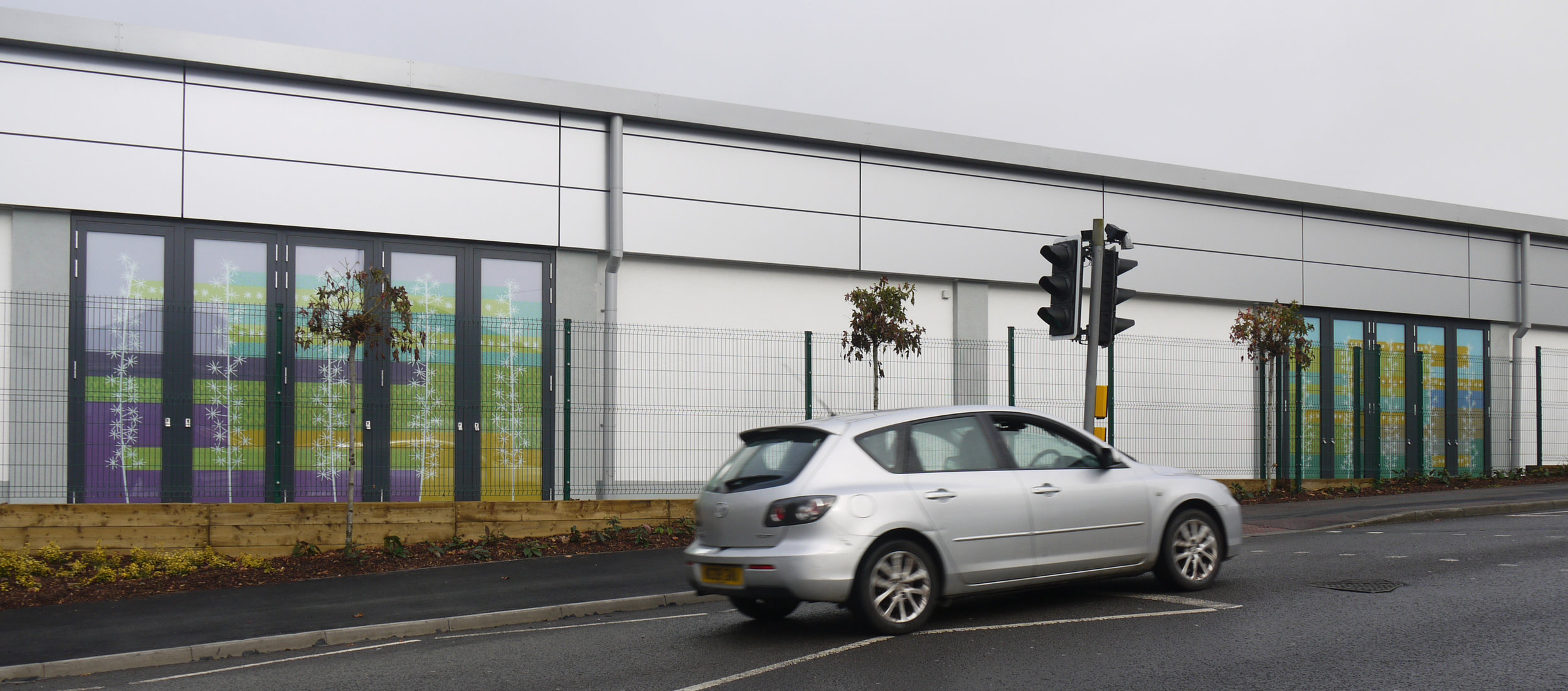
Left: Installing the fake windows in the new Lidl. Right: The drive-by commission I did for Lidl in 2017.

Left: St John Hospital Chapel, Lichfield 1984. Right: All Saints, Farnborough. Memorial window for John Betjeman 1986.

These two approaches are evident in rows of windows from many different periods of stained glass design. The first pair that I thought of are by John Piper (above). On the left hand window the shapes in the design link up, with the mullions cutting through the figures, whereas the window on the right consists of a separate picture in each opening, with the result that the fish confined to the right hand window seem to float up into the air.

The second set of examples (below) are windows in Wiltshire from the nineteenth century. In the crucifixion scene on the left, it’s not the figures that cross over the mullions but the landscape and sky behind them which become a row of coloured bands. The Warrington window on the right uses all sorts of decorative devices - borders, columns, canopies - to split up the shapes while still keeping enough room in the middle for some spectacular rocks, clouds and trees.

Left: St Mary, Nettleton, Wiltshire, Crucifixion window by E.R. Suffling 1892. Right: Christ Church, Bradford on Avon, window by William Warrington 1857.

Easy to keep photos vertical with the camera phone.

The subject matter for this commission is based on the local South Gloucestershire landscape. On my walks and drawing trips around the area I’ve been looking for features that split up the landscape, obviously trees which are also useful as borders, but also fences, buildings and paths. I’m aiming to make a composition that is richer than a stripy landscape and is something that you can’t mistake for an advertising banner.

Not to so easy to keep my drawings of hillsides, parks and paths vertical.

Screen printing by Sasha Ward

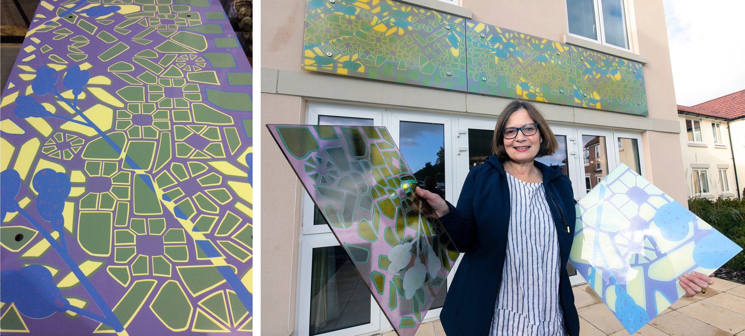
Left, glass panel in the factory before lamination. Right, glass samples in hands, installed glass behind me.

Left, glass panel in the factory before lamination. Right, glass samples in hands, installed glass behind me.

I get large or external commissions screenprinted by protoglassstudios.com . Although they have been making my work since 1992 and have always done a good job, there are so many things to worry about when you hand over the manufacture to somebody else. For this one, commissioned for Alexandra Lodge which is a new development by Churchill Retirement Living in Thornbury, South Gloucestershire, it was the colours. I had the design worked out (described in my blog “Cobbles” in July) and a combination of four opaque colours agreed - you can see the factory sample showing the glass version of these colours in my left hand (above right). In my other hand is a painted sample with an earlier colour palette which ended up being rather similar to the final version.

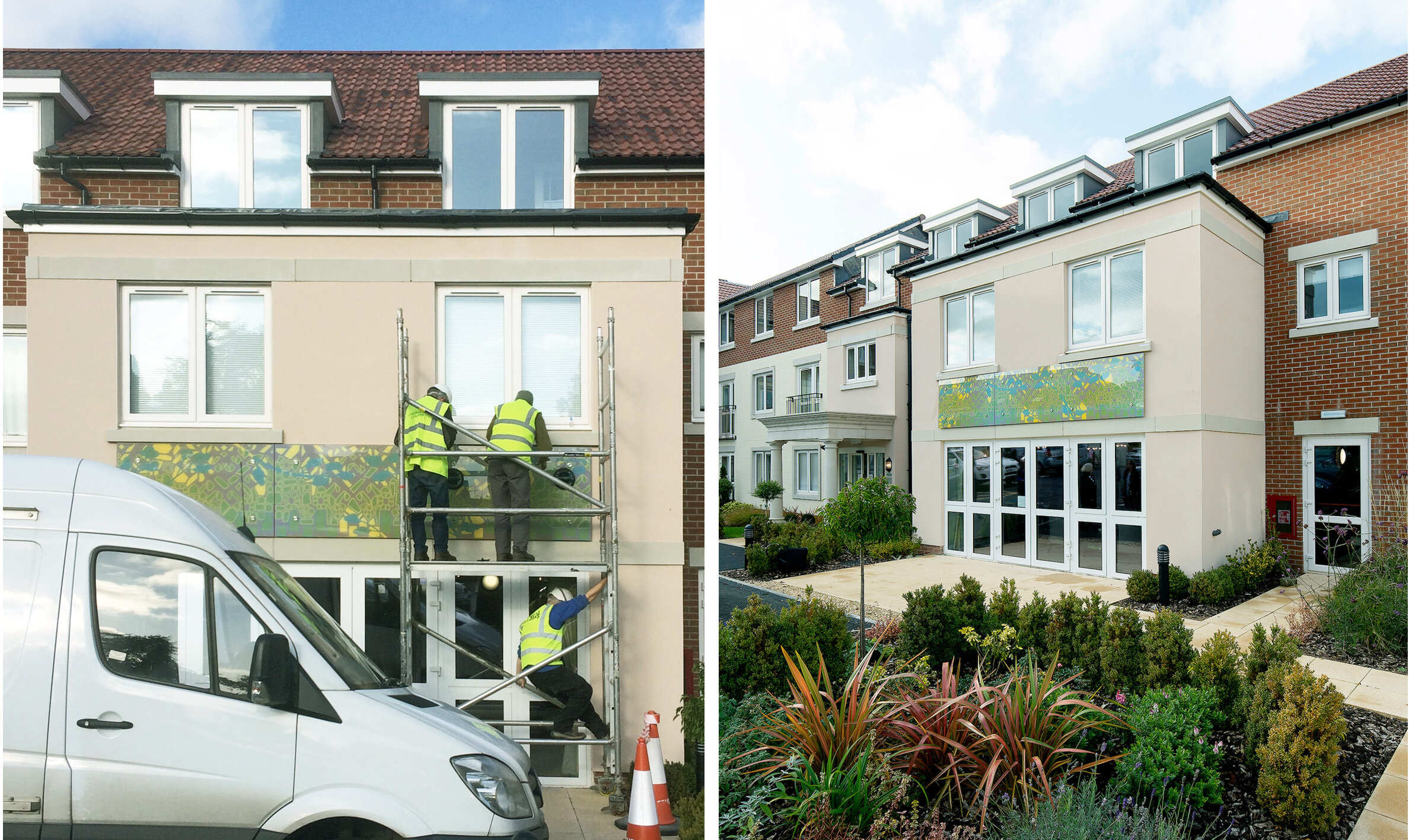
The colours I use are usually paler, and I would say subtler, than the average. In this case, I was persuaded that the design wouldn’t show up outside and from a distance unless we boosted the colours. Imagine my surprise on visiting the factory after printing but before lamination, to see how dark the colours looked (this stage shown above left) - I was convinced I hadn’t chosen that blue but it was too late to do anything about it other than start again with all three panels. But the same finished panels, as you can see installed on the face of the building below, are somewhere in the middle in terms of the colour range and look just right with the building and the planting scheme.

Left, installation of glass at Alexandra Lodge, Thornbury. Right, official photo showing glass above lounge doors.

Left, installation of glass at Alexandra Lodge, Thornbury. Right, official photo showing glass above lounge doors.

I visited the glass factory on one day during manufacture to photograph the process as far as I could. An all out yellow layer had been printed first, this background brightened the whole piece and gave the exposed laminated edges a lovely yellow and purple two tone appearance. On the day, the green cobbles had already been printed and they were doing the blues which went around the edges of some cobbles and cut across the design in flowering branches. The purple layer would be the last to be printed, you can see this stencil on the screen below right and also as the black on the films that we laid on top of the other printed colours in the bottom picture.

Left, panel 2 in front of screen for blue. Right, screen for panel 3 purple.

Left, panel 2 in front of screen for blue. Right, screen for panel 3 purple.

Left, preparing to print blue on panel 3. Right, panel 3 going through the dryer.

Left, preparing to print blue on panel 3. Right, panel 3 going through the dryer.

Left, films for screens in the factory. Right, panel 1 with film for purple overlaid.

Left, films for screens in the factory. Right, panel 1 with film for purple overlaid.

Battleships by Sasha Ward

elevation sm.jpg

The second part of my commission for the Lidl store in Kingswood, South Gloucestershire has just been installed following the sort of massive delay that has happened a lot over the past year. You can just see the new tile panel next to the Lidl sign in the photo above, for a description of the windows that make up the earlier part of the commission see my previous blog here.

The tile panel links to my designs for the windows that are set along the back of the building on this busy residential street (Cecil Road). It is made of Italian porcelain tiles in a range of beautiful colours, overprinted with layers of detail in ceramic enamel. The oranges are so much more orange than the ones you get in glass, as well as being a great match for the spirit level during installation (below left)

Tile panel during installation and completed: dimensions 1.6 m (h) x 2 m (w).

Tile panel during installation and completed: dimensions 1.6 m (h) x 2 m (w).

4 stages of the design on squared pape

4 stages of the design on squared pape

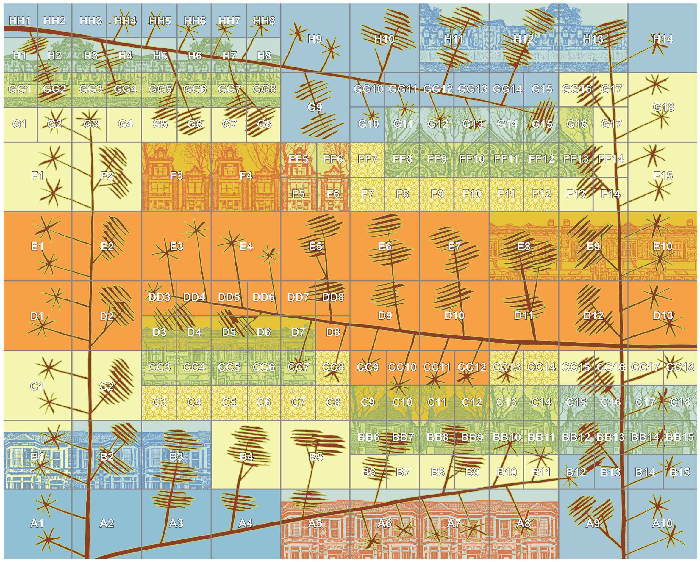
I call this commission "battleships" because when I was working out the design, concerned about balancing the blocks of detail in the overall composition, I realised I was drawing out a sea full of cruisers, destroyers and battleships as if I were playing the game, with none of them touching each other. I was pleased to find that the printed tiles came with a numbered plan (below) that you could probably use to play battleships as well as getting each tile in the right position.

battleships.jpg

There was another lovely sky on installation day, the colours looked great on the side of the building and were much admired by passers by. They are behind the green grid of a mesh fence, but you can get down the side of the building for a closer look.

vinyl & tile sm.jpg

Drive By Design by Sasha Ward

Driving along Cecil Road

Driving along Cecil Road

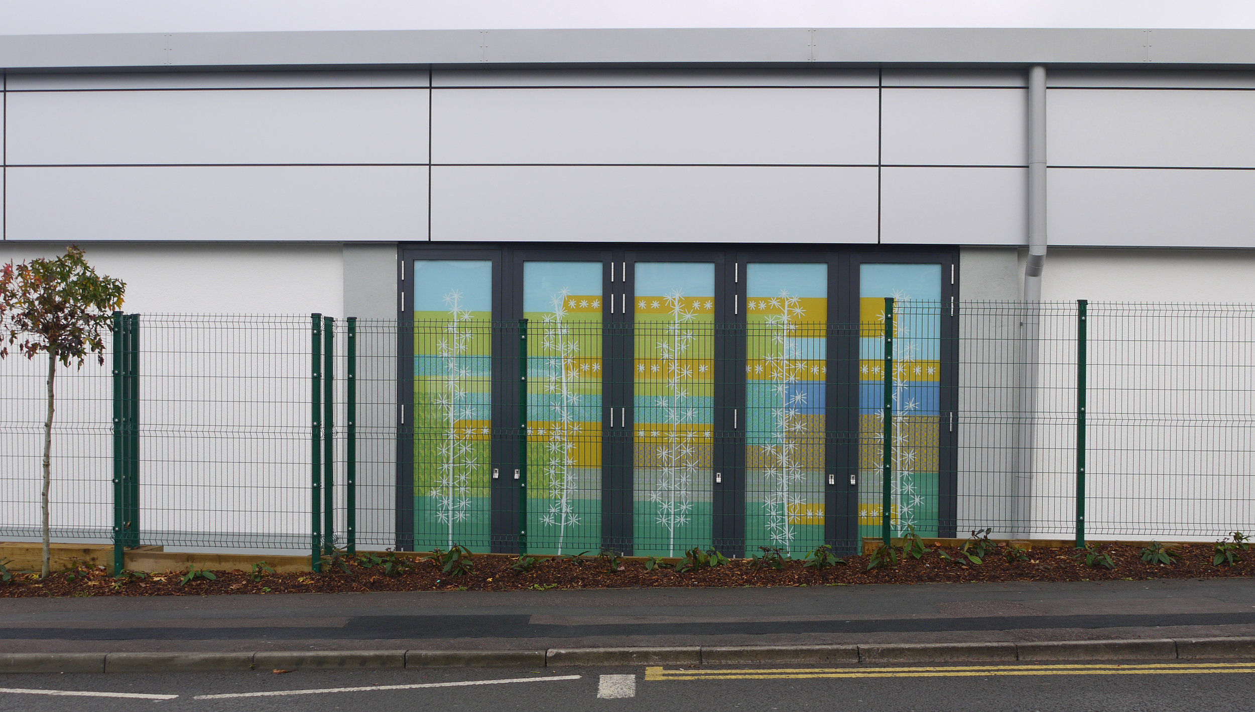
This is the first part of my commission for a new Lidl store in Kingswood, South Gloucestershire. The side of the building is on a residential street, so the standard elevation has been enlivened with a series of "windows" and a design printed on opaque vinyl that links the three sets of panels with ribbons of colour and pattern.  

panel 3.jpg

As you can see from the two sets of designs above, things change during the building process. Where there were four windows per set, there are eventually five. Where the landscape design took account of these windows, in the end it didn't and there was a fence with a banner on it partly obscuring the end windows that announced the opening of the shop in November (below).

panel 4.jpg
panel 2s.jpg

However, I am happy with my design. The geometry goes well with the grids of the building and the fence, the stars in various forms link with the lines of trees and upright posts and the colour scheme looks just right under the grey or the blue sky. In the details taken from the partially obscured windows (who knows, the banner may have been removed by now) you can see different types of stars and details from local buildings both printed and reflected in the vinyl.

panel 1.jpg