West Dean College

The Weekend Course by Sasha Ward

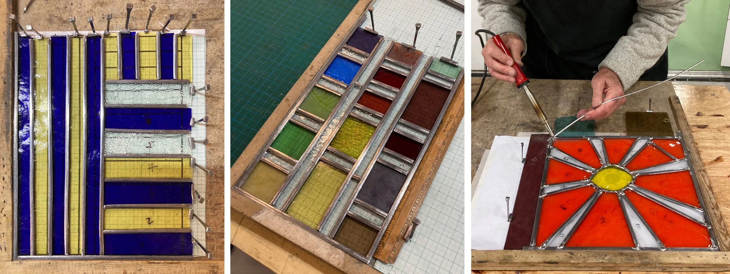
West Dean weekend student work: 1. simple leading 2. simple but lots of pieces 3. soldering a less simple design.

The adult beginner’s weekend stained glass course is a bit of a rushed affair. There are so many stages to learn, including the most important one of how to design a simple stained glass window, something I like each student to do for themselves. I felt a sense of triumph on last weekend’s course at West Dean College (which will be the last weekend course I teach) as a student actually made a window that was really simple and easy to make, yet original (1 above left). As you can see, the creeping inaccuracy of the cutting meant that the glass pieces didn’t fit the paper pattern once leaded, but easy to cut means easy to trim down if you have to.

West Dean student work in progress: 4. work bench 5. round panel pieces cut  6. panel cemented but not cleaned.

Mostly the students don’t follow my advice to keep it simple and come armed with examples of the sort of organic or representational thing they want to make. It’s only as you make the stained glass panel that you understand the pitfalls, why some shapes are easy to cut but hard to lead, like the orange star burst which is being soldered at 3 top right. This means that it’s not the number of pieces that makes a design doable or not in a weekend, for example 2 top centre & 4 above right (which has over 40 pieces of glass) were both simple to make because of the leading pattern. The round panel (5 above centre) was only just doable for a beginner, but there is always the possibility of skipping the last stage and taking the cement in a bag to do at home, or taking the panel home dirty, like 6 above right.

West Dean student work with sandblasting: 7. paper plan wave 8. around the edges 9. butterfly antennae.

We don’t have the use of a kiln on this short course, but we do have a sandblaster which gives you a different way of adding detail. In 7. (above left) a wave has been added to give the much desired organic feel, linking the pieces with three lines. Painting, or drawing and sandblasting, across the lead lines is something else I find it hard to persuade students to do, you can see another example of linking pieces with sandblasting in the wobbly circles at 12 below right. Sandblasting a section around the edges of adjacent pieces was also effective in 8 above centre, giving the finished panel a chunky appearance that went well with the blocks of glass.

West Dean finished panels: abstract designs with curves and sandbalsting. 10, 11 & 12.

It’s great when a design that is supposed to represent something actually works. The butterfly (above right) is an obvious example, but the three landscape panels below are very satisfying. The river estuary that is both curvy and geometric (13), the palm tree that floats above its trunk (14) and the lighthouse (15) that is immediately recognisable but so subtle all provide a perfect end to my teaching of the weekend course.

West Dean landscape panels: 13. river estuary 14. palm tree 15. lighthouse.
Lead Lines by Sasha Ward

On the five day stained glass course at West Dean College students sometimes make panels which are particularly good because of the way that the painting and sandblasting combine with the leading. There is no set way of doing this as you can see from the variety of examples I have chosen below.

Panels by students at West Dean College. Top: Gillian, Helen’s workbench, Zahra. Bottom Karl, Sarah, Julie.

Top left (Gillian) used a silhouette of black paint around the edges of the pieces thus disguising the lead lines, which is good practice. Bottom left (Karl) used lines of black paint and sandblasted areas in the foreground to link the separate glass pieces, which is also good practice. Top left (Zahra) framed interesting pieces of chunky glass with off cuts, collage style. Bottom right (Julie) combined the collage style with lines and spatters of paint worked across the lead lines. The panel at bottom centre was a particular triumph in its use of a colour palette where nothing jumps out and where the lead lines describe the objects while also making a pattern. This student (Sarah) did all the painting on one evening when she was able to put the glass pieces next to each other on a light box, it’s really hard to do good glass painting when you haven’t got the space to do this.

West Dean House, window with portrait of Edward James by Patrick Reyntiens 1990s and foliage detail.

The Patrick Reyntiens window in the oak hall at West Dean House is useful for showing students some of these glass painting techniques. They are usually amazed to discover that you can’t really make out from a distance what is lead line and what is black paint. This is loosely applied, with scraffito details, on the green glass that makes up the tree trunks and the foliage (above right).

Panel by Susan, 2023, with inspiration from Louis David.

Sometimes a student’s panel references a particular window, like Susan’s version of a Louis David figure from a window in Colmonell, Ayrshire. In the photos above you can see the stages in between, with a fabulous drawing on black paper where details from the illustration of the window were moved around to make something new. On another of last year’s courses, Benedikt found a Harry Clarke illustration of the mealstrom and combined it (hooray for originality) with his version of the stick man from the album cover of Led Zeppelin IV (below right).

Panel by Benedikt, 2023, with inspiration from Led Zeppelin and Harry Clarke.

On this year’s course Helen finished her large (600 x 500 mm) door panel of Thunderbird 2 flying over the sea. Her originality was in the working process, with the overall design in her head rather than on paper. The separate elements - sea, sky and copper foiled Thunderbird came together over a few courses like magic, trailing lead lines through the broken pieces of sky.

Thunderbird 2, made by Helen completed in 2024.

Inspirational students by Sasha Ward

Favourites from previous courses: left 2018 shown against the flint walls of the house, right 2019 (scale shown is on the lightbox).

Favourites from previous courses: left 2018 shown against the flint walls of the house, right 2019 (scale shown is on the lightbox).

The course I teach at West Dean College starts with an illustrated talk, of which the most popular section is the gallery of past students’ work. Although I aim to show a range of techniques and approaches to the craft, inevitably the panels I choose to show are the ones I like best. My two previous favourites are shown above, they are similar in their modular style which means the panels are fun to make as you can change your mind about which piece of glass goes where. On this year’s course, just completed, there were three students working in three different ways whose work I loved.

Six pieces of enamelled glass by Ursula Yeates.

Six pieces of enamelled glass by Ursula Yeates.

I’ve just inherited some glass enamels for students’ use - just as well as Ursula really lays it on thick! This time she painted at least thirty smallish glass pieces with opaque and transparent enamels, experimenting with spectacular results. She leaded some of these pieces together, but they are also good enough on their own - the top middle (above) at only fifteen cms tall, is amazing. All this painting inspired the group of students to use more paint in their stained glass panels than they usually do. Despite my talk with historical examples, I find it hard to convince people that the best stained glass windows are actually also painted.

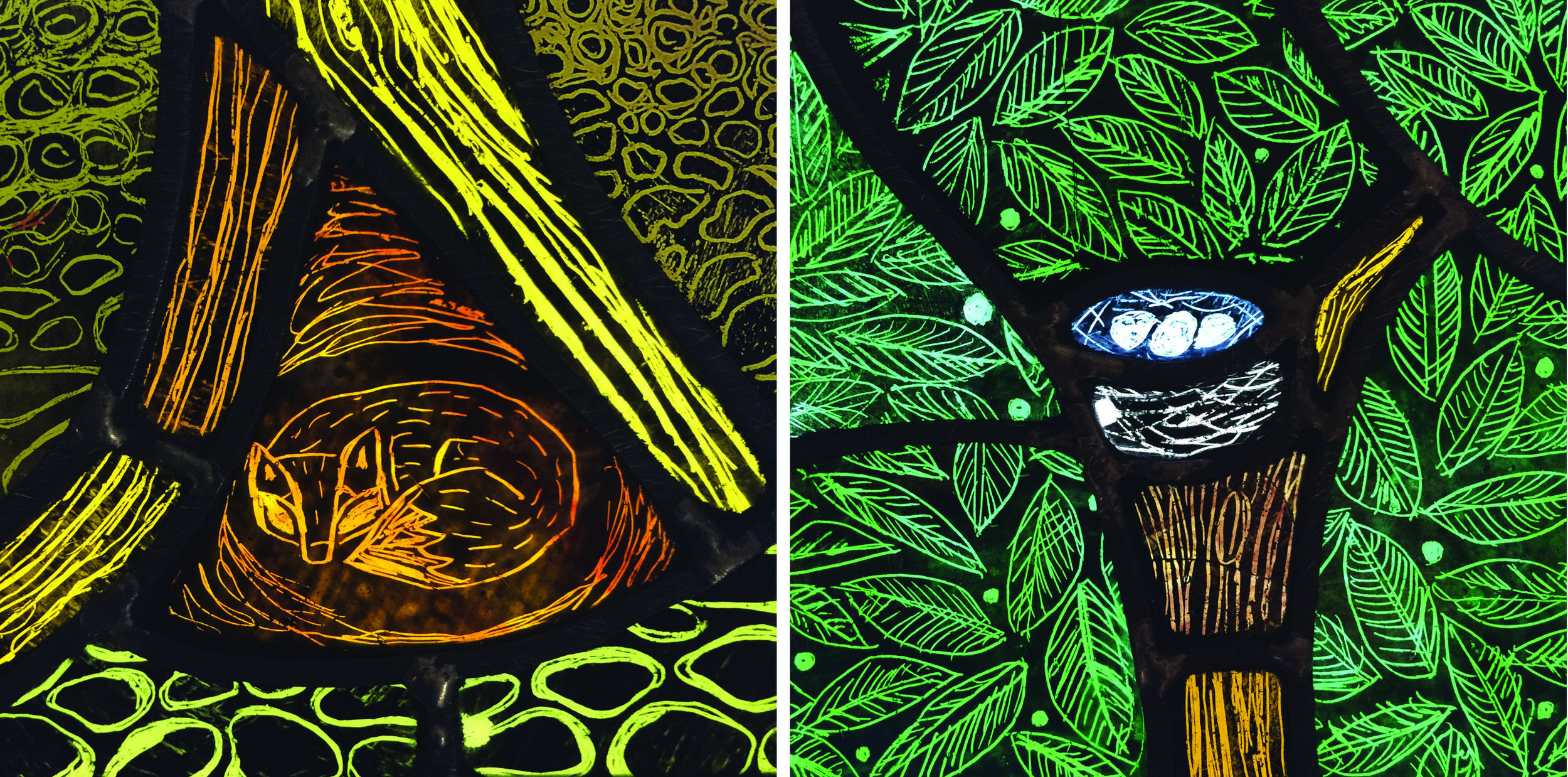
Angela covered her pieces of glass with black iron oxide and drew into it with a stick in the traditional way. At the bottom and top of her tree you find a fox and a bird’s nest which are both drawn so confidently, while for the leaves she drew on a large sheet of green glass and then cut it up. The whole panel is lovely, the details (below) show the freedom in her drawing.

Painted details from stained glass panel by Angela Ibbs.

Painted details from stained glass panel by Angela Ibbs.

The last set of panels, just some of the work that Katie did in five days, combine drawing in black iron oxide, enamel painting and pattern making. The sea urchin panel (below left) at about twenty cms. tall, was her sample piece and so good that I can imagine an enormous window like this, with shapes and patterns repeating. On her house plant panel (below left) she used some of this scratching off technique, but also sandblasting and painting with enamels on pieces of glass cut to a very satisfying plan. These last two students were absolute stained glass beginners. All of them have inspired me, now back in my own studio, with the joy of making.

Two panels by Katie Bebbington, left sea urchins, right house plants.

Two panels by Katie Bebbington, left sea urchins, right house plants.

Sea, Stone and Glass by Sasha Ward

Detail of 1919 window designed by Edward Prynne, made by J.Jennings.

Usually, you can find a great bit of detail in any old stained glass window. I saw this wonderful cupid at the bottom of one of a series of six in St Thomas a Becket, Pagham, West Sussex, helpfully signed with the inscription of the designer and the maker, "Edwd. A.F.Prynne, J. Jennings, AD 1919". The backgrounds to the figures are smothered with clumps of plants between streams of water on pieces of glass whose shape reminded me of the flints that some buildings in this area are made of.

Wall of St Thomas a Becket, Pagham.          Background detail from one of the six Edward Prynne windows

Details from the east window, with signatures at bottom right.

The whole of the east window is a lovely composition of old glass. The details I have picked out include figures in bright coloured glass with rich silverstain. In the bottom right of each photo is another useful inscription - on the left "Re-glazed & re-arranged 1939 HMOT" (Howard Martin Otto Travers), on the right "RE-LEADED AD 1919 J.Jennings". 

It was good to have this reminder of the process as I was on my way to teach a stained glass course at West Dean College. At the end of the week I could see lots of links between the windows in Pagham Church and the students' panels, see below. These include representations of the sea in cut shapes and glass paint, clump shaped pieces of glass with landscape painting, and the inspiring backdrop of a wall in the world's largest flint building (according to one of my students, an ex- architect).

Student windows from West Dean College: sea, rainy landscape, composition in front of flint wall at West Dean.

Pagham: seaside coffee break, seaside architecture, seaside window.

Click images to enlarge