Our cards - above 2022 & 2021. Below 2020, 2015 and 2018.
As we got fewer cards than usual this year and also because I have become rather critical of the ones we do get, I thought it was about time to add the ones that we send out to my annual Christmas card survey. These five are the ones I could find copies of, as you can see we are trying to do something about the scarcity of stained glass and nativity scenes that I’ve noticed over the years.
You may also notice than none of them is square. Like last year, over 50% of the cards we got were square while only 15% were landscape format. 46% had an animal or bird as part of the imagery, 10% had a religious scene and 10% had presents or Father Christmas. 37% were homemade (or designed by the person who sent it) which is a pretty steady statistic. The unwelcome trend that I noticed last year, i.e. writing on the front of the card, is the same as last year at 30%.
Here are four of the best from this year. Above left, the best shop bought one (from the V&A) and above right, the best photograph. Below are my two personal favourites mainly because they are both really well made which is hard to keep up when you’re making lots of cards. Most of the ones in the homemade category are, like ours, printed on a home printer.
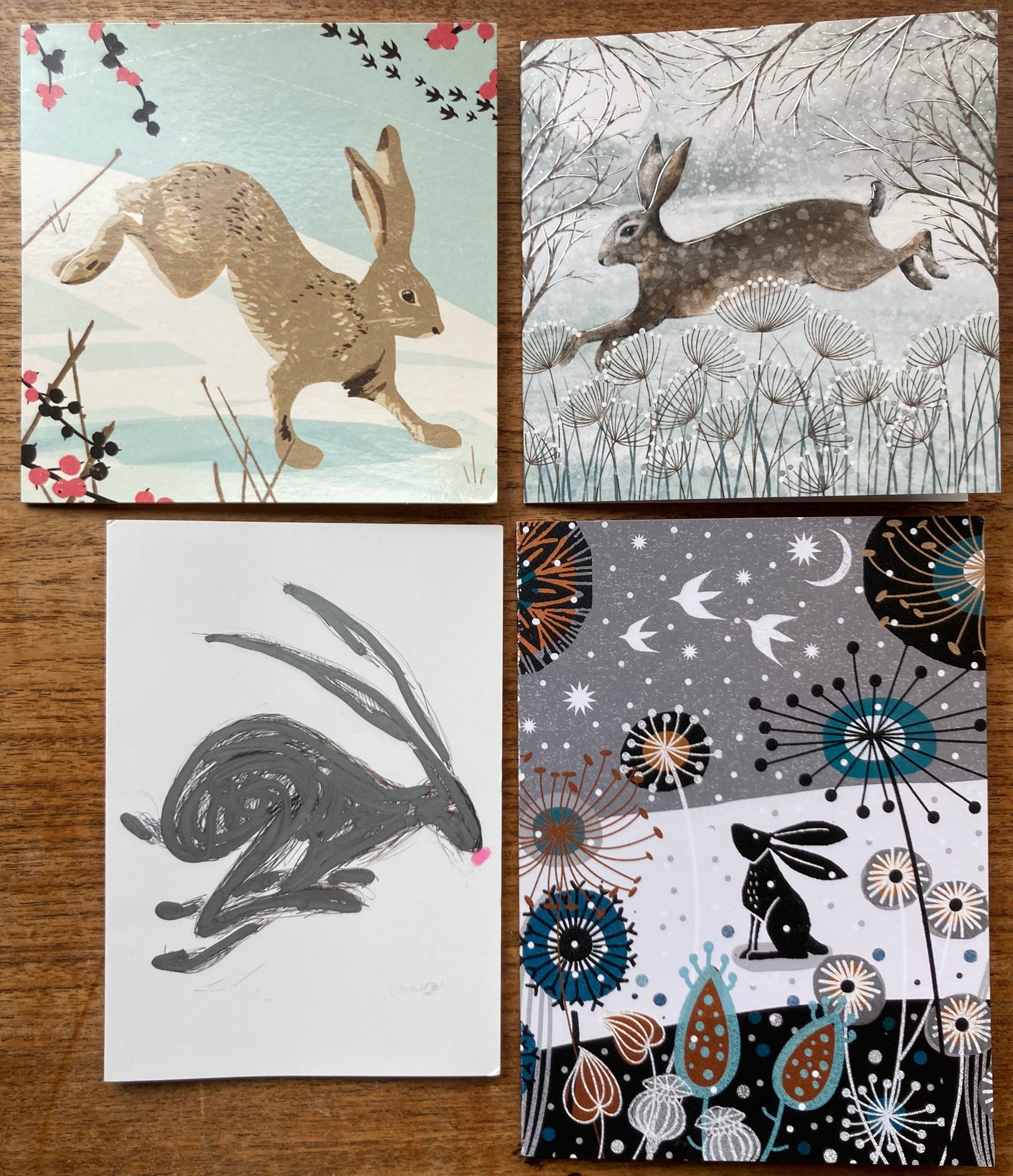
Finally, a special mention for the Chrismas hares!


