I returned to see a set of windows I designed and made last year for a house in Stockwell, London, no 41. I wrote about all of these windows while I was making them in previous blogs, so this post is about how they work in the space. It’s an early Victorian four storey double fronted house that the architect owner has completely refurbished - I’ll have to go back again to take a shot of the front elevation when the light is right (I mean when I remember to turn it on behind the fanlight).
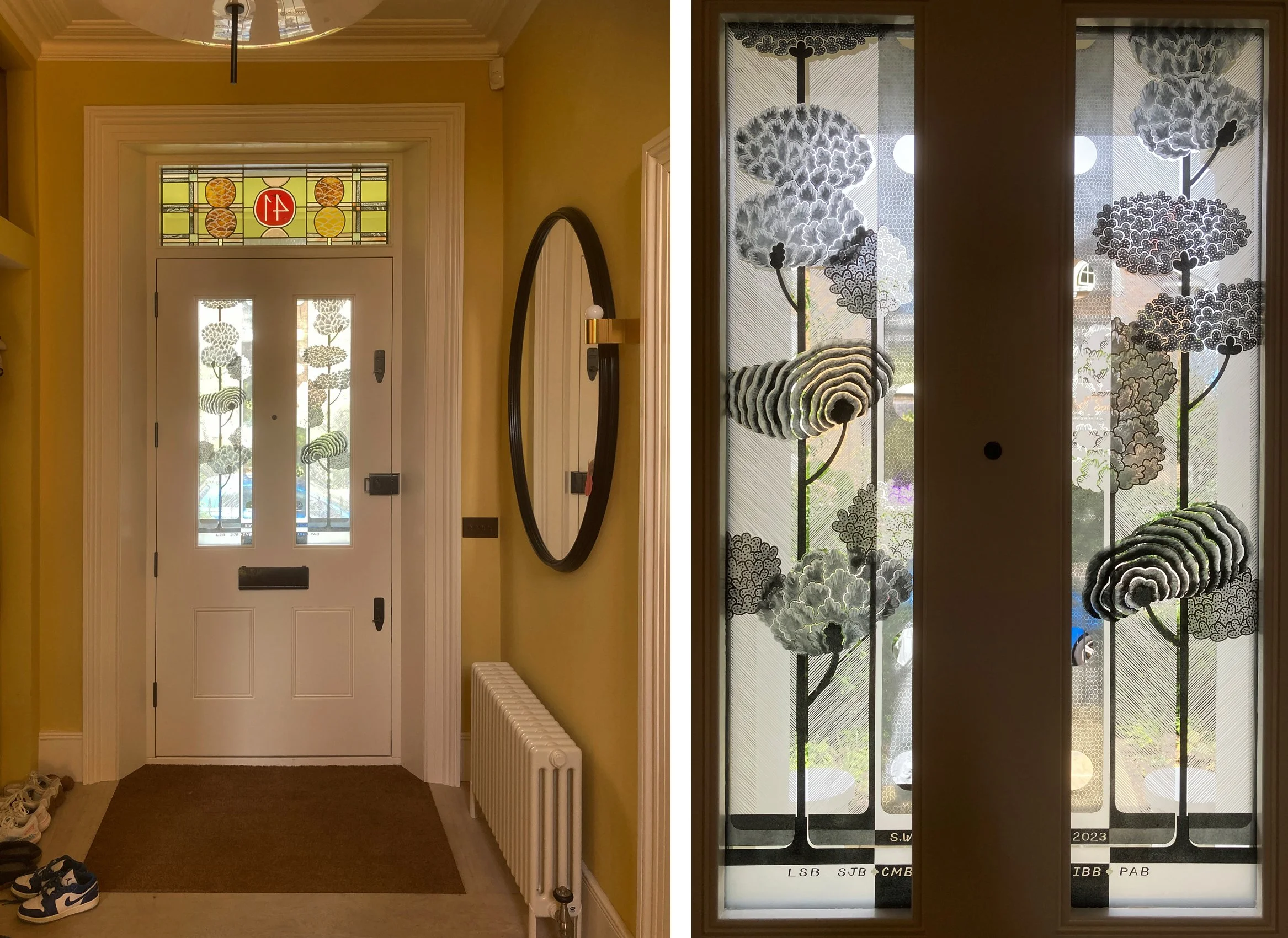
Front door and fanlight above: double glazed front door panels. The initials (& the shoes) belong to family members.
At the front there is a stained glass fanlight using colours that run through the house - ochre, gold, silver, red, pink and pale green, all of them in warm shades. Lined up with the yellow foliage blobs on the fanlight are two rows of trees on a pair of double glazed panels in the door below. I used both inside surfaces of the glass in the double glazed units to paint and sandblast on, creating the depth you can see in the detail below. The glass provides the right amount of privacy up close and also lets a lot of light in.

Front door and reflection: detail through the two layers of glass.

The back of the house: back door from the inside.
The back door faces south to a large unshaded garden. The techniques I used, again sandblasting and enamelling on the two inside surfaces of the double glazed units, show up really well from the outside and also very dramatically in sunshine. These are midsummer photos, in winter the colour travels further along the adjacent walls and the two different oranges in the glass are intensified on the yellow ochre background. I left a lot of clear glass for visibility in to the garden, you see this window down a short flight of stairs as soon as you come in the front door of the house.

Details of double glazed panels in the back door.

Second floor bathroom from the outside (lights on): from the inside.
The bathroom glass was the first I made for the house, the design was an enlargement of the colour samples I make with every colour agonised over until we got the right mix (and then they do unexpected things in the kiln). In the master bedroom it’s mainly yellow (above), upstairs serving the children’s bedrooms (below), there are more colours and a bigger difference when the lights are on and off. These colours are hand painted on etched glass so there is no chance of seeing through the glass in these lovely, functional sliding doors.

Top floor bathroom from the outside (lights off): from the inside.


