self portraits

Studio window by Sasha Ward

Winter 2020

Winter 2020

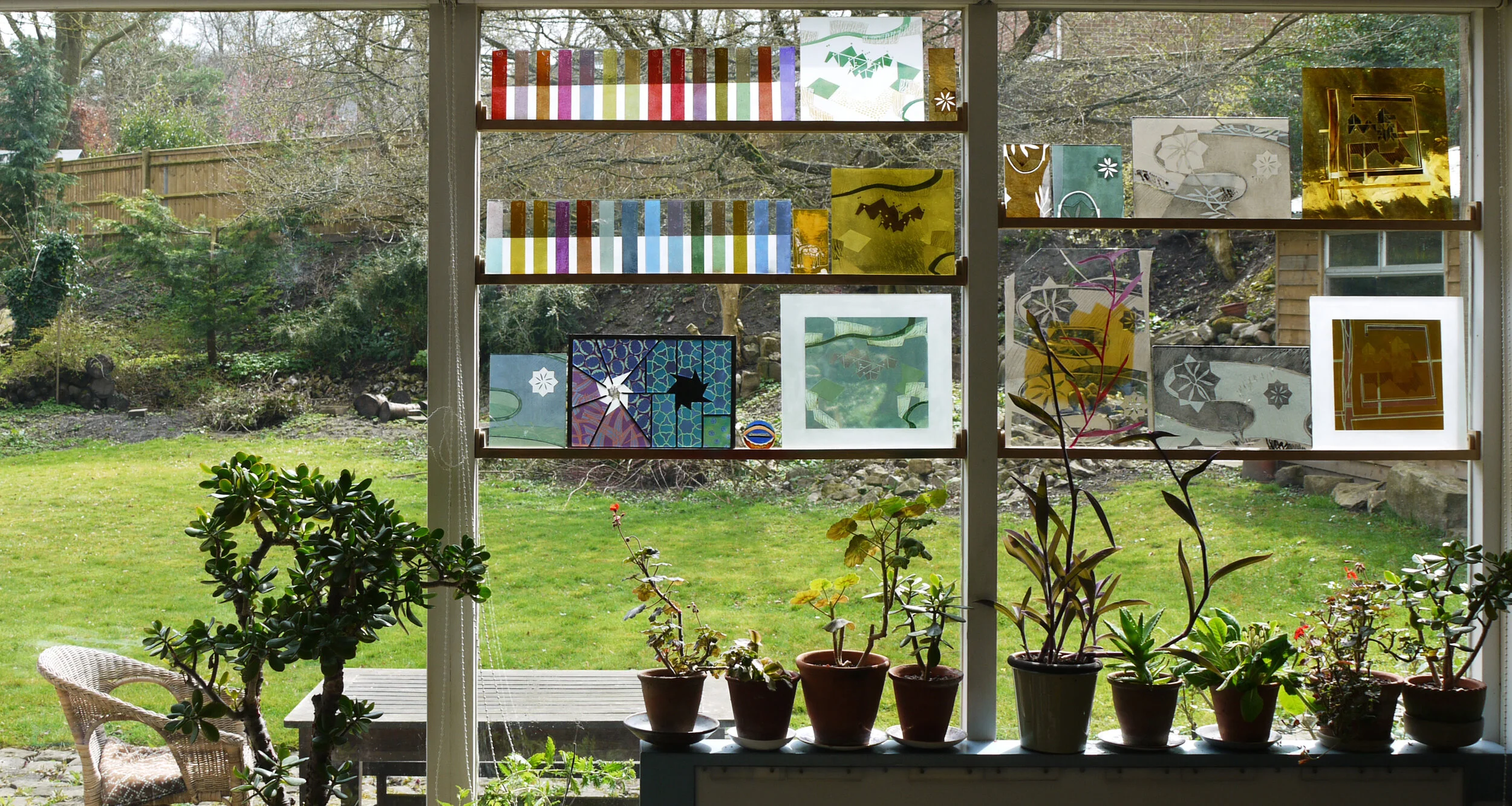
Do you ever get sick of the sight of your own work? In my case, samples and fragments of it are sitting on shelves in my window, blocking a view of our beautiful garden. The up side is that even in the gloom of a winter afternoon (above) there were interesting coloured reflections cast on the work I was doing on the lightbox. As this piece of work was a geometric composition, I ended up with a window full of striped colour samples and a more coordinated look in the studio (below). However, I was tired of that look and resolved, as we were going into lockdown, that I would end up with a completely different window at the end of it.

Winter 2020

Winter 2020

Autumn 2015

Autumn 2015

I found an autumnal photo with no coloured glass on the shelves from another year when I must have needed a change (above) and one from the following spring where I had painted the shape of one of the pink leafed plants on to a sample I was doing for a house in Italy (below).

Spring 2016

Spring 2016

Spring 2014

Spring 2014

Further back in time (above) I had the shelves in the same positions and a similar mix of geometric test strips and slightly organic patterns which were sample pieces for the commissions on the go. I recognise fragments from a wall panel for St James Hospital in Leeds, a plane propellor from Pegasus House in Bristol and colour variations for windows in Liverpool and Derbyshire. I only remember one occasion when I wanted to fill all four windows with samples (below). This was the last time we held an open studio event and the samples were labelled showing which commission they were made for. (Ten years ago I thought this was a terrible picture of me, now I can only see how much younger I look.)

Summer 2010

Summer 2010

Which brings me to the same window today and work that does look pretty different from anything I’ve put in front of it before (below). There are two main themes; self portraits which are on the bottom shelf and which I think I’ve done enough of for now, and stained glass panels from Ray Ward’s drawings which are on the top shelf and which I’ve described in previous blog posts. These have been a welcome return to making leaded panels and this is something I hope to continue doing both to commission and for exhibition.

Summer 2020

Summer 2020

Why Do Anything New? by Sasha Ward

1970

1970

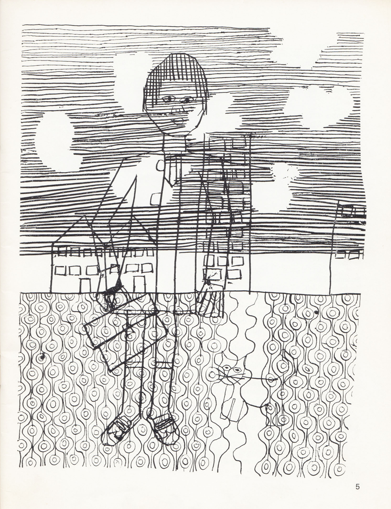
This drawing is called "Myself Going to School on the First Morning" and it had a whole page in the school magazine that year. Looking at my old drawing, I find myself transported to the moment I was doing it - I remember the scratchy dip pen, the decision not to finish off the paving pattern and the dots that I used to plan the shapes of the clouds that were supposed to be hidden by the stripy sky. The most authentic details are my lovely new shoes, briefcase and donkey jacket and the most amazing thing is how all the elements that make my artwork particular to me are present in this example. 

The cover of the magazine in that year of my first morning brings back more wallpaper memories. B.H.O. (english teacher) wrote in his editorial; "The School has been redecorated, and we can now well imagine the former elegance of the eighteenth century houses that constitute the School. To commemorate this event, our cover this year is an adaptation of a piece of wallpaper from the entrance hall". This wallpaper is listed as Sanderson's "Rivoli" in the index. The overblown floral shapes on top of irregular stripes are just like something I am designing at the moment.

1974

1974

This drawing, printed on the sort of brown paper I like to use now, has a whole page in the 1974-5 magazine. I  think it's based on observation, in fact I'm pretty sure it's of Caroline Fitt, but I think of this as another self portrait. The detail that amazed me when I saw it again was the horizontal dot pattern. I've tried to limit my use of this as a filler pattern, thinking that I'd picked it up at a later date from looking at Paul Klee. I admire the time it must have taken me to keep the dots varied in shape but not scale, perfect for that scratchy pen. So, why do anything new ? I don't think I could improve on these self portraits now.  

More recent examples of the patterns I used in those early drawings: Left to right: The vertical waves at Langley Green Hospital 2008: The stripy sky at The State Hospital 2009: The dot pattern at Longparish School 2005. Click on photos to enlarge.