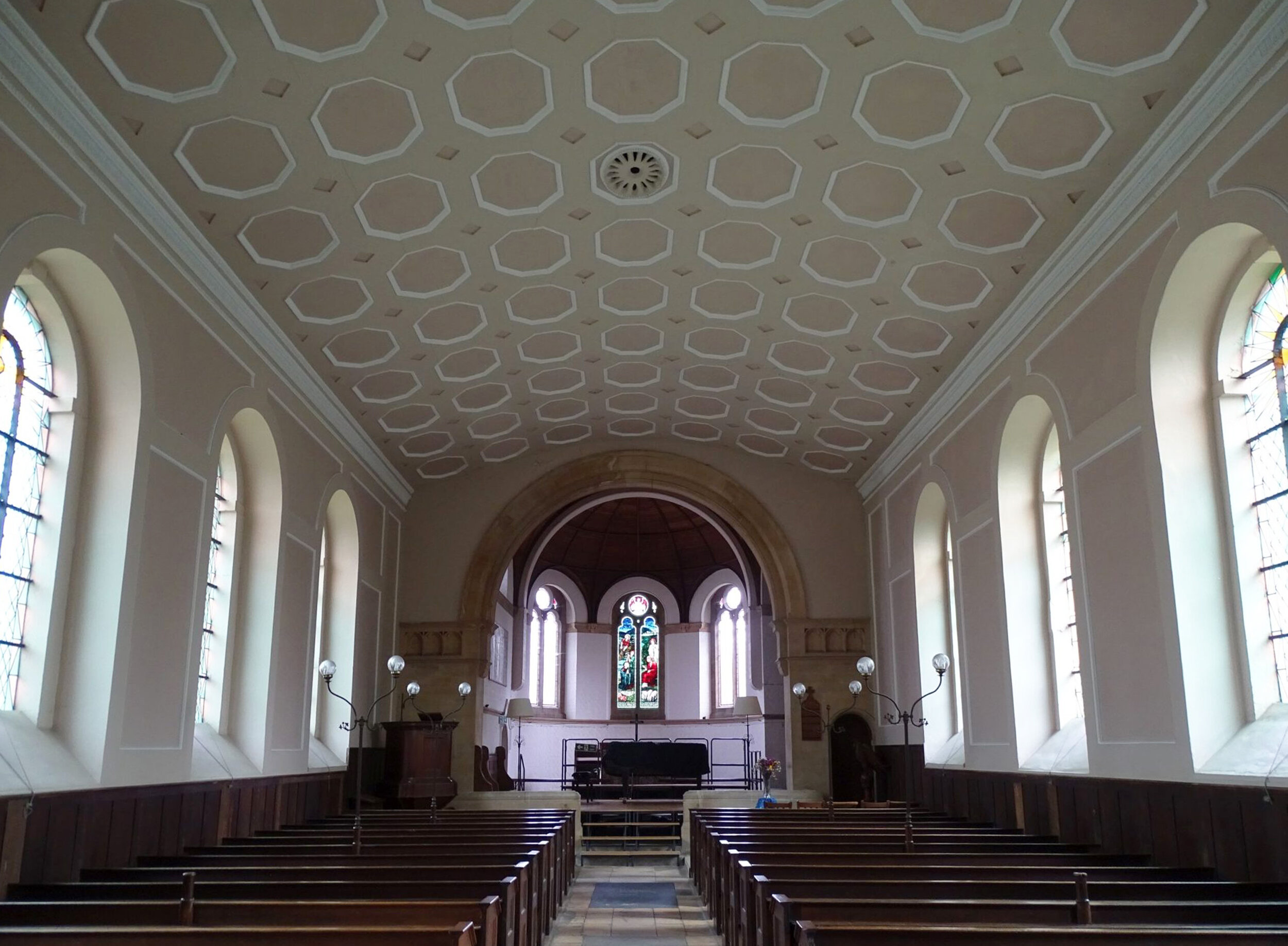
The interior of St. Peter’s Church, Wallingford, Oxfordshire.
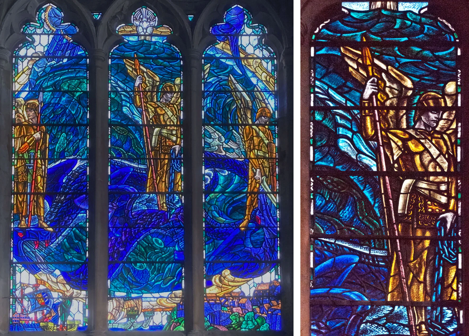
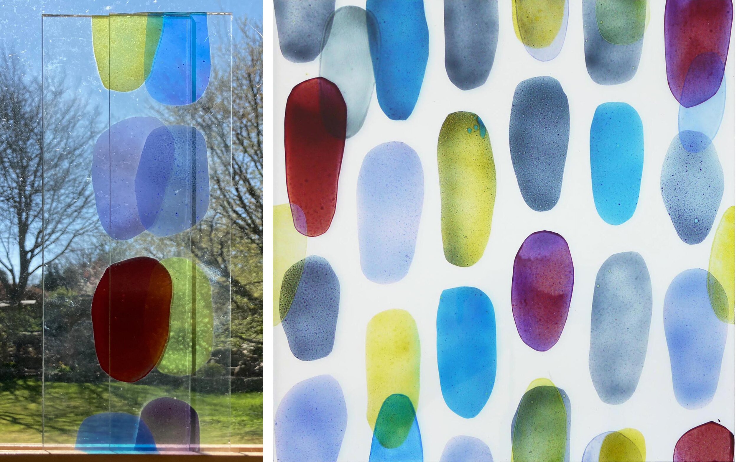
After more than a year of locked churches, most of them are opening up. The best doors are those that are fixed open, allowing a glimpse inside. Passing by St Peter’s in Wallingford I recognised the east window and went in to have a look. It’s a Morris & Co window from 1918 and shows Jesus’ charge to Peter (below left) and although I’d never seen one exactly like this before it’s the stripy sky and the colour combination that identified the makers to me. As is usual for a church looked after by the Churches Conservation Trust there is nothing ugly in the interior, the other windows are filled with pale coloured glass in an interesting and symbolic pattern (below right) that is suitable for the beautiful Georgian interior.

St Peter, Wallingford. East window and one of the windows in the nave.

St Mary, Newnham Murren, Oxfordshire. East window and as viewed through horseshoe shaped squint.
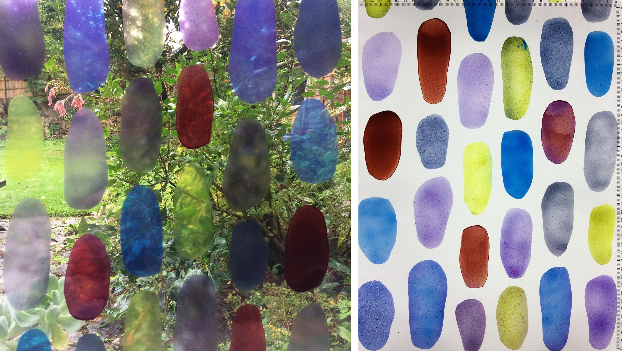
I went to find the next church, across the River Thames and hidden away along a footpath through fields. This is a small flint building with Norman origins also looked after by the Churches Conservation Trust. It is lit only by the light through the windows and the patches of bright colour in the stained glass really stand out - the 1849 restoration of the church provided these and removed much else. The patterned windows especially (example below right) provide just the right balance of colour and interest, with some yellow flour de lys wandering into the grid of floral ornamentation from a different composition, one of the joys of the patchwork nature of stained glass.

St Mary, Newnham Murren. West window and back of squint.

St Nicholas, North Bradley, Wiltshire. South and North nave windows by James Powell and Sons, 1929 & 1892.
The next day and another open church, this time in the other direction from home at North Bradley in West Wiltshire. Here all the windows I like are by Powells with, in my opinion, a decline in quality of design from the earliest to the latest (above left) which is installed in the south aisle and was not easy to see in the blazing June sunshine.
There is a gorgeous pair of windows in the south wall of the sanctuary, made by Powells and designed by the painter T.R. Lamont. They show his two wives who died ten years apart, an unusual thing to see in a church and I’ve no idea why they are there. Mary is playing the organ and Bessie is holding a sketchbook in front of a background with a blue trellis, apples and daffodils. The borders, colour combinations and inscriptions are all lovely and Mary and Bessie look like two real (albeit rather similar and rather decorative) people. This chance discovery - just the sort of thing I was hoping for on my return to church visiting - has reminded me of what a great thing a stained glass portrait can be.

St Nicholas, North Bradley. Window designed by T.R. Lamont and made by Powells in 1881.

The two wives of T.R. Lamont, Mary and Bessie.