Bathroom Windows by Sasha Ward

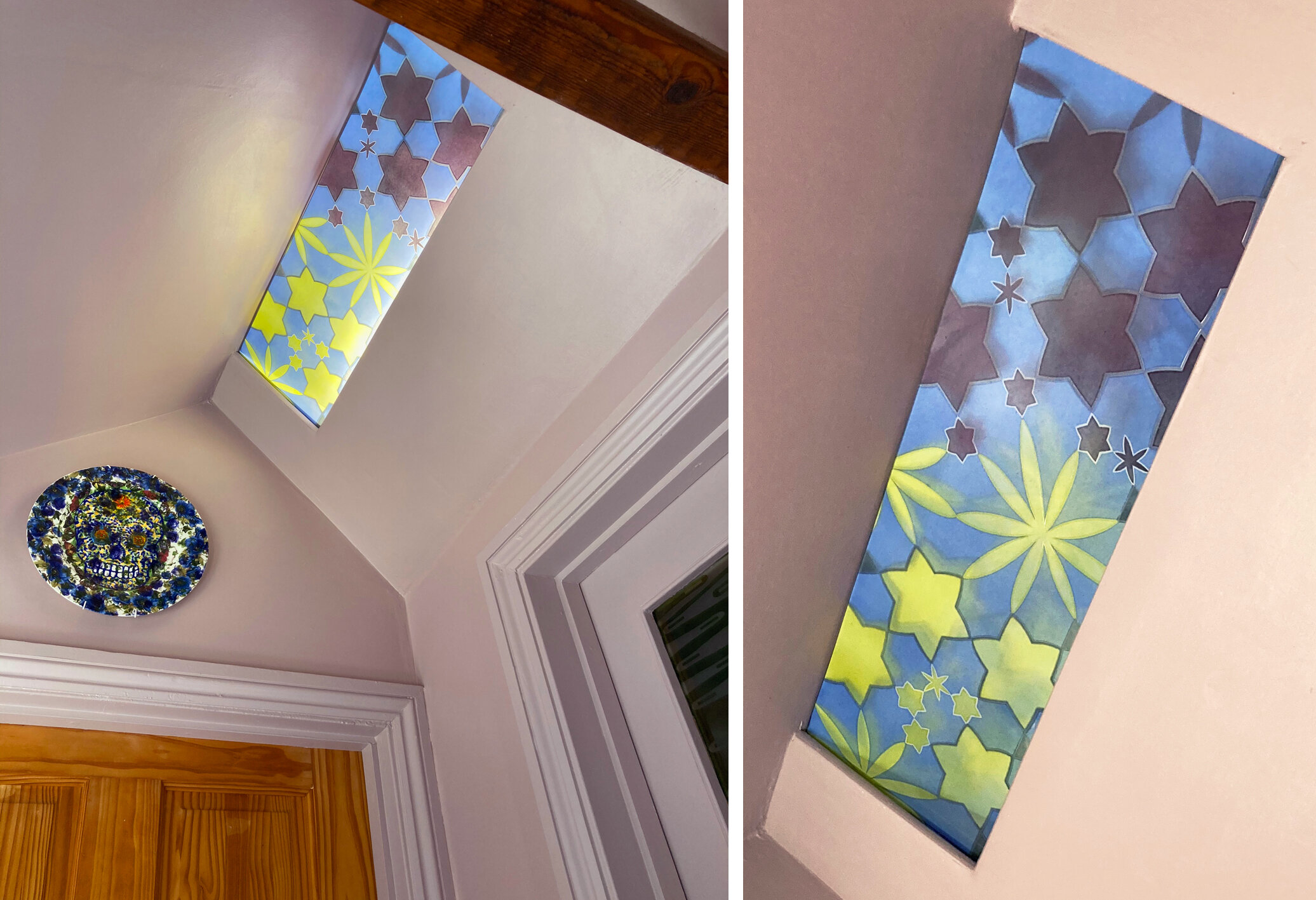
This winter we’ve painted our hall spaces pinky grey, a colour that we chose to compliment the greens and oranges we had in our interiors. The hall is lit by a concealed strip light and although it looked fine as it was I thought I could add something more to the space by making a glass panel to cover it. You can see it installed with the light on and off below.

Left: All three windows with the lights on.  Right: Ceiling and door window with the lights off.

Left: All three windows with the lights on. Right: Ceiling and door window with the lights off.

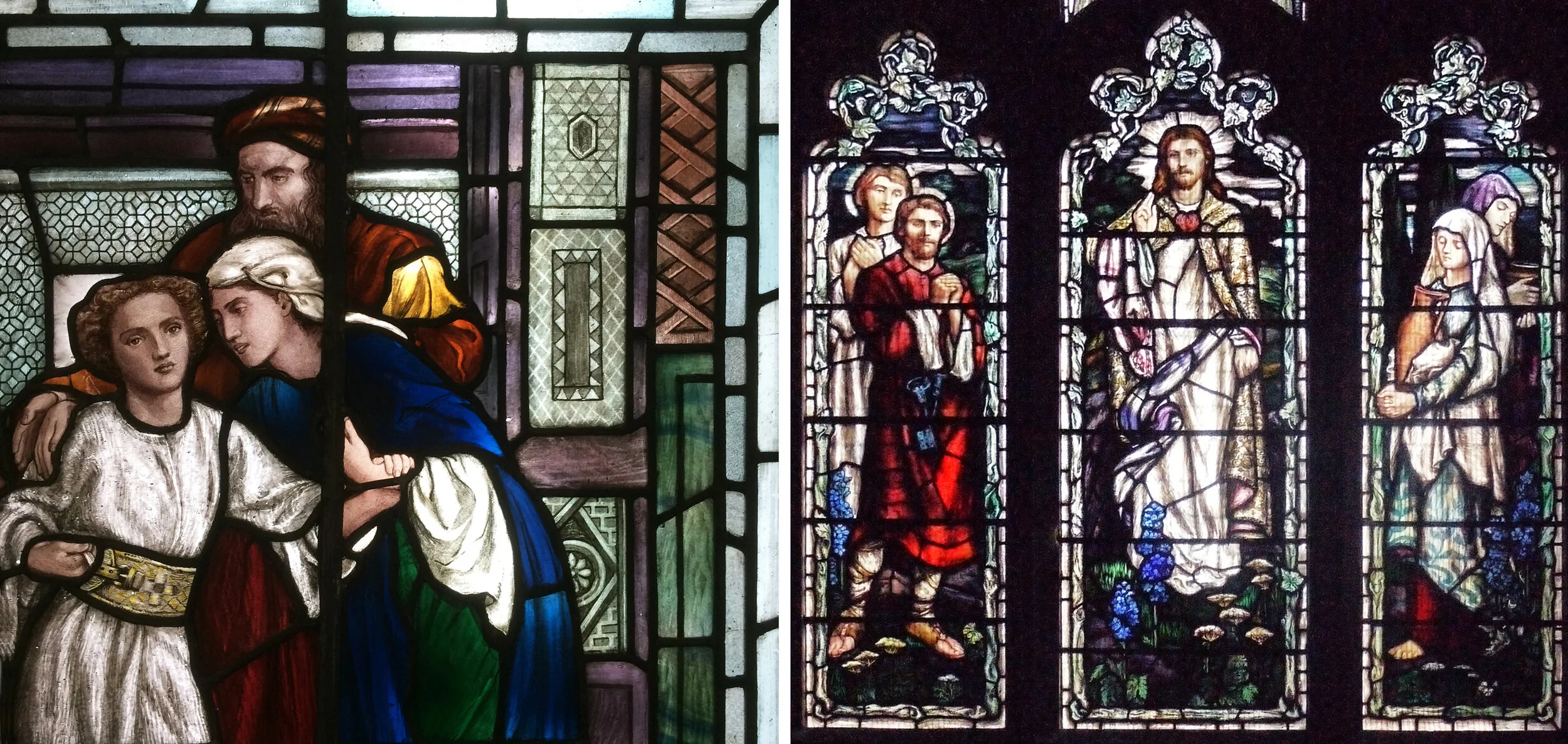
The new panel had to go with the windows I’d made in 2005 for the house, two of which you can see at the same time as the new one (above left). For our own windows I’ve used intricate, geometric patterns - I see these windows as an opportunity to use favourite designs that didn’t quite fit in to the schemes I was working on at the time. The bathroom window has a pink/green/gold repeating circle which looks great from a distance (below left) and the door panels have pale blue flower/stars floating across olive green horizontal bands on an etched background. You can see how good these colours look with the lovely brown quarry tiles and red brick of the bathroom walls below.

Inside the bathroom - Left: window.  Right: door.

Inside the bathroom - Left: window. Right: door.

So for the new design I plotted out a flower/star design on a hexagonal grid, thinking of the central flower as a burst of light from the centre. Each point meets another point, but the geometry is not organised into a regular pattern. I wanted the colour to change in the middle as this panel is at a meeting point with a door to the left and the right, and I also wanted it to go with the plate that greets visitors to the spare room on the left which we bought from Rob Turner (below left). As usual the colours, which are transparent fired enamels made of a mix of different pigments, aren’t exactly as I’d planned, the yellow is not quite olive enough and the pink is too dark. However the window sits very well in its place, it’s nice to look up and see a few unexpectedly twinkly stars inside the house.

Outside the bathroom - Left: light on. Right: light off.

Outside the bathroom - Left: light on. Right: light off.

New ceiling panel, 210 x 620 mm.

New ceiling panel, 210 x 620 mm.

Chaos out of Order by Sasha Ward

I found an old piece of work based on a drawing of a hut by a lake in the hills that gave me an idea for a new piece of work. The idea was to turn the picture into a sequence by repeating the shapes of road, hut, lake and hills and changing them slightly in each version. The sequence I followed to get to the final piece is described below - starting with stage one where I cut nine pieces of glass, some coloured, some flashed and some painted, into squares and sandblasted them with the basic design (below left). Stage two involved adding colour (below right), which never turns out quite how I imagine.

Stage one: Nine 90mm squares of glass, sandblasted.  Stage two: First layer of painting.

Stage one: Nine 90mm squares of glass, sandblasted. Stage two: First layer of painting.

It was at this point that I realised I’d made things too simple and too twee. So I dropped the squares down to add another colour between them (below left). This led me to join up the white paths and the black blobs (which were originally the lakes) to create a more disorderly pattern. The huts had served their purpose as pattern makers so they had to go (below right).

Stage three: Strips of coloured glass added.  Stage four: Sandblasting & painting to link pieces together.

Stage three: Strips of coloured glass added. Stage four: Sandblasting & painting to link pieces together.

After more painting and sandblasting to disguise the remnants of the huts, I thought the colours looked OK together and leaded up the piece (below left). Then I left it a while, knowing it wasn’t quite right. I liked the columns but not the rows, so I spaced a photograph of the panel out in photoshop and got rid of the cramped up look (below right). Then I ripped up the leading before I could change my mind and came up with a new plan.

Stage six: Leaded panel after more sandblasting & painting.  Stage seven: Moving the columns apart.

Stage six: Leaded panel after more sandblasting & painting. Stage seven: Moving the columns apart.

The new plan followed a pattern that I worked out on paper first. I added borders to give more space to the design, especially the blobby blacks which had been designed to cover the lead joints. I added horizontal colour strips between the columns which link visually to the geometry of the horizontal lead lines, with the white paths meandering across all the glass pieces. Another layer of sandblasting and painting meant that I changed some of the colour combinations I wasn’t happy with, before I leaded up the panel for the final time (below left). The sun projected version of the panel emphasised the blobby contrasted with the stripey that I was after (below right).

Stage ten: Panel with borders added.

Stage ten: Panel with borders added.

You can see the aspects of the panel that I like best below - sunlight through different types of glass and glass painting, and subtle colour combinations that flow across the lead lines.

Left: Sunlight through the panel.  Right: Detail shown on light box.

Left: Sunlight through the panel. Right: Detail shown on light box.

Christmas Cards - Year 6 by Sasha Ward

When I drew up the graph of the shapes of the christmas cards we were sent this year (below) I saw that we were into our sixth year of statistics. I realised a couple of years ago that most of the categories I’d ordered the cards into were overlapping or arbitrary - the only certainty is the shape and the rise of the square card. The homemade category was at a steady 37% this year, although due to the rise of self printing and the sale of home made cards the title of this category is now ‘card made by the person who sent it’.

IMG_0697.jpg

The overall number of cards we received was down about 10% and like last year, when we hung them up the display wasn’t very colourful. There were more birds than ever (a wapping 13%) and quite a few animal cards. Among them were two very similar hares, an amusing cat and a totally hilarious pig (below). This isn’t an art or homemade card, despite the real silver braid, but a charity card supporting the British Heart Foundation.

animals.jpg
IMG_0687.jpg

There were three nativity scenes (above), I must have needed cheering up as I particularly enjoyed the little funny one on the left. The best two this year, shown below, are both more 3 dimensional than your average card, and both suitably wintery. The tin star looked great on the mantlepiece reflecting the light from the christmas candles, and the one on the left is a delicate folded screen of a Japanese snow scene - thanks friends for continuing to make and send cards!

best.jpg

Serious waterfall by Sasha Ward

Left: Paintings in egg tempera & indian ink on gesso - Ray’s wall in the exhibition ‘The Cloud of Unknowing’.                                       Right: ‘That’s not really a question is it, more of a statement’ by Ray Ward. 340 x 210 mm

Left: Paintings in egg tempera & indian ink on gesso - Ray’s wall in the exhibition ‘The Cloud of Unknowing’. Right: ‘That’s not really a question is it, more of a statement’ by Ray Ward. 340 x 210 mm

Right in the middle of Ray’s wall in our exhibition at Norwich Cathedral was a painting entitled ‘That’s not really a question is it, more of a statement’ that I really liked and decided to make the subject of my next stained glass interpretation. In this picture most of the detail is in the landscape, the figures are small and melancholy and the man looks very much like my dad did in the 1970s.

Left: Glass piece on top of a copy of Ray’s painting.  Right: Glass pieces painted, fired and sandblasted.

Left: Glass piece on top of a copy of Ray’s painting. Right: Glass pieces painted, fired and sandblasted.

As I’ve progressed with these interpretations I’ve found that a limited and contrasting colour palette works best. In this panel I used dark colours for the background pieces around the bright, light figures with the tones getting lighter into the distance at the top of the waterfall. Once I’d chosen the glass and cut it, I laid the pieces on top of a copy of the painting (above left) and worked out how to proceed with the glass painting stage. The figures are easy, I just copy very directly from Ray’s drawing, but the translation of the landscape was something different and much harder to get right. My first attempts at the rocks looked laboured and scratchy, in the end I painted loosely and then sandblasted a zigzag white line. This device indicates what is a rock or not in a decorative way and also breaks up the greyness of the loose painting style. For the magnificent curtains of water I used a strong opalescent green glass that is quite impervious to painted detail, so the falling water is done with white enamel in sandblasted lines. Below you can see how different the finished panel looks in transmitted (left) and reflected light (right), in weak daylight you get something between the two. You can also see how I replaced the original pink sky - which completely ruined the effect I’d been wanting to achieve of the pink figures contrasting with everything else - with a pale lilac piece.

Left: panel in transmitted light.  Right: panel in reflected light.  420 x 275 mm

Left: panel in transmitted light. Right: panel in reflected light. 420 x 275 mm

Detail showing the top of the waterfall surrounded by rocks.

Detail showing the top of the waterfall surrounded by rocks.

Left to right: ‘Moon Walk” ink drawing by Ray Ward, Glass pieces cut and sandblasted, Glass pieces painted, Stained glass panel completed.

Left to right: ‘Moon Walk” ink drawing by Ray Ward, Glass pieces cut and sandblasted, Glass pieces painted, Stained glass panel completed.

My last stained glass interpretation of the year was a quick piece of a woman’s head in profile (above). We used the photo of the finished panel "‘Moon Walk’ for our christmas card, as it turned out her serious expression fitted the mood this year.

Highlights from The Stained Glass Museum by Sasha Ward

I feel lucky to have visited the stained glass museum, upstairs in Ely Cathedral, last week when such things were open. My last visit was about thirty years ago, I read that it has been revamped since then but much remains the same. The collection of fabulous stained glass panels is mounted on light boxes in the narrow triforium gallery. The contrast between the experience of viewing these here, stripped of architectural context and the stained glass in the windows of the stunning cathedral space is inevitable, but still painful. However, it’s fine if you focus on detail, and as I’ve been looking at painted faces recently that’s what I concentrated on. Here are six of the best (below).

Top left to right: Mary at the tomb, George Hedgeland 1856.  St Catherine from Wood Walton, Cambridgeshire c1310-30.  Virgin and Christ Child, Margaret Traherne 1956.Bottom left to right: Head by John Richard Clayton of Clayton & Bell 1861.  Cro…

Top left to right: Mary at the tomb, George Hedgeland 1856. St Catherine from Wood Walton, Cambridgeshire c1310-30. Virgin and Christ Child, Margaret Traherne 1956.

Bottom left to right: Head by John Richard Clayton of Clayton & Bell 1861. Crowned female head, Norfolk c.1440-60. From the legend of St. James, Rouen c.1500-50.

The other aspect of the museum I enjoyed this time around was getting close up to panels by some of the favourite makers whose work I have got to know on my stained glass travels.

Mary Lowndes: Left, The Finding of the Saviour in the Temple (detail) 1910.  Right, St Peter, Christ, Mary Magdalene, St Peter’s Church, Great Cheverell, Wiltshire 1909.

Mary Lowndes: Left, The Finding of the Saviour in the Temple (detail) 1910. Right, St Peter, Christ, Mary Magdalene, St Peter’s Church, Great Cheverell, Wiltshire 1909.

It was the window in Great Cheverell, Wiltshire (above right) that made me really appreciate the artist Mary Lowndes, this east window has an incredible presence in the church. Obviously this is the very quality you don’t get from the display in the museum, but the soft painting and interplay between the figures in her Saviour in the Temple panel (above left) are wonderful to see.

I saw a Leonard Walker window in Lydd Church on the Romney marshes (below right) and loved his technique, where specially made glass full of streaks and textures does the work that painting would normally do. The example in the museum (below left) is a replica of part of a window he made for the Hong Kong and Shanghai Bank, Singapore. The minimal painting, on head, hands and feet, blends in beautifully with the hand made glass pieces.

Leonard Walker: Left, Commerce 1923.  Right, Christ in Glory, All saints Church, Lydd 1959.

Leonard Walker: Left, Commerce 1923. Right, Christ in Glory, All saints Church, Lydd 1959.

Geoffrey Clarke: Left, Priest 1949. Centre, exhibition panel. Right, Church of the Ascension, Plymouth 1958.

Geoffrey Clarke: Left, Priest 1949. Centre, exhibition panel. Right, Church of the Ascension, Plymouth 1958.

The museum has acquired four works by Geoffrey Clarke, all of them fascinating, pioneering and difficult to see properly in the space. Priest (above left) is made of glass pieces set in layers of painted plaster. The exhibition panel (above centre) I saw last year in the Pangolin Gallery at Masterpiece is made of cast aluminium, as are his windows in the Church of the Ascension in Plymouth (above right) which I never managed to get inside. Whenever I see a glass panel by Geoffrey Clarke it makes me want to start experimenting with materials.

There aren’t many stained glass panels around by the pop artist Pauline Boty. The first one I ever saw in an exhibition at the Pallant House in Chichester (below right) I thought was the best thing I’d ever seen at the time. Her stained glass self portrait in the NPG is wonderful, as is the Siren panel (below left) that I was thrilled to see at the museum. I read that Boty was keen to get out of the stained glass department at The Royal College of Art in order for her work to be taken more seriously. I also saw a photo of her at Wimbledon School of Art where she first learned stained glass, with her fellow students including my teacher at The Central School of Art, Tony Attenborough - I’m so pleased to have discovered this link.

Pauline Boty: Left, Siren c1958-62.  Right, Untitled (dreaming woman) 1961.

Pauline Boty: Left, Siren c1958-62. Right, Untitled (dreaming woman) 1961.