In 2011 Yeovil District Hospital refurbished the Haematology and Oncology Department and asked me to design various artworks spread throughout the suite of treatment, consultation and waiting rooms. They are printed on a variety of materials; transparent window vinyl, vinyl wallpaper, fabric for screens and paper for wall boxes. 2018 has brought a second refurbishment and more opportunities for my work in the new department.
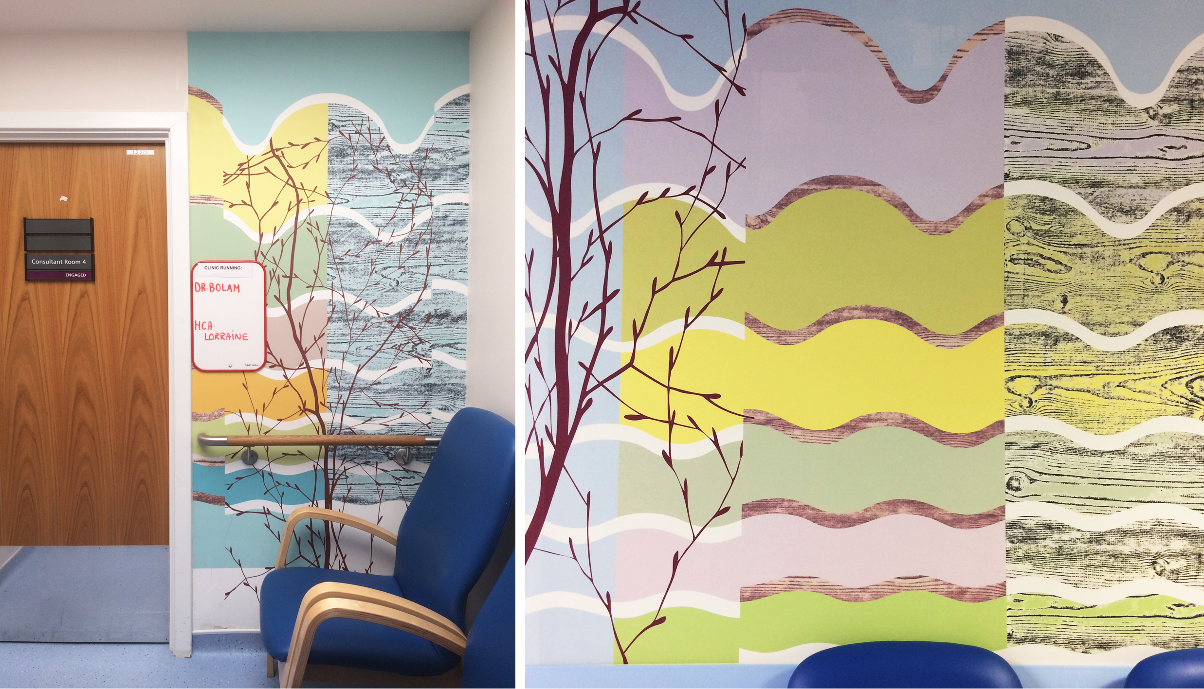
Digitally printed vinyl wallpaper outside consultation room and in waiting corridor.
I find revisiting old commissions nerve wracking - have they stood the test of time and do people, including me, really like them? What I liked on this revisit was my design, based on wavy lines and filled in with peaceful colours, that links all the different artworks (above). The wallpaper still looks good on the corridor walls, although I wish Dr. Bolam would put his board elsewhere. I particularly like the corridor wall where you can see the waves starting with a shallow curve at the bottom where they hug the crash rail and swelling with life as the curve increases towards the ceiling.
Design for entrance wall, digital wallpaper and glass square: glass sample in progress
The wavy lines were the basis for the new work, but this time I pulled them apart and upside down so they float around in a looser formation. There is more wallpaper, some printing on acrylic and even some glass panels. The design flows across these different materials (above left), in the middle the glass square glows with backlit colour (below right). It was so exciting actually making some glass for a change, see the sample with layers of vivid colour on the sandblasted surface (above right). As usual, the sample was a quite different colour from the real thing. I opened the kiln (below left) and marvelled at the fantastic, luscious pink surface - just one firing!
Glass square in the kiln after firing: during installation in the newly papered entrance wall.
Detail of the finished glass square (575 x 575 mm).
The second glass panel was for a screen in the waiting area. I made this piece over a weekend - every process went smoothly including installation and admiration. In the design for this one, and by the way the design takes far longer than the manufacture, I took out the wavy lines one by one until only two remained to link this artwork to the others.
Design for glass insert in screen: finished glass panel photographed in studio: glass installed in waiting room screen
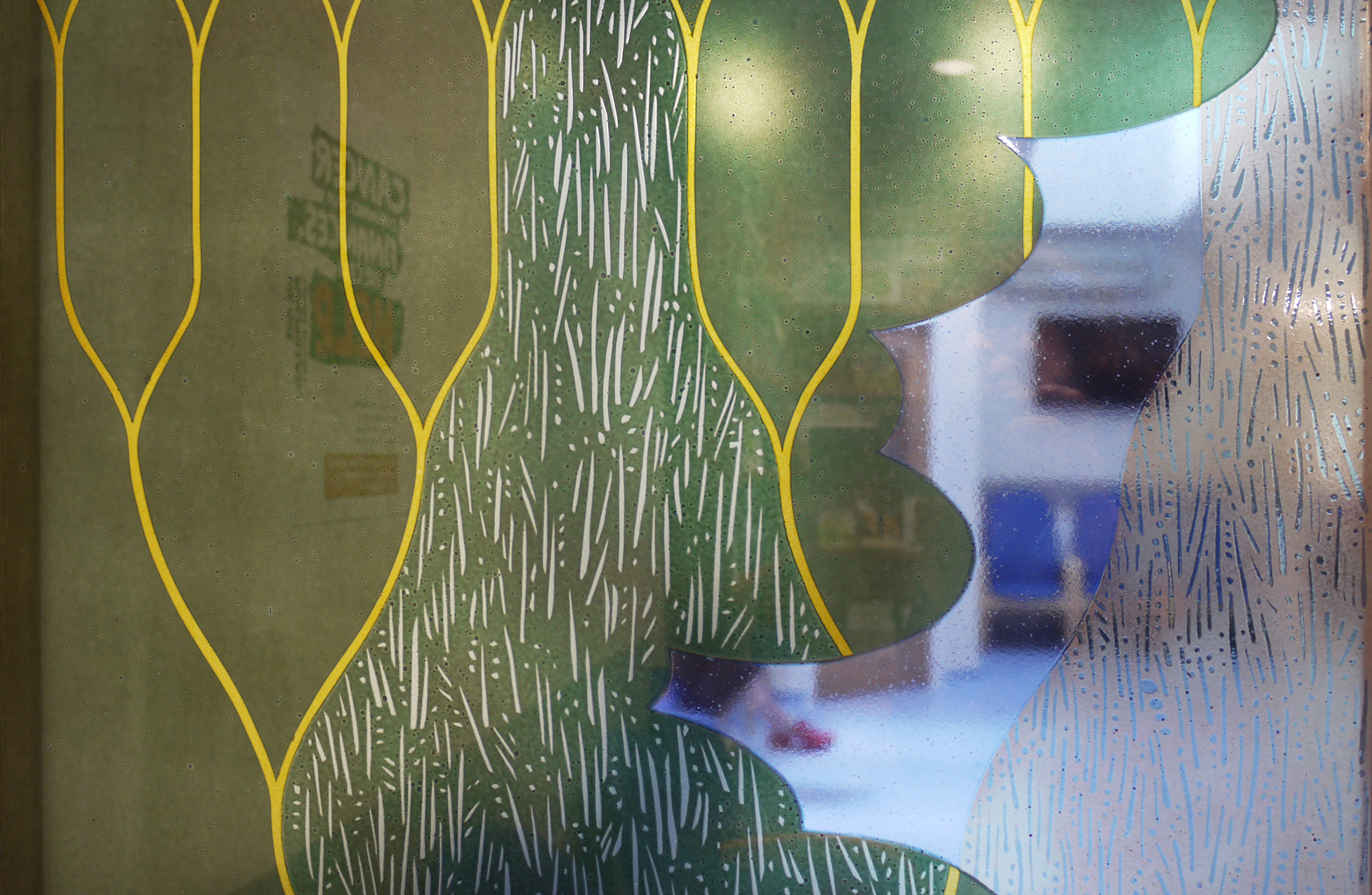
Detail through screen, showing hand cut, painted and printed detail in transparent enamels.


