geometry

Attic Windows by Sasha Ward

Left, Attic Windows, patchwork quilt. Right, Attic Windows, stained glass version, 420 x 460 mm

Attic Windows has been always one of my favourites in the patchwork quilt book I’ve had since I was young. It’s got that essential simplicity and a design that is perfectly suited to stained glass as well as patchwork. Because there are only two different shapes in the design you can cut lots of different coloured squares and trapezoids and then decide where the colours are going to go, it’s always more fun if you have room to move and change while you’re making something.

The stained glass version of Attic Windows was made for my grandson’s first birthday last month, I thought the windows, which also look like building blocks, were ideal for carrying the letters in his name, date and location. I was already up to 135 pieces of glass after cutting these and so decided to give them a plain pale blue background (below).

155 glass pieces cut and laid on the template

I used different colours for each row of blocks and each row of the trapezoids around them. To add variation, so that you get dark colours surrounding light as well as light surrounding dark, the trapezoid colours run vertically and the square colours run horizontally.

All the squares are made of flashed glass, meaning there is a layer of coloured glass which can be sandblasted off through a stencil to reveal the clear glass layer underneath. Some flashed glass is made of two layers of coloured glass, like the red on blue for FRANCIS and the red on yellow for WARD (below right). All the trapezoids are made of streaky glass in subtle colours (below left) to frame the bold, bright blocks.

Left, Lettering pieces removed. Right, Lettering blocks sandblasted.

Left, Leading underway. Right, Soldered panel.

My favourite stained glass stage to do is the leading (above left), with these tiny pieces I used up old scraps of the thinnest lead. When the panel had been leaded, soldered and laid on the bench (above right) you can most clearly see the shape of the pattern and a resemblance to the quilt that inspired it.

Left, Cementing the panel. Right, Detail of finished panel in the sun.

Bathroom Windows by Sasha Ward

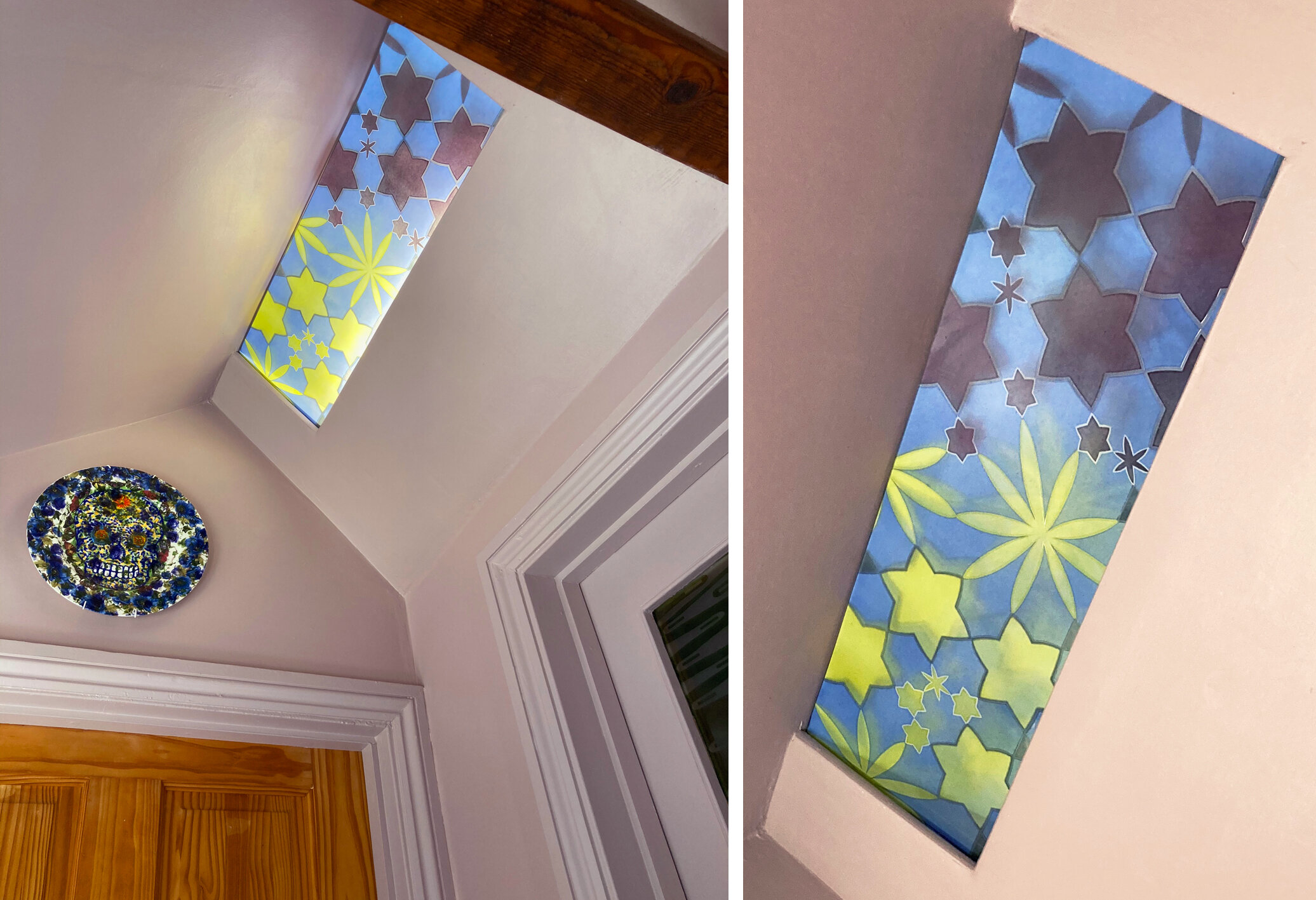
This winter we’ve painted our hall spaces pinky grey, a colour that we chose to compliment the greens and oranges we had in our interiors. The hall is lit by a concealed strip light and although it looked fine as it was I thought I could add something more to the space by making a glass panel to cover it. You can see it installed with the light on and off below.

Left: All three windows with the lights on.  Right: Ceiling and door window with the lights off.

Left: All three windows with the lights on. Right: Ceiling and door window with the lights off.

The new panel had to go with the windows I’d made in 2005 for the house, two of which you can see at the same time as the new one (above left). For our own windows I’ve used intricate, geometric patterns - I see these windows as an opportunity to use favourite designs that didn’t quite fit in to the schemes I was working on at the time. The bathroom window has a pink/green/gold repeating circle which looks great from a distance (below left) and the door panels have pale blue flower/stars floating across olive green horizontal bands on an etched background. You can see how good these colours look with the lovely brown quarry tiles and red brick of the bathroom walls below.

Inside the bathroom - Left: window.  Right: door.

Inside the bathroom - Left: window. Right: door.

So for the new design I plotted out a flower/star design on a hexagonal grid, thinking of the central flower as a burst of light from the centre. Each point meets another point, but the geometry is not organised into a regular pattern. I wanted the colour to change in the middle as this panel is at a meeting point with a door to the left and the right, and I also wanted it to go with the plate that greets visitors to the spare room on the left which we bought from Rob Turner (below left). As usual the colours, which are transparent fired enamels made of a mix of different pigments, aren’t exactly as I’d planned, the yellow is not quite olive enough and the pink is too dark. However the window sits very well in its place, it’s nice to look up and see a few unexpectedly twinkly stars inside the house.

Outside the bathroom - Left: light on. Right: light off.

Outside the bathroom - Left: light on. Right: light off.

New ceiling panel, 210 x 620 mm.

New ceiling panel, 210 x 620 mm.

Moving Windows by Sasha Ward

Rectangular fanlight window, private house Devizes, 2004.

Rectangular fanlight window, private house Devizes, 2004.

Occasionally friends commissions me to make windows for their houses. These commissions often provide an opportunity for me to do what I think would look good in the space, rather than design something to a theme that has to be approved by a committee. The fanlight windows commissioned by friends in Devizes in 2004 and 2008, shown above and below, show my preference for order and geometry. They looked good installed above the front and back doors and when the friends moved they wanted to take them to the new house, although not quite sure of where they would fit.

Square fanlight window, private house Devizes 2008.

Square fanlight window, private house Devizes 2008.

Detail showing quarter circle and original collage design.

Detail showing quarter circle and original collage design.

Rectangular window moved to private house, Bristol and during installation (with coincidental matching t-shirt design).

Rectangular window moved to private house, Bristol and during installation (with coincidental matching t-shirt design).

It was perfectly easy to take the glass panels out, give them a good clean and find them new spaces. The rectangular window had its ends chopped off and was put in front of the existing reeded glass above a bedroom door. The bar that divides the window in two goes well with the sandblasted lines on the design, which flew out of the sides of the panel even before the chopping.

The square window, which has always been one of my favourite designs, was easy to miss in its previous high up home so in the new house they wanted to hang it lower down in one of the conservatory windows. As it is big (790 x 815 mm) and heavy, we had to place it on fixed rods rather than in a hanging frame with the sandblasted section, originally at the top to hide bits of the ceiling, at the bottom. You can now appreciate all the hand painted detail in this panel and it looks especially good from the outside, surrounded by plants.

Square window moved to conservatory of Bristol house, from outside and inside.

Square window moved to conservatory of Bristol house, from outside and inside.

Please don’t let the fact that you may move some time in the future put you off commissioning me, windows are very easy to move to a new place - as any church crawler knows.

Hops by Sasha Ward

befores.jpg

This house really needed new stained glass panels in its front door - the leaded lights continued to deteriorate (above) while I made the windows which were fitted earlier this month (below). The new windows do a good job of obscuring direct visibility on to the busy street, while letting patches of coloured light into the house which used to be a pub and brew house - hence the hops in my design.

Hop windows, left from the inside, right from the outside.

Hop windows, left from the inside, right from the outside.

Branches of dried hops: section of window design: sketch design for the three windows

Branches of dried hops: section of window design: sketch design for the three windows

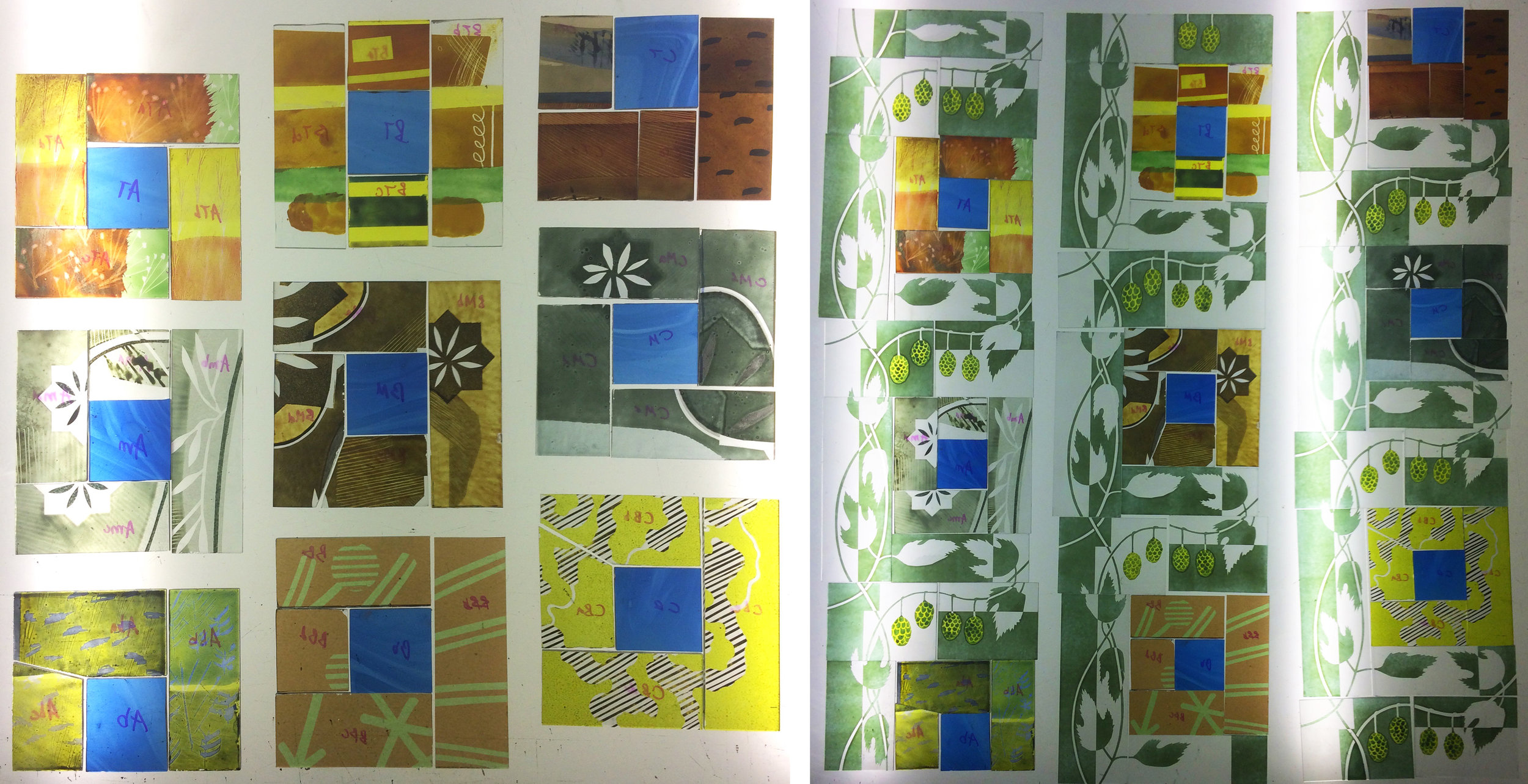
I really wanted the plant to look like hop, rather then grape, vines. I gave them particularly thin, twisty stems, small leaves and an extra firing of acid yellow on the hops themselves, which are actual size. Pictures taken on the lighbox during the making (below) show the play of painted patterned pieces from my scrapbox, and how the blocks move diagonally across the design. When the hop vines surround them, the coloured blocks are intertwined with a curvy pattern in green and sandblasted white.

lightbox.jpg
detail 1.jpg

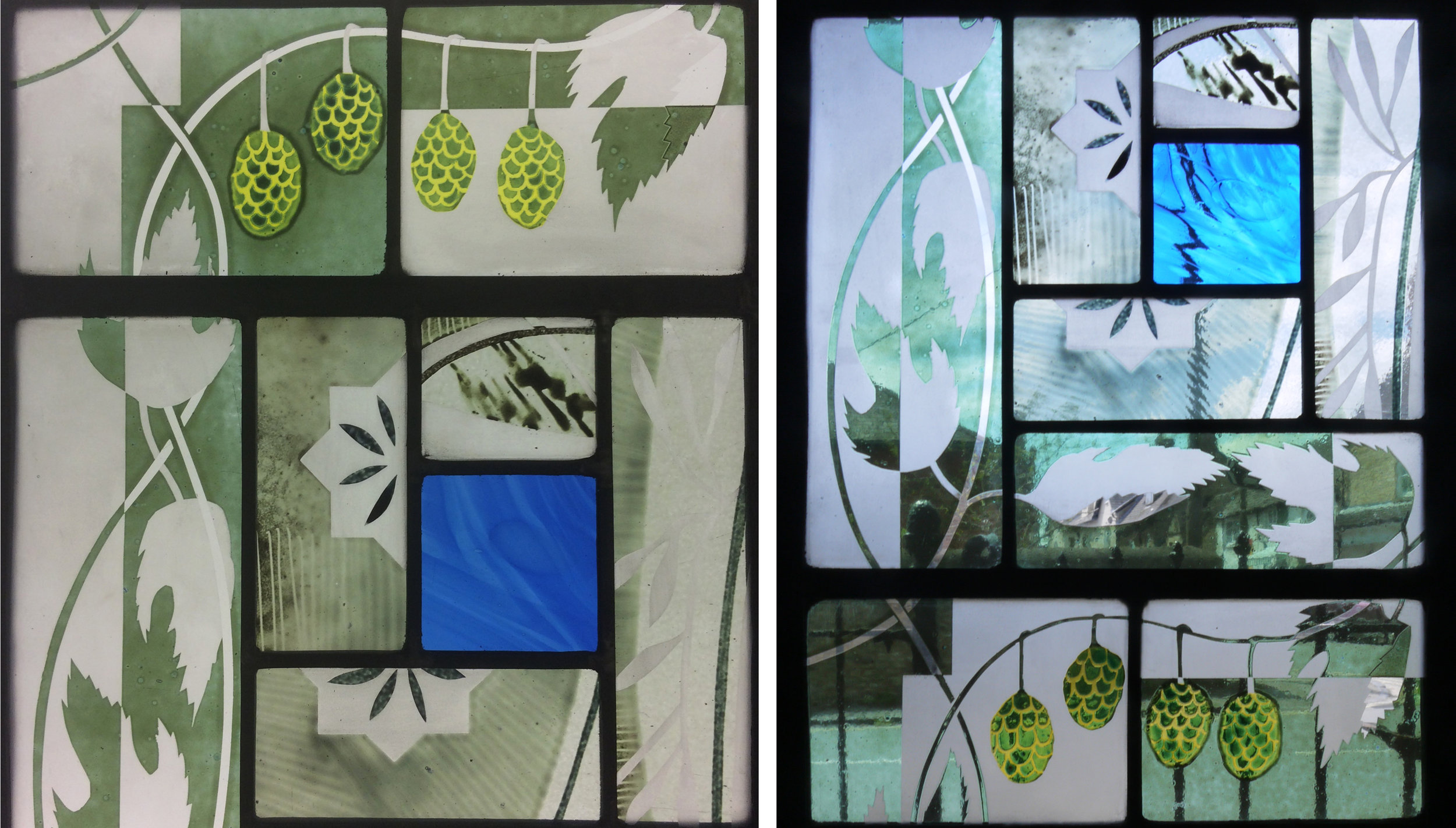
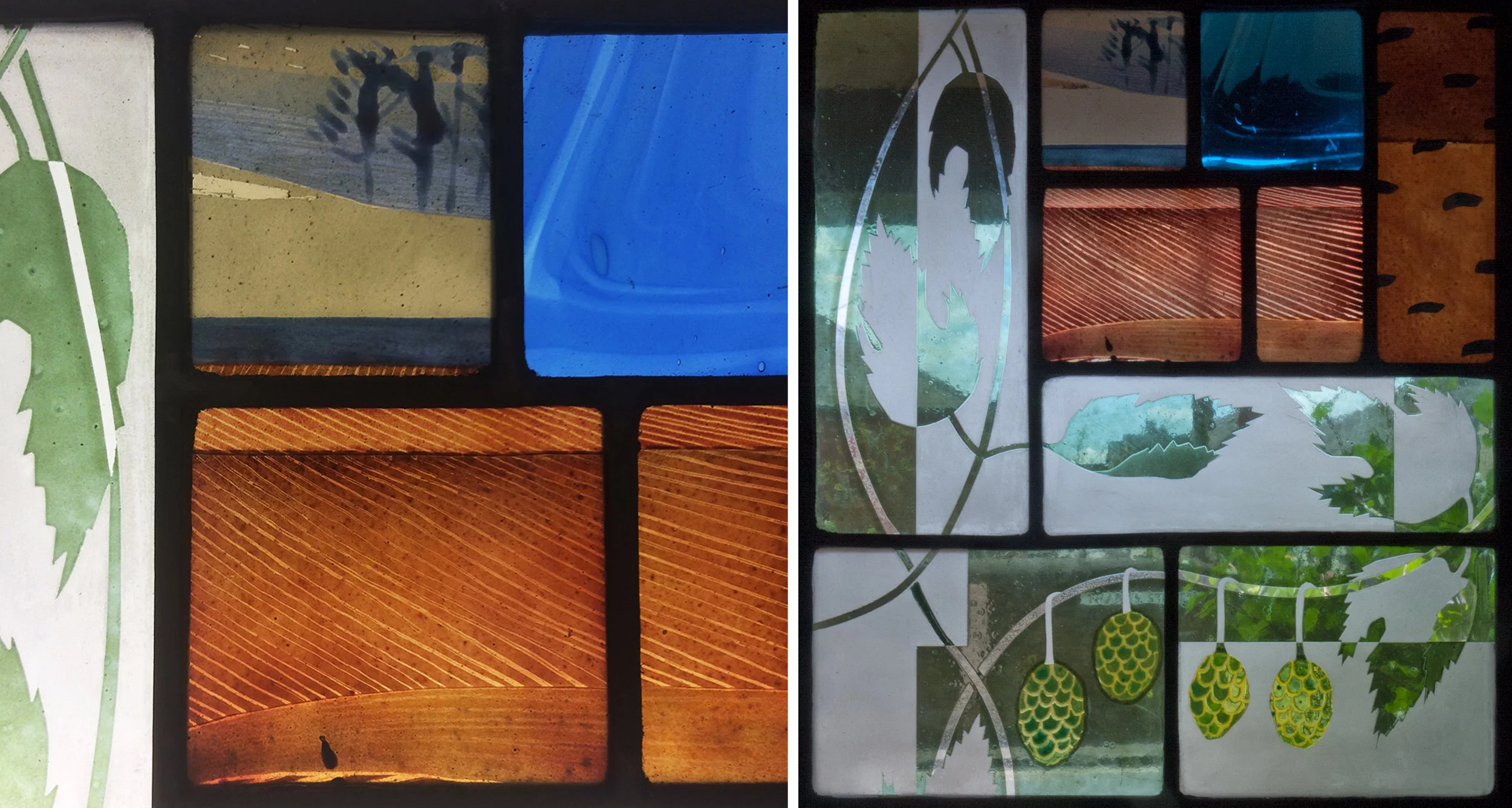
Details of the left hand panel (above) and the top right corner (below) show how the colours and textures change with the background to the window - obvious really. On the left the details are seen on a lightbox, on the right they have been installed in the front door and, as they should, look much better there with sparkling colours and highlights.

detaol 2.jpg