intersections by Sasha Ward

Thick slabs of coloured glass on the lightbox

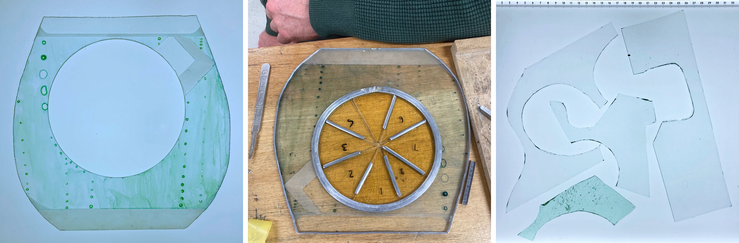
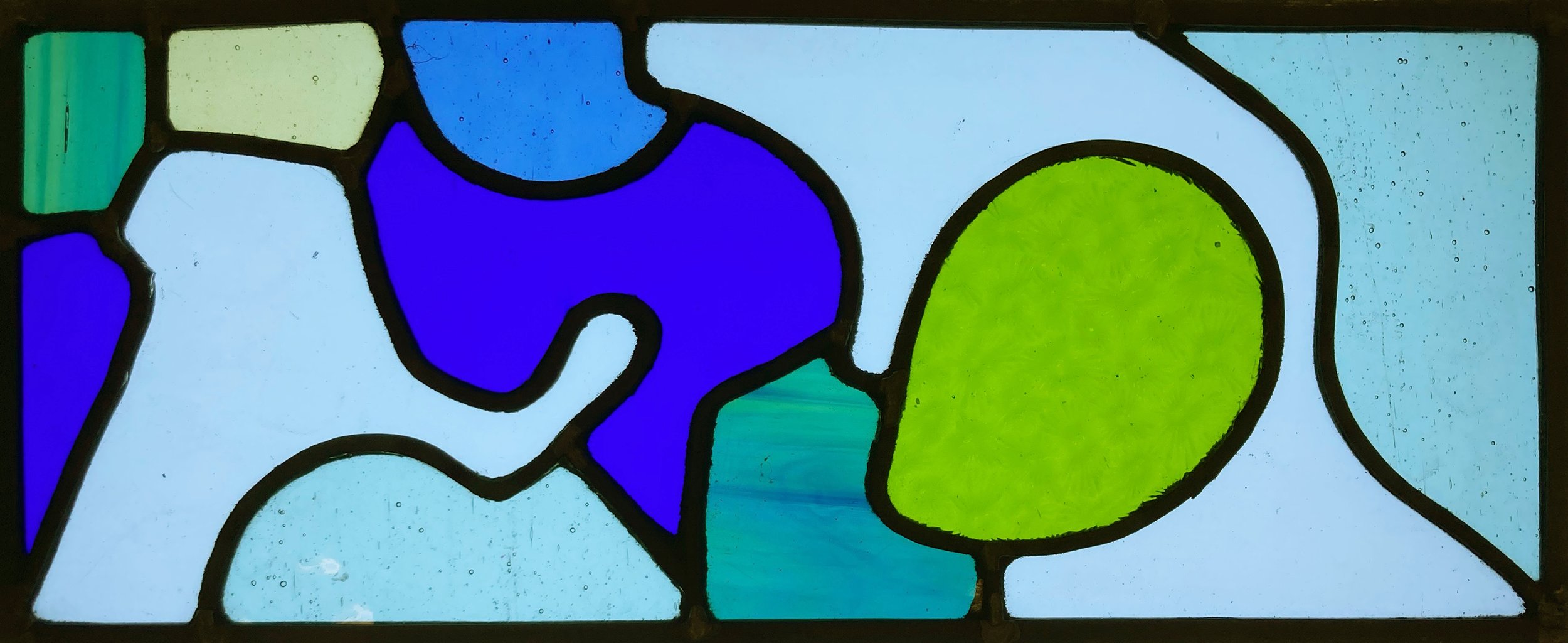
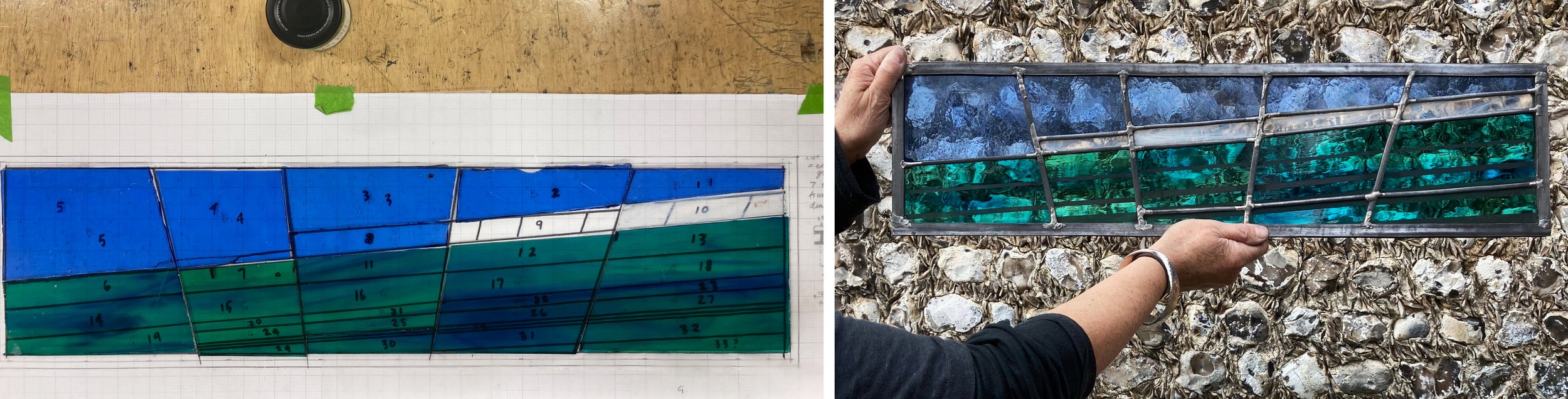
I’ve been using melted glass slabs for a commission - still in progress - in a gorgeous colour range. Working to commission is always slow, so in the meantime I decided to make a spontaneous smaller panel using the spare slabs. It’s very simple, four colours that look great together, the intersections of the slabs cut off and filled with another colour that is close to what I imagined the combined glass colour could be (below left). I had intended to give it a contrasting pale blue background, but then chickened out as I didn’t want to ruin the colour balance I’d achieved so used a clear textured glass instead. You can see this during the cementing process (below right) and in daylight with the lawn behind (lower right). I did also cut a background in swirling bright blue glass to check the effect (lower right). The panel measures 315 x 285 mm.

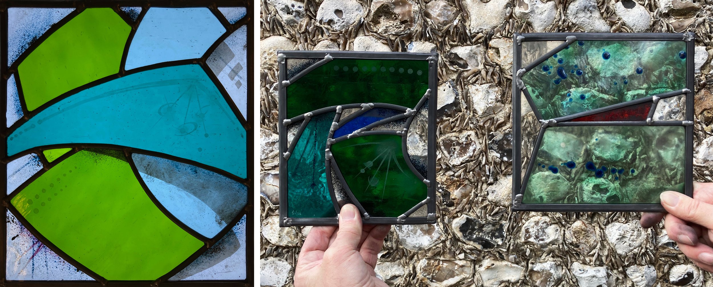
As I’m not keen on wasting glass, I used those background blues to make an alternative composition, here the darkest area is the background and the intersections are in clear glass. It’s more about textures than colours, using up the last scraps of my favourite pressed glass that’s covered in little reflective triangles and some painted pieces with intersecting circles that have been wheel cut and filled with blue enamel. The photos (clockwise from top left) show the glass pieces cut and on the lightbox, the composition with a clear background just to see, the finished panel in daylight (with the lawn behind) and my favourite photo, showing the centre detail cleaned and ready for soldering.

It still bothered me that I hadn’t carried out my original intention, so I found small leftovers of the original four colours and fitted them together with a contrasting pale blue background and a little yellow halo around the glass flower (below).

Glass flower on the lightbox and in daylight, 180 x 190 mm.

Paris Windows by Sasha Ward

Left to right: courtyard at Hotel de la Marine, dome of Bourse de Commerce, dome of Galeries Lafayettes.

A trip to Paris, the first time out of England for more than two years, left me with snapshots of windows as I was led around a succession of beautiful interiors lit by a bright blue spring sky.

As well as museums, galleries, shops and cafes, there were of course churches. All were open, busy and awe inspiring with a wealth of art - paintings, sculpture, stained glass - in every one.

Left to right: window in St Jean de Montmartre, inside St Sulplice, door detail at Ste Odile.

The church I knew I wanted to visit was Ste Odile, north of the city centre. Built from 1935-46 in Romanesque-Byzantine style, it was designed by Jacques Barge, made of reinforced concrete and filled with wonderful architectural details in brick, stone and glass. The three huge windows are the work of Francois Decorchement and are made entirely of pate de verre set in cement blocks. The detail (below right) shows the characteristics of the technique quite well, it is astonishing to see it used on this scale, the effect is of a multicoloured riot of figures, symbols and everyday scenes.

Ste Odile, windows by Francois Decorchement 1935-38

The church that surprised me the most was Sacre Coeur, I’d never thought of going inside before because I’d regarded it principally as a landmark. All around the basilica are the most wonderful stained glass windows, 33 in total, designed by Theo Hanssen and made by L Gouffault from 1949. Here, the colour combinations are rich but beautifully judged and the figures are unmistakably of their period.

Sacre Coeur, windows by Theodore Gerard Hanssen 1949

The church that most needs to be seen in real life is St Severin, one of the oldest still standing on Paris’ left bank. A set of seven windows by Jean Bazaine all around the apse harmonises perfectly with this fifteenth century gothic interior, something that’s impossible to judge from photos. Each piece of glass looks like a coloured brushstroke, I think due to the light, skilful grisaille paintwork. The subject matter is the seven sacraments of the church.

St Severin, windows by Jean Bazaine 1965-70

My last three windows (below) all show a glimpse of something beyond the glass, part of a rich and intriguing snapshot of the city.

Left to right: interior at Hotel de la Marine, door at Giacometti Institute, window at Institut du Monde Arabe.

The Shape of Leading by Sasha Ward

Inside the short course top workshop at West Dean College, February 2022

Cutting out a circle, working out how to lead inside it, and the offcuts from several attempts at circle cutting.

On the last occasion I wrote about West Dean students’ work I was inspired by the glass painting they did. On this course it was the adventurous cutting and leading stages of making a stained glass window that stood out. The trail blazer was a student (who specialised in metal restoration) who was determined to cut a hole out of a piece of glass (above); as a beginner this took him several attempts. The finished piece was fun, but what I really liked was the panel made from offcuts, where he had to match complicated shapes and then work out how to feed the lead around them (below).

Panel made from the circle offcuts.

Simple colour, cutting and leading.

Another student, also a beginner, made a window that was lovely and simple, with a few lead lines and a few painted ones to make a fanlight that was really effective (above). Some more interesting leading, or rather copper foiling, was the result of a thermal crack when quite a large piece of enamelled glass was fired in a cold spot in the kiln (below).

Thermal crack, made into a panel.

Three from a series of seven panels by a more experienced student.

Another student made a series of panels with sharp graphic lines, painting and sandblasting. The smaller ones (above right) were based on letters of the alphabet. For a returning student I devised a challenge using four pieces of painted enamelled glass and just three other colours that pushed her use of glass by making her play with the material, cutting and designing as she went along (below).

Composition challenge in progress.

This was a very companionable course, and as you can see the work produced was diverse, interesting and unexpected. I’m teaching again for a week in July, here is a link if you would like to sign up, West Dean College is a great place to stay and study.

Students cementing their panels on the final morning.

Some Cotswold Churches by Sasha Ward

St. Michael and St. Martin’s Church, Eastleach Martin: west window.

On the signpost opposite the church of St. Michael and St Martin (above left) are all the villages that we visited on this walk in Gloucestershire, just north of Lechlade as the signpost says. There are two churches at Eastleach with a river running between them, they are both lovely from the outside and the inside. As is usual for churches in the care of The Churches Conservation Trust, the only not so tasteful thing in the building is the sign that tells you about the Trust at the west end of the church (above right). In most of the windows the only colour is a yellow border strip, some have fragments of medieval glass in them and how exciting this seems in the face of all this plainness (below).

Eastleach Martin: looking east and medieval glass fragments in chancel.

St. Andrew’s Church, Eastleach Turville: looking west.

St Andrew’s Church across the river is even simpler and plainer despite being in use for services, with a beautiful bible out on a lectern. The windows are filled with diamonds or squares, some with spectacular mends that link with the branches outside (below).

Eastleach Turville, east window and south nave window.

St. Nicholas Church, Hatherop, south chapel.

A short walk across to Hatherop, another church with a saddleback tower and a calm, uncluttered interior. The south chapel (above right), its windows filled in with white plastic sheet, is particularly lovely. It was built as a mortuary in 1855 by the architect Henry Clutton with the assistance of William Burges and is filled with rich carving. There is also a beautiful marble monument to Barbara, Lady Mauley who died in 1844, an angel at her feet and another at her head (below).

Marble monument by Raffaelle Monti to Barbara, Lady de Mauley.

St Peter’s Church, Southrop: east and west windows with bits of colour and detail.

The last church was at Southrop, equally clean, coordinated and simple (above), and honestly by now I could hardly remember which interior went with which church.

When church visiting I’ve started imagining that if I lived nearby, would I look forward to attending a service in that church. Some have the wrong sort of atmosphere for me, like a damp guesthouse, and I walk straight out, it’s a good way of assessing what I want from a church interior. On that basis, this group of Cotswolds churches, although superb in terms of interior decoration, are a bit austere for me, not giving enough in terms of colour or meaning.

Christmas Cards - Year 7 by Sasha Ward

For seven years running, when I take down my christmas cards in early January, I have counted and sorted them into different categories. We get 50 to 70 cards, with not much change over these years, and the statistics are not very different this year from the last one ( you can see the analysis of 2020 cards here ).

I sort them into shape - square cards continue their rise and now account for more than 50%, homemade - a steady 34%, charity cards - 32%, and various subject categories including the ever popular trees, birds and animals in snow scenes. Some of the images are very similar to each other and some cards are ones I have been sent in previous years (I’ve no idea if from the same people). This christmas card analysis habit has made me look at them differently, when I open the envelope I am hoping for either a high quality, well designed example of the classic snow scene/nativity or for some originality.

This (above) is what I mean by classic, it is big (200mm across), bright and shiny and has an inner page glued in with the writing on it.

And these (below) are what I mean by original, they are all christmassy and also a surprise - the strong colours look good when on display.

There was an unwelcome trend that I noticed this year, writing on the front of cards - 30% of them. As you can see from a selection of these below, some of the writing is on the best homemade card variety, while some just disfigures pretty standard or really badly designed cards. I continue to be amazed at how awful and drab so many of the commercial card designs are, something I’ve never dared mention before as I still love and hope to continue receiving them.