I’ve just installed a design for an actual window, the first in quite a while. It felt good to be working out a design for the constraints of a shape, long and thin, and the clients’ preferences, simple, blue and with a touch of the organic. Once I got back into the stride of architectural glass design as opposed to making exhibition pieces, all went well. You can see the final design as it progressed in the drawings on my studio wall below.
Full size designs, 1320 x 150 mm, drawn in this order (from left to right) 5, 4, 1, 2, 3
Samples, enamel and sandblasting on glass.
The glass samples (above) I made at the end of this stage show the basic idea, a pattern of triangles with two stems of plants growing in the gaps between them. The detail comes from the intersection of the stems and the triangle points, you get thin lines of clear glass in the outlines of the leaves while the white triangles are sandblasted and therefore opaque.
The window is in a front door and is double glazed. We realised that you could get a more interesting effect by using both panes of glass with parts of the design on each pane, something I’ve done before, so that the two layers shift against each other as you move around, as in the two layered samples I made next (below).
Samples on two layers of glass.
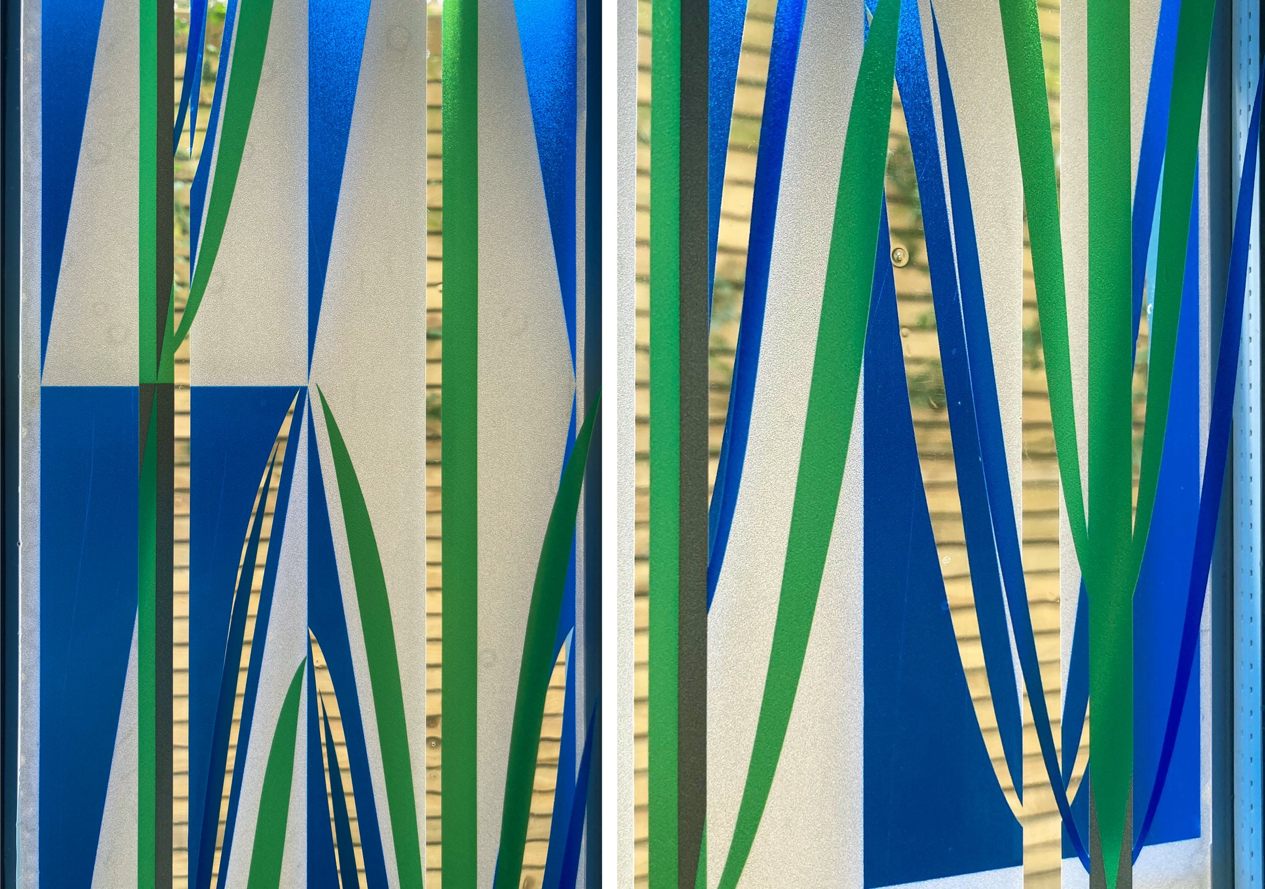
Front door with design in vinyl - left: first layer inside, centre: second layer outside, right: both layers from the inside.
However, our plans had to change with the news that we couldn’t change the double glazed unit in the front door without getting a whole new front door (because of warranty not technical issues). We decided it was fine to go with the design printed on vinyl, that is adhesive window film, instead. As you can see above, the new window looks completely different from the outside and the inside, with a different part of the design printed on the interior and the exterior film. Although the colour printed on the vinyl is not as transparent as the blue and green enamels would have been the window does the job of providing privacy in the hallway while letting you know who is at the front door.
Details of completed window, 2 layers of vinyl.


