stained glass windows

glass patchwork by Sasha Ward

I’m making a series of windows of which large sections are made out of glass pieces from my scrapbox, patchwork style. I’ve done this lots of times before, but that doesn’t stop the scrap box growing in size, with pieces dating back to the 1980s when I first started painting and firing glass. In my endeavours I’m inspired both by fabric patchwork, which I used to spend a lot of time doing, and by the fragment windows that you see in churches.

Studio lightbox with glass pieces spread over paper window cartoons.

Sorting the pieces, mainly by colour.

Sorting my glass pieces comes easily as I know them so well. I’m ordering them by colour because the pieces are nearly all by me and the subject matter and style is pretty consistent over the forty year period that they cover. Many of them are samples from commissions that I did or didn’t get or from pieces that went wrong. I can often remember what I was listening to on the radio at the time I was making the sample - like a proper patchwork quilt all of my life is in these pieces.

The pink section cut and numbered, the yellow section cut and numbered.

I reached number 121, then made a list to see if I really knew where all the pieces came from. Lots of them are useful colour strips which I can’t date, for example numbers 21, 23, 24, 27, 29, 60 and 61 below. Above you can see sample pieces for the last public commission I installed in Liverpool Hospital almost two years ago (numbers 31 & 33 on the right) next to a piece from a dismantled 1987 panel (no. 34) and some Bournemouth pine cones from a residency I did there in 1995 (36 and 38).

The four corners all together (but not as they will be in the windows).

I’ve planned the next stage of the windows around all of these fragments. There will be black and white painted/sandblasted sections that pick up on the marks, patterns and shapes contained in them. I’ve drawn everything up full size (see window A below) as I can’t afford to have second thoughts once I start on the glass - but with apologies to my clients for the extra time that all of this takes.

Drawing for window A, showing lead lines and paintwork to come. 680 x 690 mm.

Trying to fit all the pieces of the four windows on my lightbox.

In the Window by Sasha Ward

Left, roadside front window before. Right, kitchen window.

Left, roadside front window before. Right, kitchen window.

As you can see in the two pictures above, the windows in my friend’s new house have restricted views. At the back, the kitchen looks on to a concrete wall with tiles and objects positioned wherever they fit. At the front, there is a busy stretch of main road and a pavement close up to the low window. Although she has made it look great with her objects and stick on patterns, she wanted some pieces of my glass in front of the window to block the traffic in a more colourful way.

This was after seeing the rows of random samples I always have in my studio window, slotted into wooden grooves fitted across the window frames. At the moment (below right) I have my most recent samples, some colour test strips and a few samples that stay every time I have a reshuffle so I suppose they must be my favourites. I’ve used grooved wood for shelves in the window since I was a student at the Royal College of Art (years ago, picture below left), with a great view of the Albert Hall and a changing display of the pieces I was painting on top of a backlit piece of glass.

Left, my window at The Royal College of Art in 1985. Right, my studio window this week (2019).

Left, my window at The Royal College of Art in 1985. Right, my studio window this week (2019).

Left, roadside window after. Right, colours through the glass.

Left, roadside window after. Right, colours through the glass.

Choosing glass offcuts or old samples, cutting them up and arranging them in a row is like making a fragment-style stained glass window. That is, anything looks OK but there is an art to the ordering and cropping. These pieces are big at 400 mm tall, and from many different periods so I did a bit of work to unite them with two rows of circles sandblasted out and filled with green enamel. It means that you can still play around with the order and orientation of the pieces. The best part, as always, was seeing the colours projected through the glass on to the carpet in the afternoon sun (above right).

Detail of three panels, originally samples for The Centre Livingston, private house & Manchester Children’s Hospital.

Detail of three panels, originally samples for The Centre Livingston, private house & Manchester Children’s Hospital.

Faces and Fragments by Sasha Ward

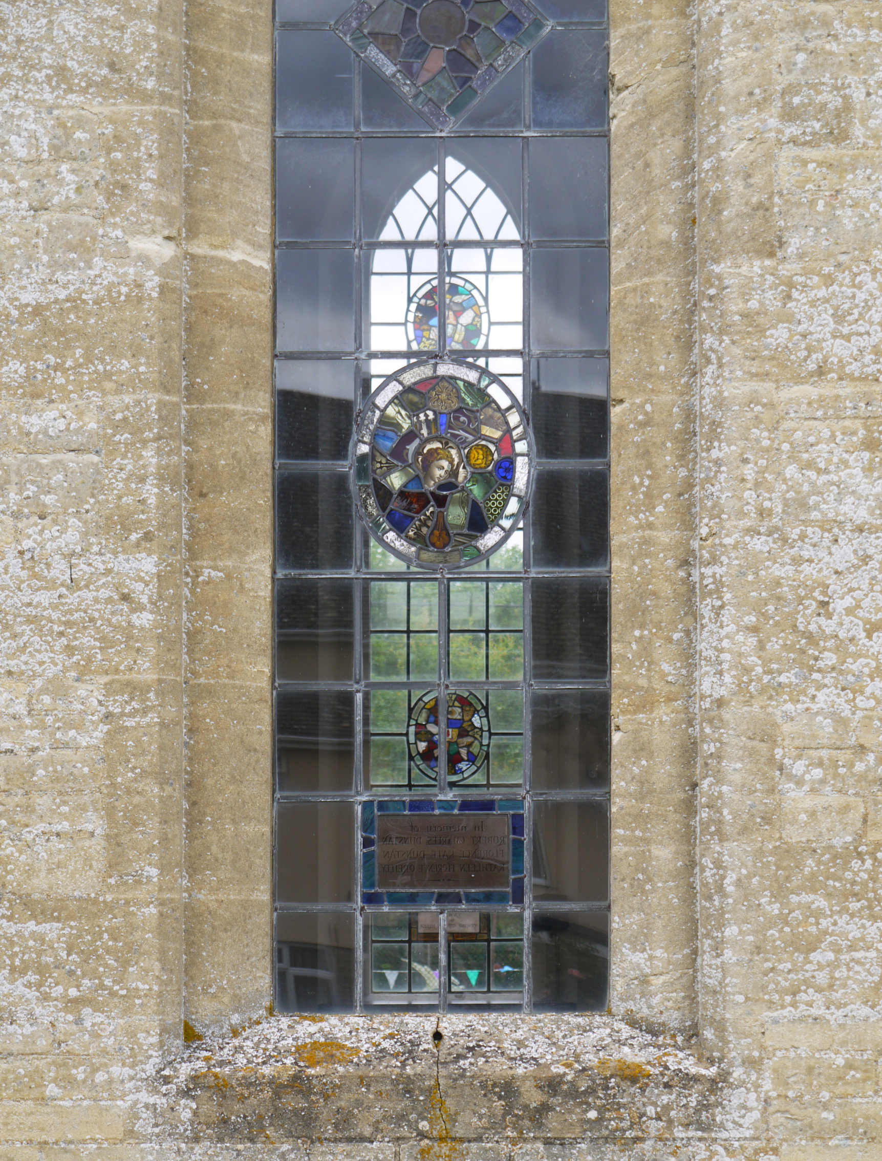
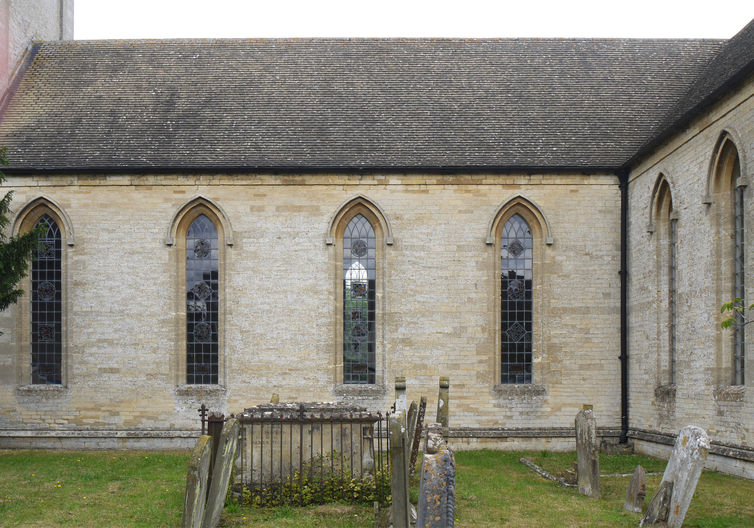
I was travelling through Oxfordshire, "church crawling" as I believe it's called, when I drove straight past the wonderful sight of one set of stained glass windows visible through the other. Unusually this church, St James' Aston, was open, empty and very light inside, with a coordinated set of patterned windows and a few commemorative figurative ones that I ignored. 

St. James, Aston, West Oxfordshire

St. James, Aston, West Oxfordshire

The even light of a dull summer's day was perfect for viewing and photographing the stained glass. There are 18 of these lancet windows with up to three medallions of coloured glass, crazy patchwork style, in each with a dedication below. I have always loved this way of making stained glass, it's as fun to look at as it is to make, with unexpected juxtapositions and colour combinations. These fragments don't look that old and could some of them have been made especially for the scrap box (cheating in my book)? The latest date on a dedication panel is 1970, that's all I've been able to find out about the windows so far.

Inside the nave, plain apart from glass medallions, kneelers & pews - all very attractive.

Inside the nave, plain apart from glass medallions, kneelers & pews - all very attractive.

These top two ovals are my favourites; like many of the ones shown here the medallion is centred around a face, expressive, poignant or sliced down the middle. I really admire the compositional skill of the artist who put these together, I stayed for ages gazing up at them. Scroll down for more photos, all of them are from the eight nave windows, and as usual, click on an image to enlarge.

The Return of Some Favourite Themes by Sasha Ward

The Great Hall, Manchester Town Hall - between weddings - with 4 of 12 murals painted by Ford Madox Brown between 1879 & 1893. Click on all images to enlarge.

Since I discovered that I have in my bedroom a chair "possibly designed by FMB", see previous blog entry, I have been very keen on Ford Madox Brown. On my recent trip to Manchester I managed - between weddings - to get in to the Great Hall of Manchester Town Hall to see the murals that he painted there towards the end of his life. However, as I approached the hall via one of the magnificent staircases, I was so absorbed by others aspects of the building's interior decoration that I couldn't concentrate on the paintings.

Great Hall Foyer, photo by Michael D. Beckwith.  Block of 6 stained glass panels. 

The first thing was the roof, simply glazed to my great delight with "brown and yellow windows", see another previous blog entry, of my favourite type, with no lead just brown paint and silver stain. The inscription on the glass reads "THE MAYORS MANCHESTER FROM THE YEAR OF INCORPORATION TO THE OPENING OF THE BUILDING " with names and dates from 1838 to 2003, well after the opening of the building. The lettering changes over the years but the cotton plant does not.

Staircase windows

Then there are the windows. They admit a beautiful quality of light to the interior of the building, including the Great Hall itself, where there is a complete set of delicately coloured stained glass windows. Here I found a favourite motif, see yet another previous blog entry, the wonderfully decorative horse chestnut leaf.

Details from the 3 window types in The Great Hall (in my order of preference).

Wandering around the corridors and into the public rooms on the first floor I came across mosaic floors, painted walls, textiles, carvings and patterned ceilings. The work was carried out by at least three different firms but all, including the lettering, said to have been designed by the architect of The Town Hall, Alfred Waterhouse.

In the south vestibule, horse chestnut motif around the door frame and original patterned ceiling.

Transformation by Sasha Ward

Offcuts standing sideways in my studio window, each 1 metre tall

Offcuts standing sideways in my studio window, each 1 metre tall

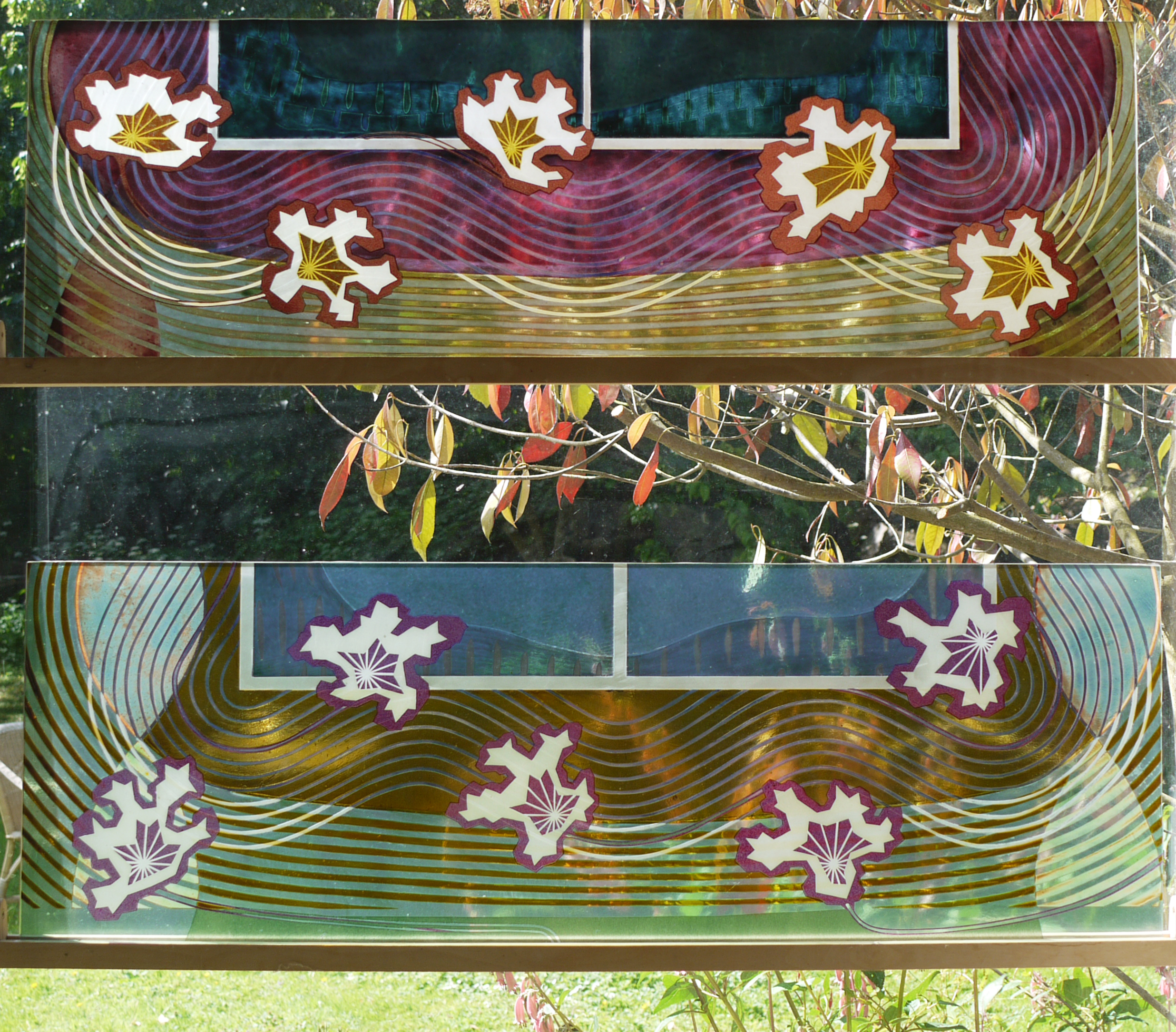
I had a commission to make two fanlight windows for a friend's house in Poland. She said offcuts would do, so I put two leftovers sideways in my studio window and waited for inspiration. I had made the glass in 2000 for an exhibition, the pink one broke and I remade it in yellow but was never satisfied with the results. You can see in the pages below from my 2000 sketchbooks that there was a lot going on here - how could I add something while also making sense of a poor composition ?

Meanwhile another friend, the artist Wendy Smith who I met when we were students together, came to stay. She had a lot to say about the process of transformation, you can read about it on her blog. Her ideas spoke to me about the danger of overworking versus making a fresh start. I have often tried to make new pieces on top of old samples and all I got was a struggle made visible.

The new panels in my studio, finished last week.

The new panels in my studio, finished last week.

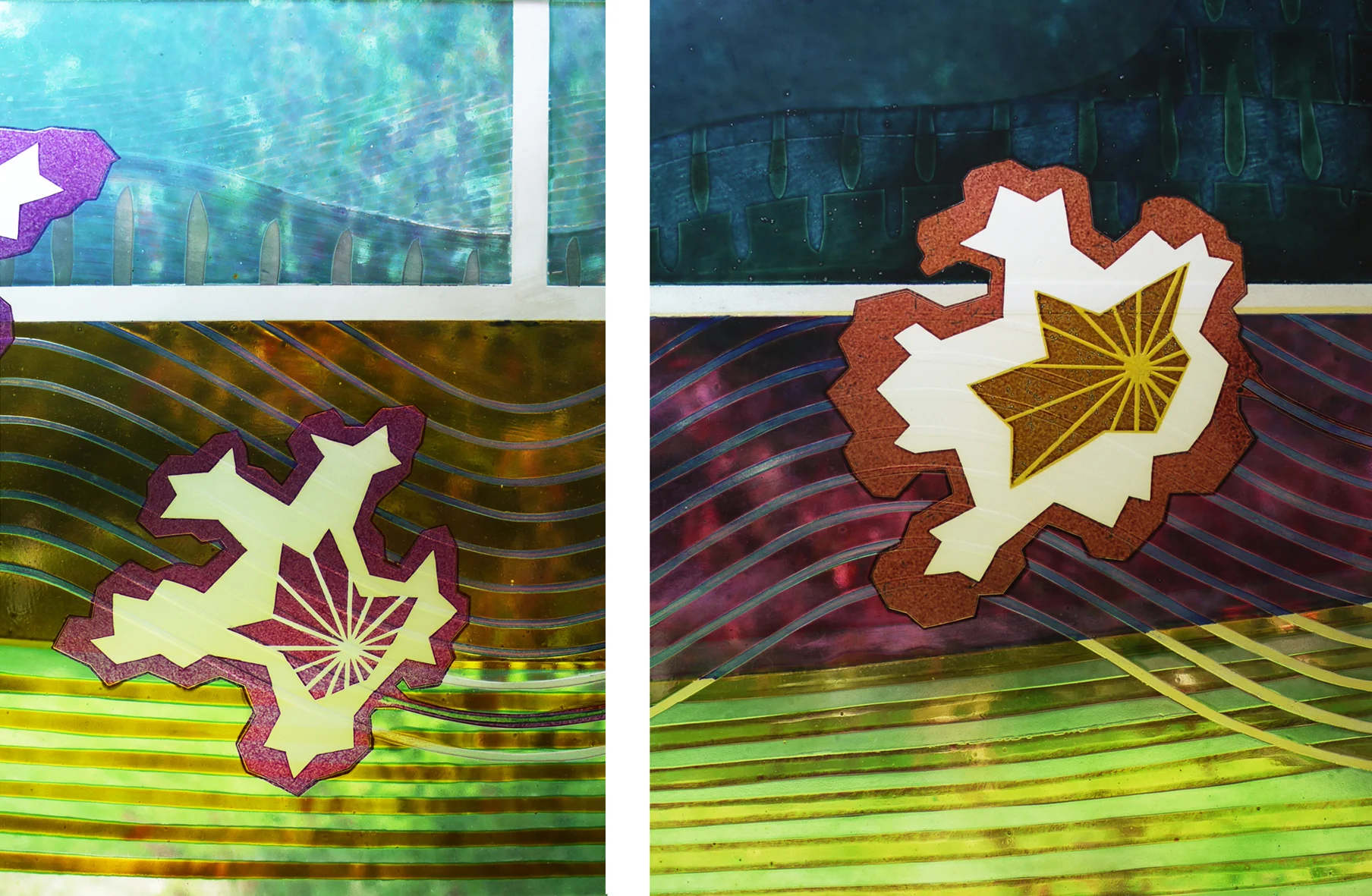
This time, I sandblasted across the glass backgrounds with star/flower shapes, as if embroidering figures across a patterned and pleated fabric ground. The yellow ground got pink details, the pink ground got yellow and a fantastic rich amber made from a mix of enamels. You can see the depth of the old lines under the surface of the glass in the details below.