patchwork

Number 110 by Sasha Ward

A row of windows - view from the outside at night.

Last Monday we delivered, installed and unveiled a row of windows that Rob and Lorna Ryan had commissioned for the front of their workshop in Bethnal Green, London E2. I’ve written about making them in a previous blog post here, all without showing how the design joined up, flying from one end of the sequence to the other where you find the number 110.

Window 1 on the workbench : In my studio window : Windows 1 & 2 installed.

Window 1 (above) is designed around a floating oval which was the last piece of glass I cut. I agonised over which of the streaky colour combinations to use, in the end going for the most vibrant glass I had, golden yellow with green to tie in with the pale green that runs through the design. The painting stage took a long time as I worked out the best way of tying the shapes together with black and grey oxide and enamel painted across the lead lines - you can see this in a ring around the number 110 below and the same pieces of glass on the lightbox before painting and sand blasting. When we installed the last two windows the sun came out casting a shadow of the number on the wall and a flash of the bright pink glass above it.

Window 4, working out the painting : Detail of the number in my studio window : Windows 3 & 4 installed.

A row of windows - view from the inside in the daytime.

Approximately one third of the glass in the row of windows is clear, this maintains their connection to the large windows below them and also to the world beyond the windows with its blocks of flats, tree tops and big patches of sky. Previously the glass in the windows was opaque so now we are letting more of the outside in.

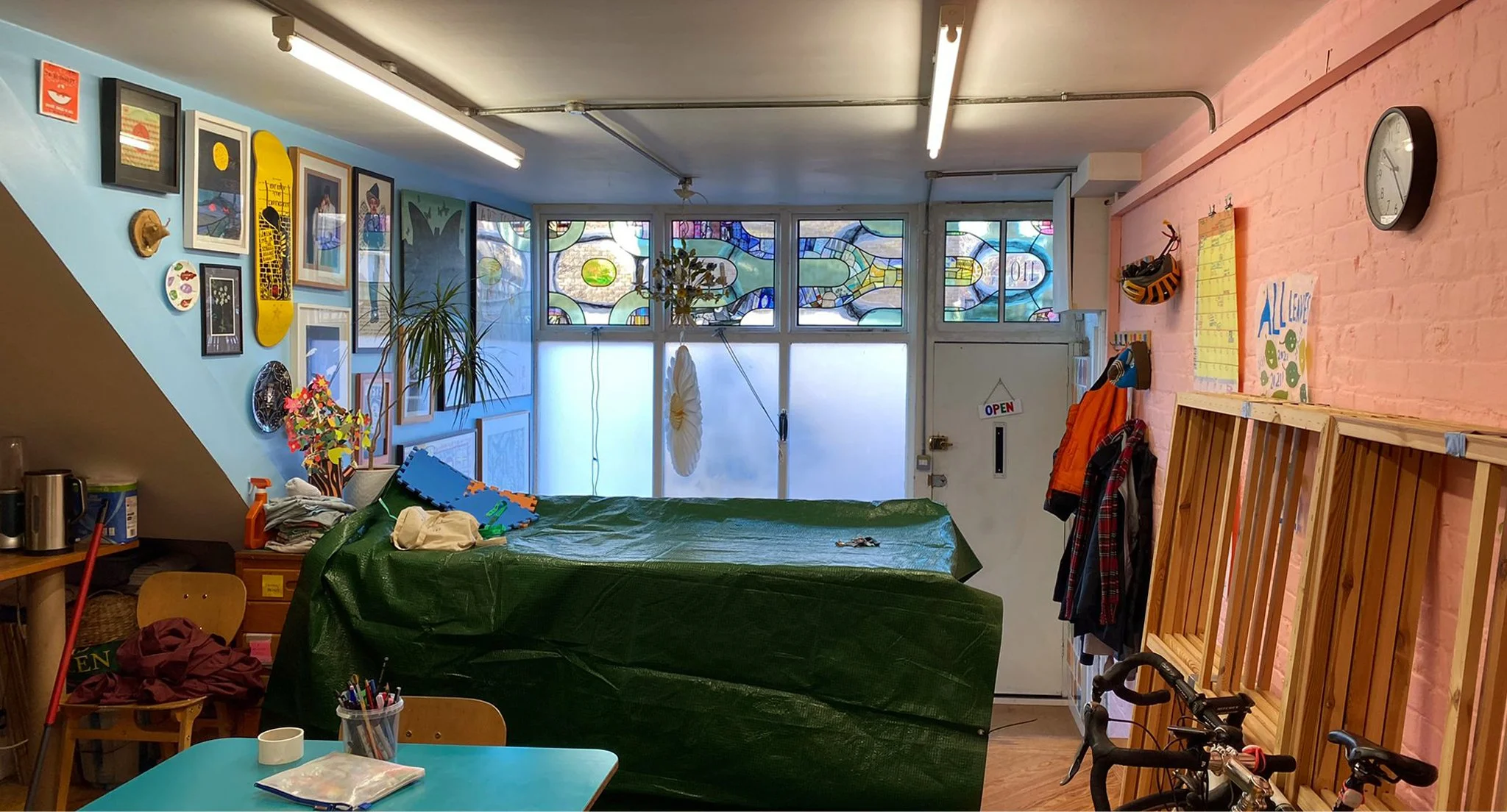
These photos (above and below) show the row of windows in the context of the workshop. It wasn’t too hard to fit in with their aesthetic as I’ve known Rob and Lorna for more than forty years since we were at art college together. If you’re not familiar with Rob Ryan’s work you can find it on this website and there are examples of his drawings and Lorna’s paintings on the green wall in the sitting room (below). Next to the green wall is the curtain made of a patchwork of silk scarves, a wonderful thing that inspired the spirit of my glass design. The blue wall (above) is equally crammed with art - I’m very happy to have my work added to this generous collection of drawings, paintings and photographs by friends and fellow artists.

The sitting room part of the workshop : wall of pictures and window with Rob’s vinyl design and silk scarf curtain.

The unveiling ceremony.

The friends and fellow artists turned up that evening for a proper unveiling ceremony where the wrapping came away without a hitch. The bright lights of the workshop spread a perfectly even light with the bonus of a reflection or two in a big black car bonnet.

Reflections in a car bonnet and invitation card by Rob.

glass patchwork by Sasha Ward

I’m making a series of windows of which large sections are made out of glass pieces from my scrapbox, patchwork style. I’ve done this lots of times before, but that doesn’t stop the scrap box growing in size, with pieces dating back to the 1980s when I first started painting and firing glass. In my endeavours I’m inspired both by fabric patchwork, which I used to spend a lot of time doing, and by the fragment windows that you see in churches.

Studio lightbox with glass pieces spread over paper window cartoons.

Sorting the pieces, mainly by colour.

Sorting my glass pieces comes easily as I know them so well. I’m ordering them by colour because the pieces are nearly all by me and the subject matter and style is pretty consistent over the forty year period that they cover. Many of them are samples from commissions that I did or didn’t get or from pieces that went wrong. I can often remember what I was listening to on the radio at the time I was making the sample - like a proper patchwork quilt all of my life is in these pieces.

The pink section cut and numbered, the yellow section cut and numbered.

I reached number 121, then made a list to see if I really knew where all the pieces came from. Lots of them are useful colour strips which I can’t date, for example numbers 21, 23, 24, 27, 29, 60 and 61 below. Above you can see sample pieces for the last public commission I installed in Liverpool Hospital almost two years ago (numbers 31 & 33 on the right) next to a piece from a dismantled 1987 panel (no. 34) and some Bournemouth pine cones from a residency I did there in 1995 (36 and 38).

The four corners all together (but not as they will be in the windows).

I’ve planned the next stage of the windows around all of these fragments. There will be black and white painted/sandblasted sections that pick up on the marks, patterns and shapes contained in them. I’ve drawn everything up full size (see window A below) as I can’t afford to have second thoughts once I start on the glass - but with apologies to my clients for the extra time that all of this takes.

Drawing for window A, showing lead lines and paintwork to come. 680 x 690 mm.

Trying to fit all the pieces of the four windows on my lightbox.

vinyl patchwork by Sasha Ward

Scraps of sample adhesive vinyl.

The long term plan for blocking the view through the bay window and into the sitting room (below) is to make a stained glass window. The short term plan was to use scraps of printed adhesive vinyl, otherwise know as window film, to make a patchwork in the window so we could get rid of the hated lace curtain. The before and after photos show the transformation of the room (mostly by painting it) and the surprising way that the coloured vinyl works. It blocks the view more but lets light through, with none of the droopiness you got from the lace curtain.

Levenshulme window - before and after.

Levenshulme window - inside and outside.

The easy part was the design, kept simple with repeated, accurately cut shapes that could be moved around later. The hard part was the installation, some of the vinyl was too old or bent to stick properly and some of it looked too pale against the opaque colours (which have a white backing that you can see on the photo of the window from the outside) and had to be discarded.

Hexagons are always good, they make the design feel open and slightly curvy, but the three ‘flowers’ we planned, each with a red centre, don’t stand out because of the different properties of the different types of vinyl - it’s like mixing cotton and silk and thinking you wouldn’t notice. This vinyl project is a useful step towards designing the future stained glass window which will be a collaborative effort (this is my daughter’s house). I’ll be advocating that some red stays in.

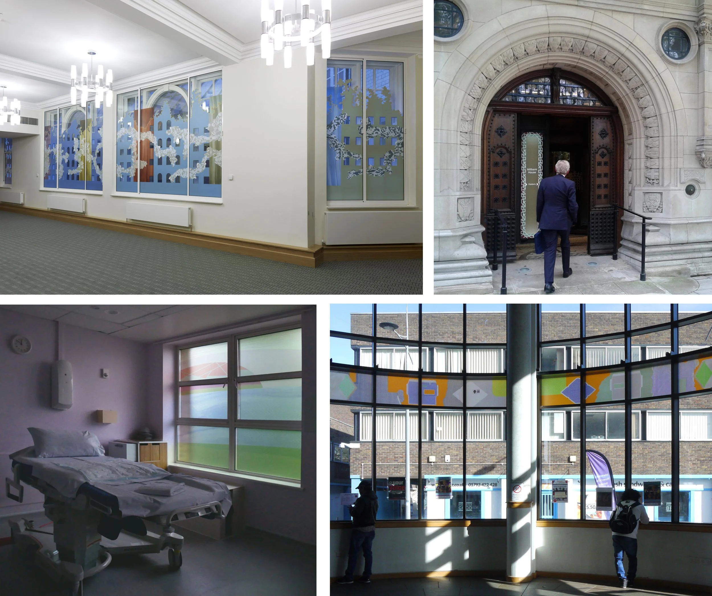
The red vinyl stands out because it’s the only sample that I didn’t design. The other pieces we used are samples from four projects shown below. One at Millbank House where the aim was to block a building right outside the windows with peepholes remaining, two at the entrance to the same building to cover an over bright lightbox, three next to a maternity bed at Dorchester Hospital where privacy was vital, and four from was a design I always really liked installed as part of an exhibition about public art at Swindon library.

Origins of the vinyl leftovers - temporary commissions for The House of Lords Library at Millbank House (2011), The entrance to Millbank House (2012), Dorchester Hospital Maternity Suite (2019) and Swindon Library (2017).

Attic Windows by Sasha Ward

Left, Attic Windows, patchwork quilt. Right, Attic Windows, stained glass version, 420 x 460 mm

Attic Windows has been always one of my favourites in the patchwork quilt book I’ve had since I was young. It’s got that essential simplicity and a design that is perfectly suited to stained glass as well as patchwork. Because there are only two different shapes in the design you can cut lots of different coloured squares and trapezoids and then decide where the colours are going to go, it’s always more fun if you have room to move and change while you’re making something.

The stained glass version of Attic Windows was made for my grandson’s first birthday last month, I thought the windows, which also look like building blocks, were ideal for carrying the letters in his name, date and location. I was already up to 135 pieces of glass after cutting these and so decided to give them a plain pale blue background (below).

155 glass pieces cut and laid on the template

I used different colours for each row of blocks and each row of the trapezoids around them. To add variation, so that you get dark colours surrounding light as well as light surrounding dark, the trapezoid colours run vertically and the square colours run horizontally.

All the squares are made of flashed glass, meaning there is a layer of coloured glass which can be sandblasted off through a stencil to reveal the clear glass layer underneath. Some flashed glass is made of two layers of coloured glass, like the red on blue for FRANCIS and the red on yellow for WARD (below right). All the trapezoids are made of streaky glass in subtle colours (below left) to frame the bold, bright blocks.

Left, Lettering pieces removed. Right, Lettering blocks sandblasted.

Left, Leading underway. Right, Soldered panel.

My favourite stained glass stage to do is the leading (above left), with these tiny pieces I used up old scraps of the thinnest lead. When the panel had been leaded, soldered and laid on the bench (above right) you can most clearly see the shape of the pattern and a resemblance to the quilt that inspired it.

Left, Cementing the panel. Right, Detail of finished panel in the sun.