wallpaper

Royal Liverpool University Hospital by Sasha Ward

This was a commission that I thought would never get finished. A new Liverpool Hospital has been built next to the old one which is due for demolition. During the course of its construction, the main building contractor, Carillion, went bust, faults were discovered in the building and with the cladding that had been used causing further costs and delays which were added to by the pandemic. The selected artists, who had been contracted to Carillion, stored their work and waited to see what would happen next. Understandably, my enthusiasm for the project started draining away as the seven oval glass panels I had made were stored behind my kiln for five years.

Drawing for glass and wall design at Ward 7A, 2015.

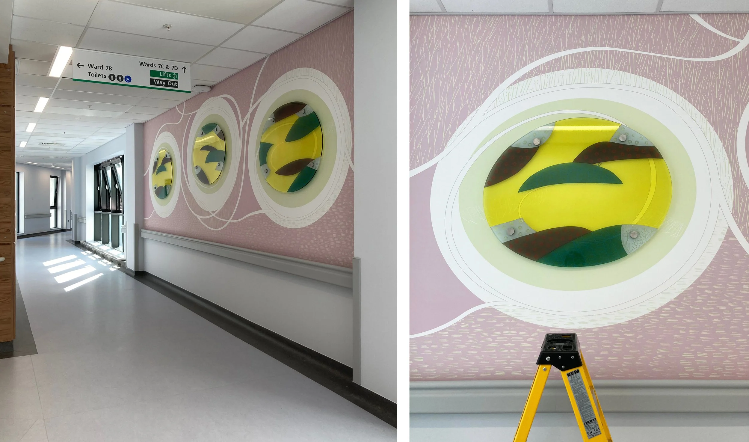
The selected artists had each been asked to design work for walls next to the four ward entrances on their allocated level, mine was the seventh with bright green accents. Hospitals often ask for artwork that is organic and curvy, definitely not geometric, a look that I have struggled with over the years of doing commissions for health care settings. On this occasion I decided to go for no straight lines or interlocking patterns, taking inspiration from the natural world rather than the urban environment. For each location I designed a swirly drawing that would be printed on vinyl wallpaper with shaped pieces of glass mounted on top of a pool of pale colour.

The wall next to Ward 7A (above and below) changed shape and colour during the course of the years, with a piece of glass that is the biggest and I think the best. It was hard to photograph on installation day with reflections from a screen opposite and equipment stored up against it (below).

Ward 7A during installation, left wallpaper, right with glass on top.

Ward 7D, from drawing to glass, 2015 & 2022.

Ward 7D is similar, and for this one my first drawing (above left) shows the initial concept where lines and circles spiral into the pool of overlapping colours. However, the blank wall had been too much for someone to resist, and when I visited just before installation I saw that a square access hatch had been cut into it so I moved the glass up and some white lines around on the design. This wall is opposite a window which provides some great reflections of the the new building (below right) which is white and grey and spiky in design.

Details of wall and glass at Ward 7D.

Drawing for Ward 7C, 2016.

The wall leading up to Ward 7C had room for two glass panels above the crash rail. My watercolour drawing for this one (above) is closest in feel and colour to the work installed. The changes I made to the shape of the lines and the positioning of the panels happened because of a fire alarm that I had to keep well away from. The detail (lower right) shows how the ceiling lights are effective in picking up the lines sandblasted on the edge of the glass and mixing them with fine white lines printed onto the background vinyl.

Entrance to Ward 7C

Details of the glass at Ward 7C

Drawing for Ward 7B

The wall leading up to Ward 7B, six metres long, is the one that didn’t change so neither did the lines on my watercolour drawing (above). It’s a piece of wall between bays of windows - wouldn’t it be lovely and simple to be able to go back to doing windows again! This series of three looks the simplest and cleanest with an unfortunate resemblance to a row of washing machines.

Wallpaper and glass for Ward 7C

Corridor at Ward 7C and detail of glass panel during installation.

Overall, I am delighted with my last hospital commission. The no straight lines design looks effortless and was very easy to alter over the years and to install. Above all the colours look great, the transparent enamels on the glass are strong against the pastel coloured wallpaper and complement the tricky green on level 7. It’s hard to find your way around this building, hopefully this commission will help you remember the way and give you a boost of energy as you watch the patterns swirling around.

Pugin Patterns by Sasha Ward

roundels.jpg

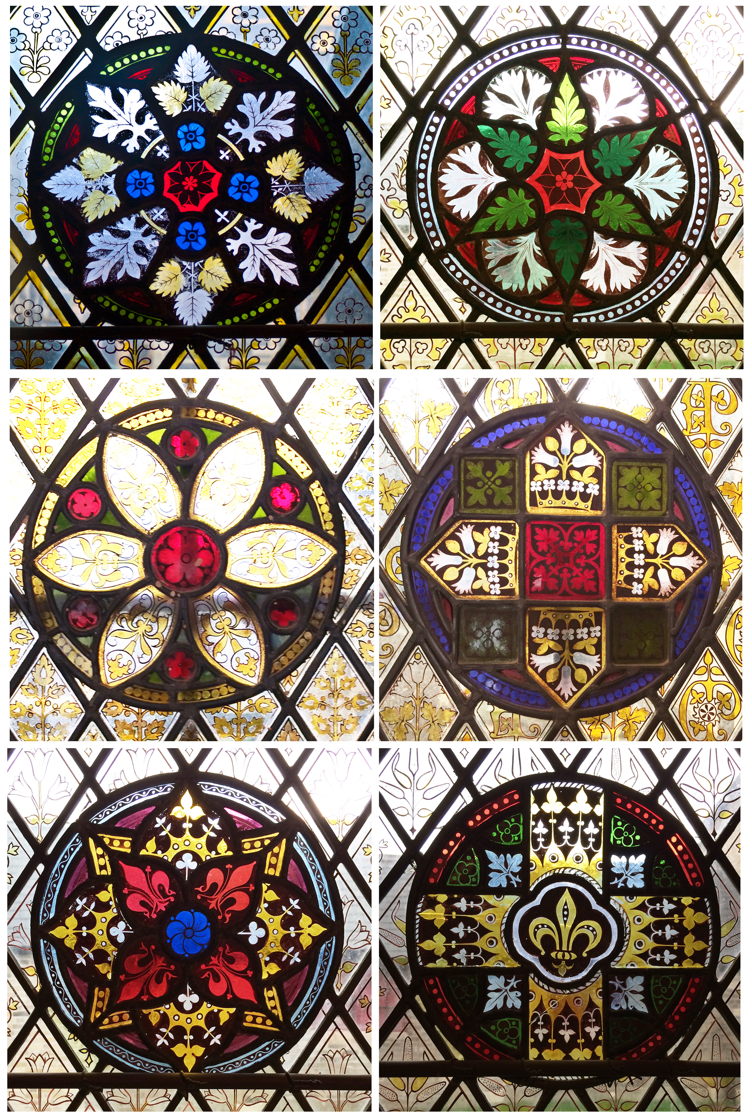
Since a visit to Pugin's house and church in Ramsgate, I've had the picture of these roundels (above) on my wall to remind me about good stained glass design. They are from a series in the cloister of St. Augustine's Church, and were designed between 1846 and 1858 either by Augustus Pugin or his son in law John Hardman Powell. Their design shows how Pugin used plant forms as flat patterns to fill up the space they were intended to enrich, keeping them formalised and abstract rather than three-dimensional. As our guide to his house, The Grange, commented 'no Pugin, no William Morris'.

Windows in South Aisle West, Pugin Chantry South and Lady Chapel East

Windows in South Aisle West, Pugin Chantry South and Lady Chapel East

The church interior is fabulous, both in terms of the integrated design details and furnishings and, as we were invited to notice, by the way that every view is interesting. The layout is unexpected, the windows are all spectacular and full of meaningful details. In the three pictures above, I have tried to show them in their architectural context. The top lights were all made in 1848 and 1849, while the lower panels are from the 1850s and 60s. Pugin died in 1852, like the roundels the later lower panels were designed by John Hardman Powell from the firm Hardman of Birmingham who were the makers of Pugin's stained glass from 1845.

Wallpaper fragments and the reprinted version in a different colourway

Wallpaper fragments and the reprinted version in a different colourway

Seeing Pugin's wallpaper design somewhere had made me want to visit the house. The scraps that have been found and preserved (above left) and the version that has been reprinted and hung in the hall all use great colour combinations. The colours continue in the painted borders in the chapel, and the bird pattern reappears around a stained glass map of Thanet in a sitting room window. What I like about this house are the details and the links between the decorative finishes.

Chapel window with Pugin portraits & coloured border: sitting room window

Chapel window with Pugin portraits & coloured border: sitting room window

Pugin's two sons, Edward and Peter Paul, became architects too, and made alterations to the house and church. They are shown in the bottom of one of the chapel windows (below), the other one (above) shows Pugin on one side and his third wife and daughters on the other in traditional pose and in clear, bright colours.

pug a.jpg

Before and After by Sasha Ward

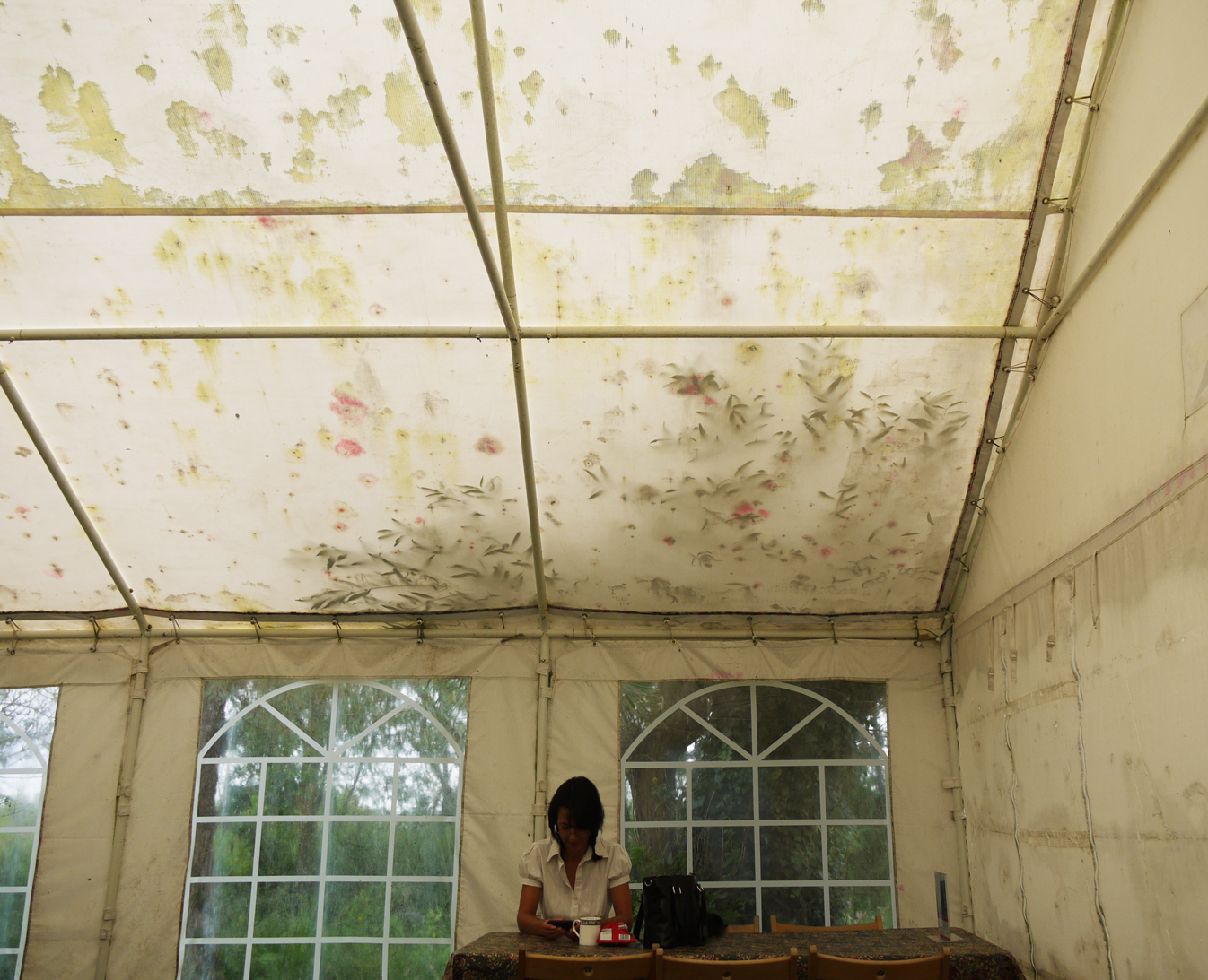
Before - inside the old marquee

Before - inside the old marquee

When I took what I thought was a great picture on a rainy day at Kelmscott Manor last summer (above), I thought with regret that I wouldn't be able to use it. To me, the damp and mould on the marquee ceiling in combination with willow leaves & pink petals that have blown in from somewhere else make a spectacular pattern.  I know that this sort of grot, although often celebrated by artists, is not to everyone's taste. So this summer, a new marquee has arrived (picture below), and the patterns on the ceiling only appear when the sun shines through the willow tree outside.  Inside, there is new bunting made from Morris patterns and the perfect white wall on which to hang a panel made from last year's wallpaper printing activity days.

After - inside the new marquee

After - inside the new marquee

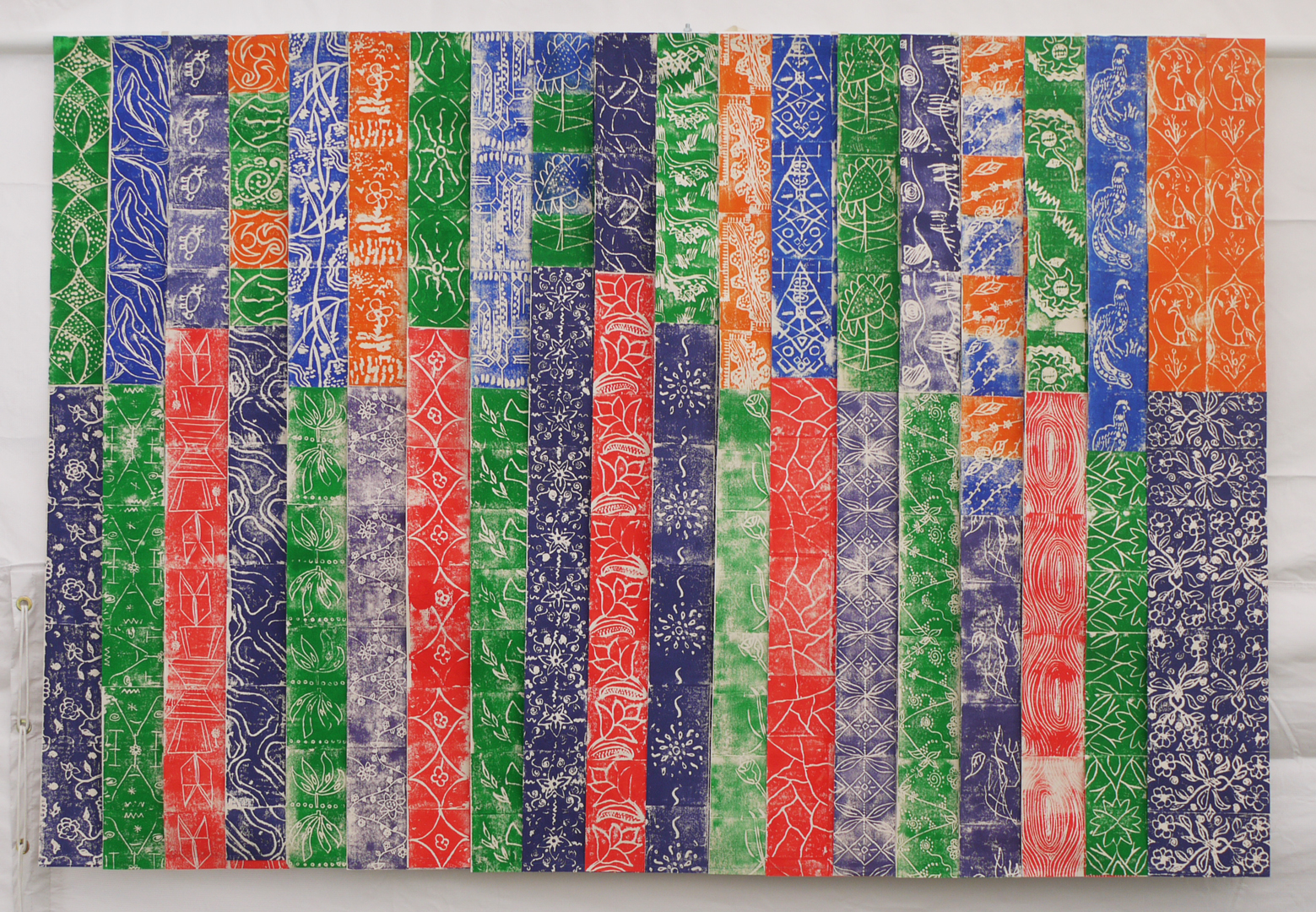
Panel made of 38 different wallpapers

Panel made of 38 different wallpapers

I included all the wallpapers in the panel, hoping that there would be some return visitors as well as members of Kelmscott staff who would enjoy seeing their designs on display. I wanted to keep a fluttering feel reminiscent of the way they looked hanging from the drying line (below). I've sewn them together in an overlapping arrangement so you can open up the pleats to see a whole panel and they can move around as the marquee sides flap in the wind.

Wallpapers drying last October

Wallpapers drying last October

Peepholes by Sasha Ward

Temporarily installed in the small window in the Brewhouse is a wallpaper and glass version of my Kelmscott design 1 (above). You can see how this links to my playhouse project below: a  house in the courtyard before decoration, and a view of the interior with block printed paper and acetate windows (below). The houses are supposed to look rough on the outside and full of pattern and colour when you are inside.

Although the point of my residency is not to have fun, the playhouses are the fun part. I have spent some time rearranging the window panels to get some sense of order, we need more striped designs as these work best with the wallpaper strips. Kizzy Jones (below left) sensibly brought her sketchbook full of designs to work from and her friend Eden Oakley-Shaw (below right) did the gorgeous window on the far right below. Incidentally not all these works are by children.

Peacocks by Sasha Ward

One of WM's peacocks                                                         Drawing by Millie, aged 5

One of WM's peacocks                                                         Drawing by Millie, aged 5

I have been asking people to draw something they like in the Manor and William Morris' pair of peacocks keeps coming up. Millie's superb drawing (above) is from observation, the other three are from memory and, in my view, all great in their own way.

Drawings by Mabel (5), Lara (5), Steff (8)

Drawings by Mabel (5), Lara (5), Steff (8)

The blocks made during our wallpaper printing workshop last Saturday featured two separate peacock designs. You can see them inside the playhouse we made, in orange on the right and in blue on the left, below.

playhouses.jpg