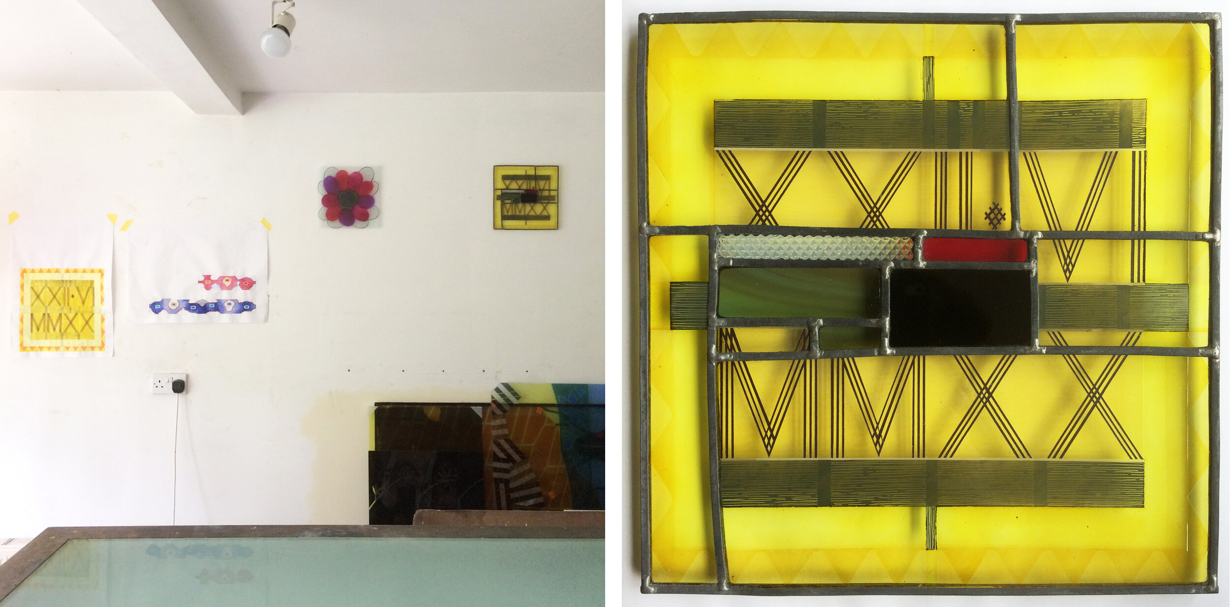
Version 1, 700 x 540mm and detail showing layers of fired enamel colour.
I had an idea for a new design and, as is my usual practice, worked out the best combination of colours, made a template and set to work on what was to become Version 1 (above). Each transparent enamel was applied differently to give a different texture, I hand painted, sprayed and rolled the paint on. The result looked good, but was not quite what I had in mind so I made some smaller versions to see where the same design in other colour combinations would take me.

Left: Version 2 after first firing. Right: Versions 2,3 & 4 in progress.
Version 2 (above and below left) used the colours I had in mind, pale grey (I haven’t got much of this enamel left) and a more yellowy green mix (not got much green either, so I mix up blue & yellow). With these colours went a paler blue and the pinky foreground that all the versions have in common. Version 3, the narrow panel below, is in an alternative colour scheme I’d drawn up and version 4, below right, used up the leftover enamels in a different combination. You can see these panels on the lightbox above, the first layer of enamel has been fired and is therefore transparent, while the second as yet unfired layer appears opaque.

Versions 2,3 & 4, height 270mm.
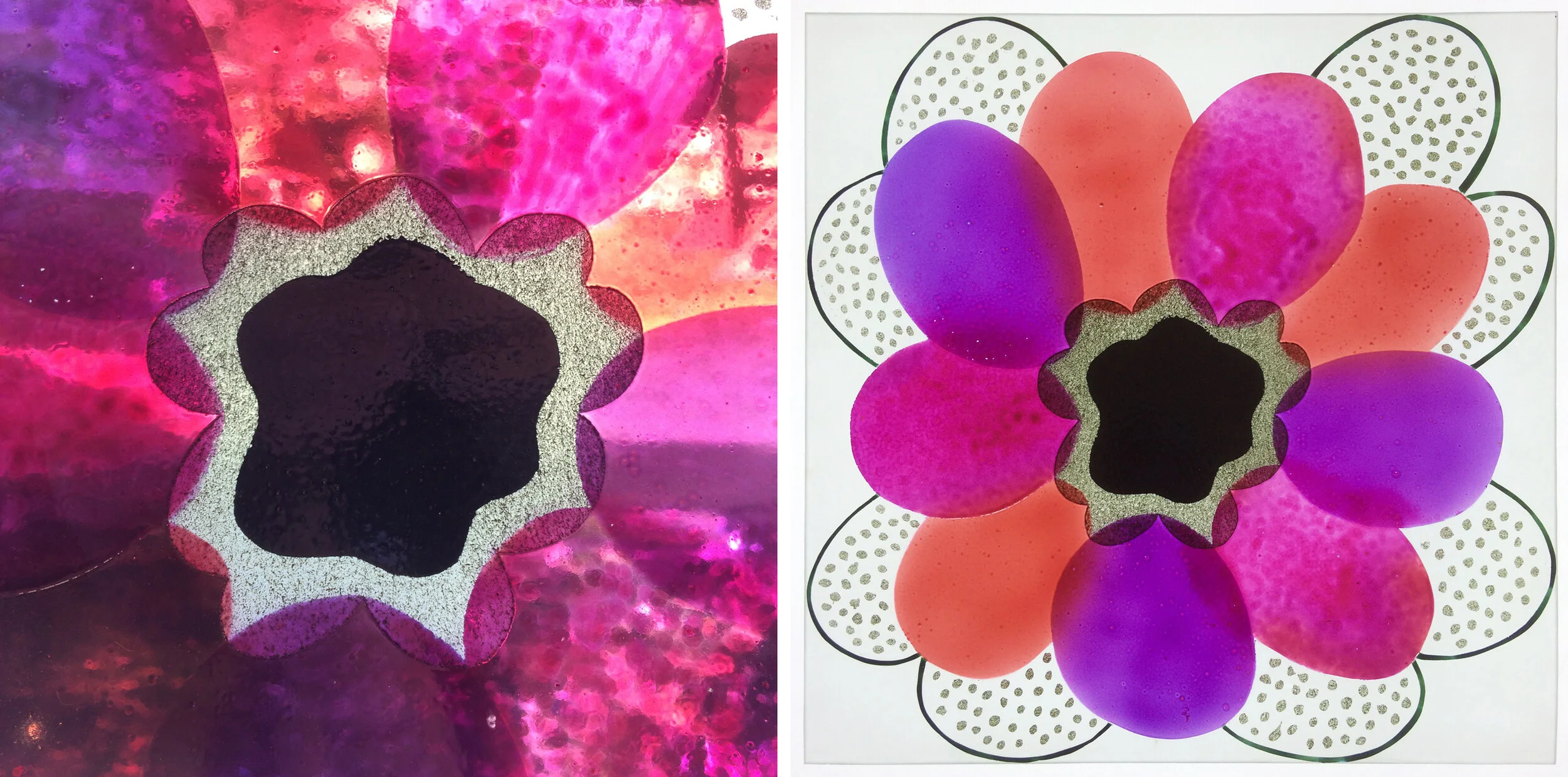
All together in the window, these panels looked rather like my usual stripey colour samples, and I decided to make some improvements to versions 3 & 4. V3 looked insipid, so I beefed up the colour and added some more sandblasting (below left). V4 was a mess, it needed two trips to the sandblaster and a firing to transform the shapes and take the series off in a new direction.

Variations on Version 3 and 4.