Studio Pictures by Sasha Ward

Invitation to our studio from 2010 (left) and 2021 (right).

Night time photo of the studio, with Ray’s work upstairs and mine downstairs.

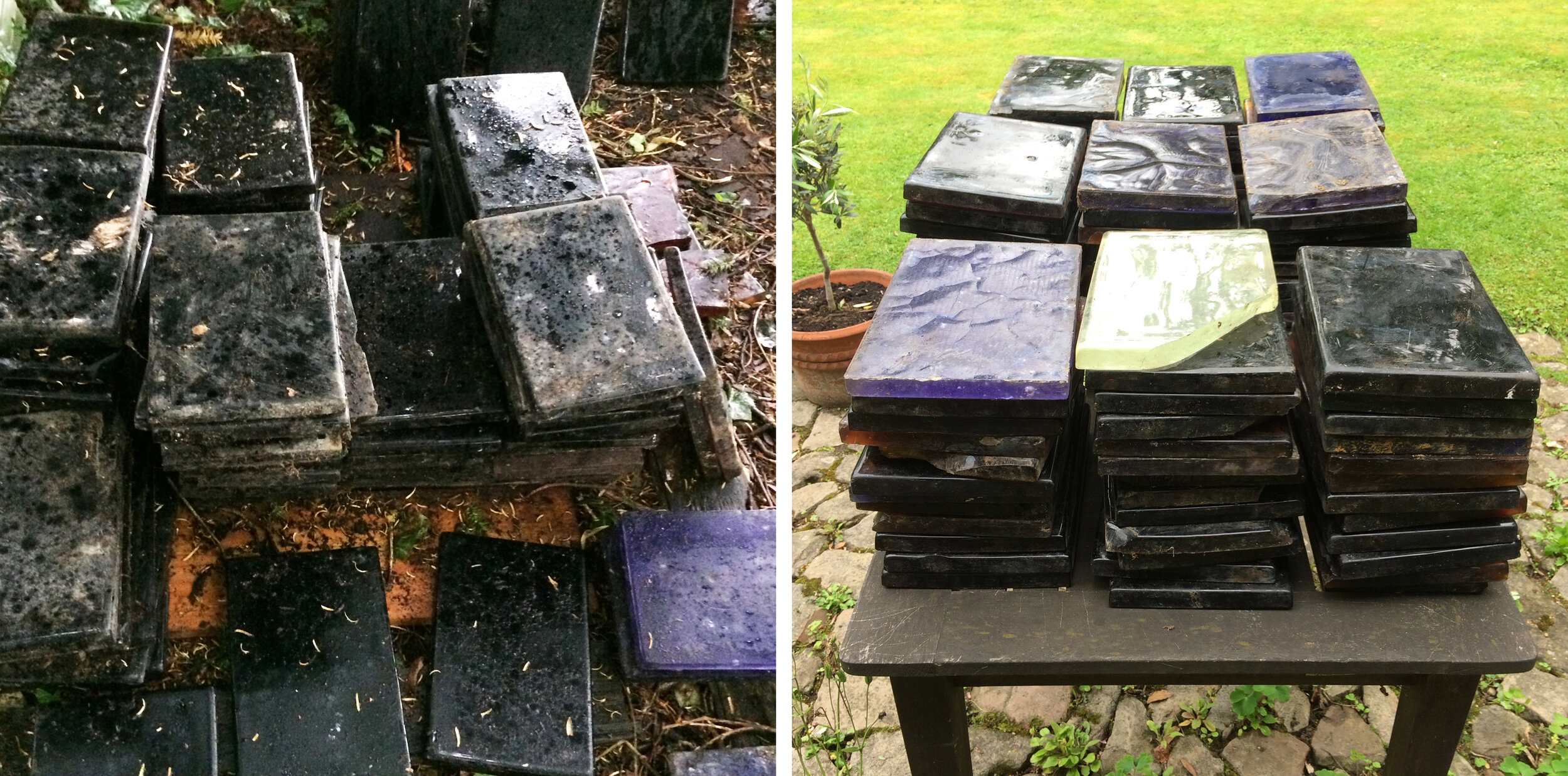
Open studio weekend has been and gone - the first since 2010 and therefore the first thorough tidy up in eleven years as we showed our studio and its contents to friends, family and neighbours. Luckily they came, bought things and we all enjoyed ourselves in a restrained semi pandemic sort of way. Warm autumn weather meant the garden was looking good (below).

Back of studio from the garden.

Studio windows from the inside, top Ray’s, bottom mine.

Paintings and piles of drawings in Ray’s studio..

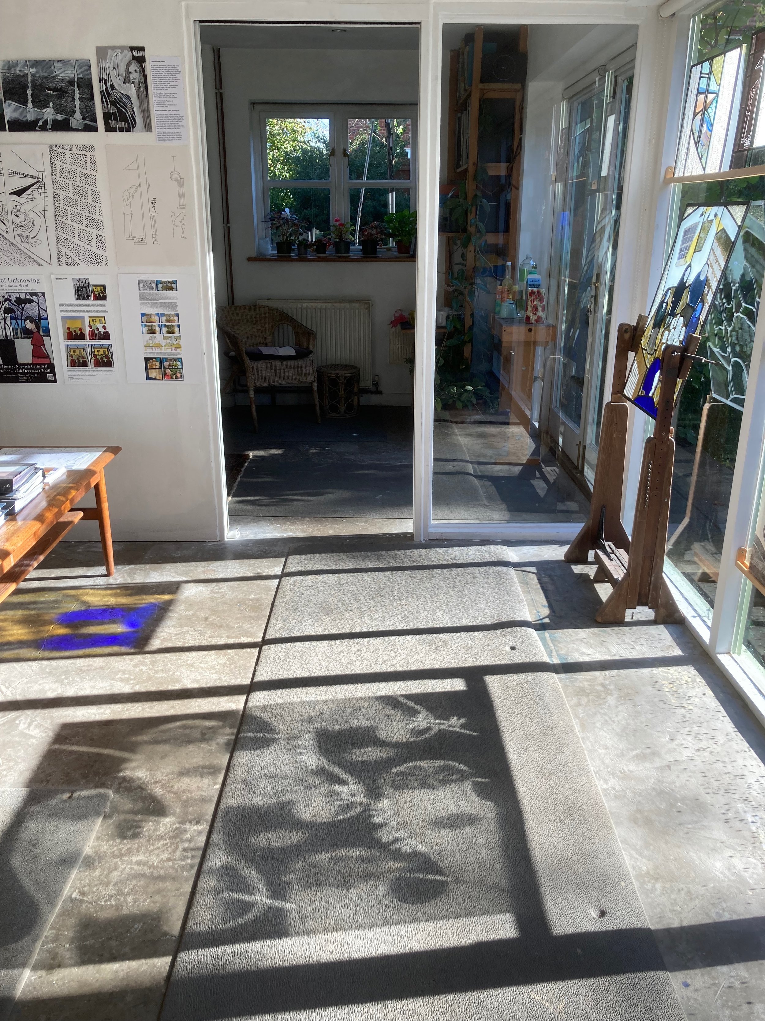
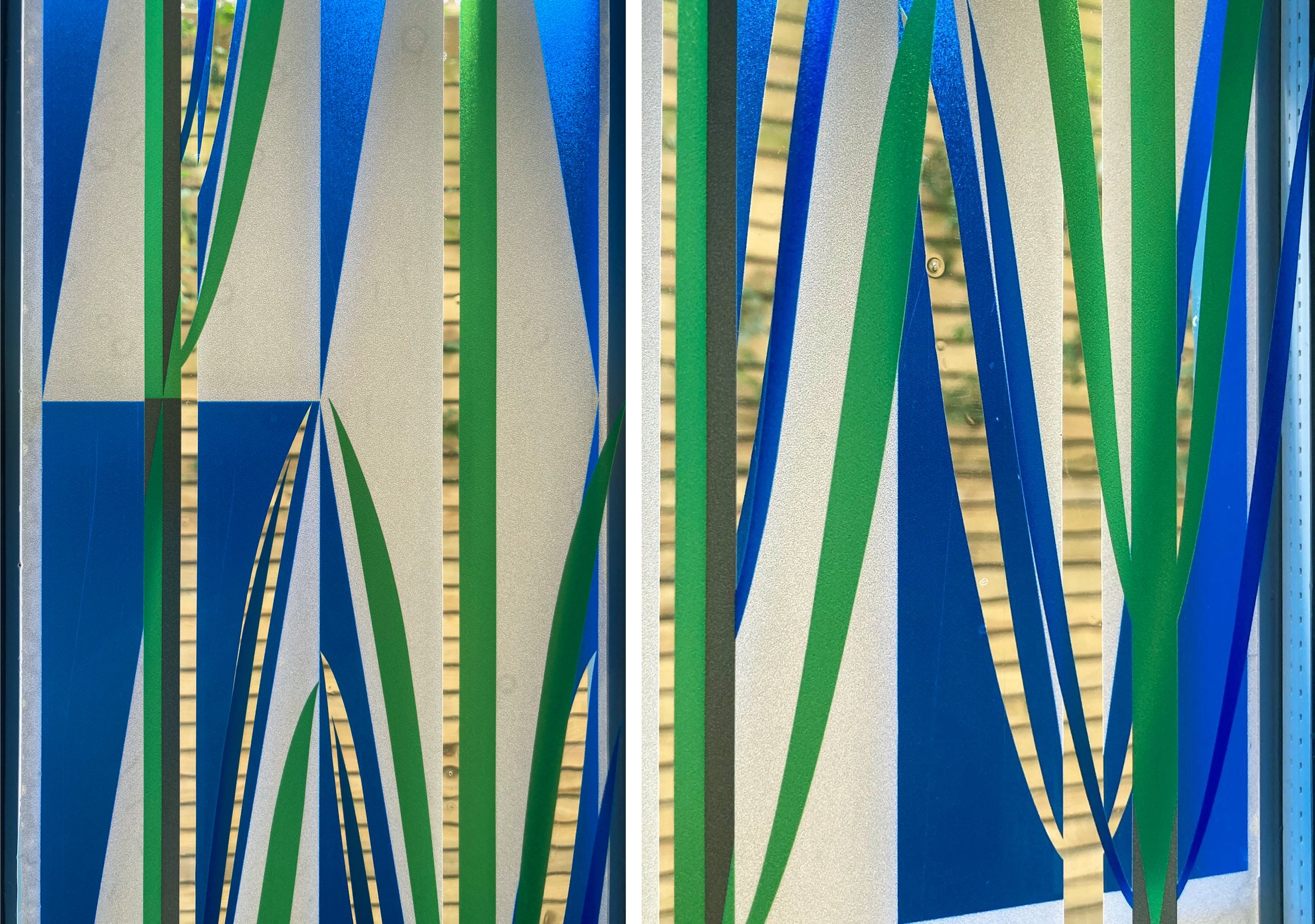
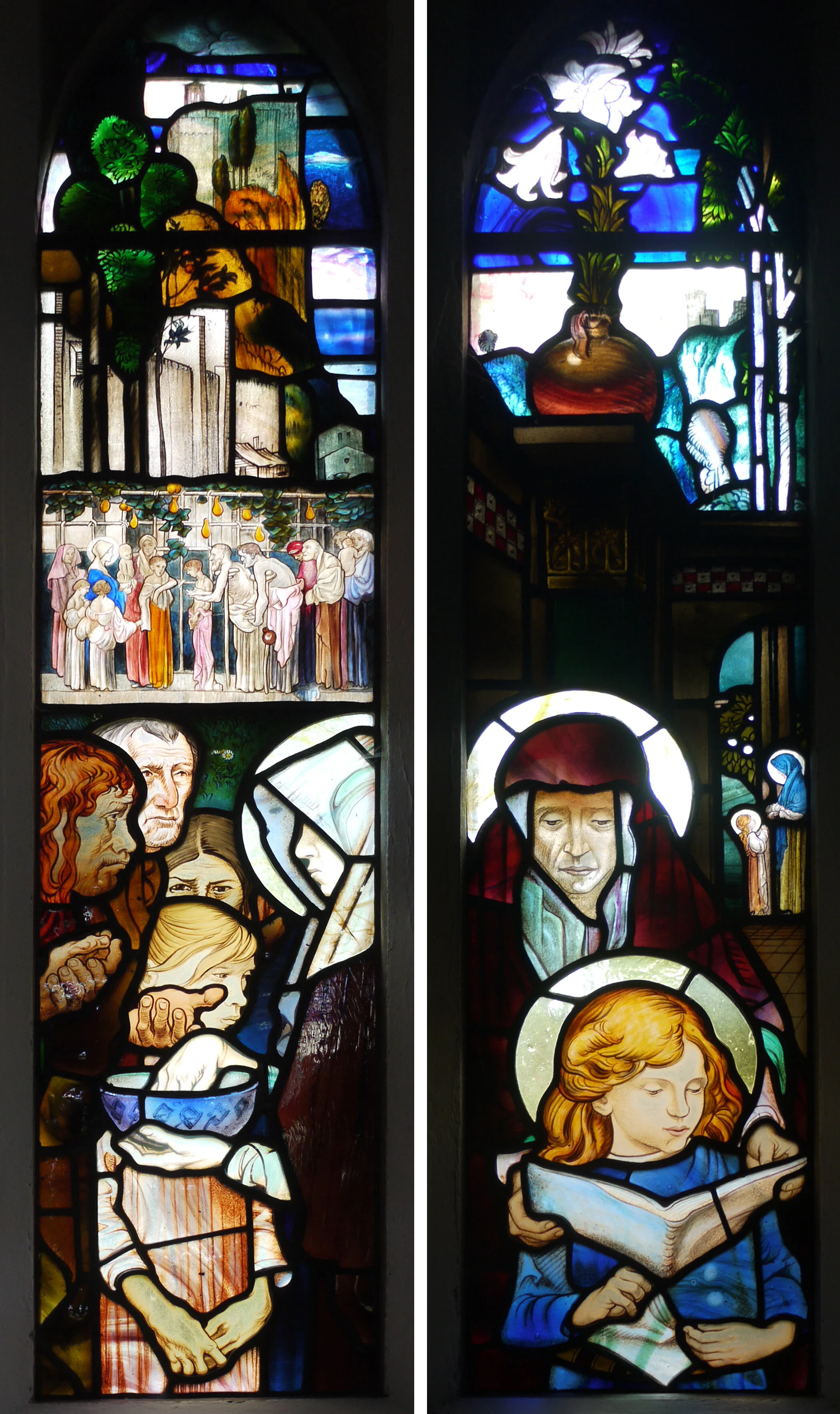
Morning sunshine through stained glass in my studio.

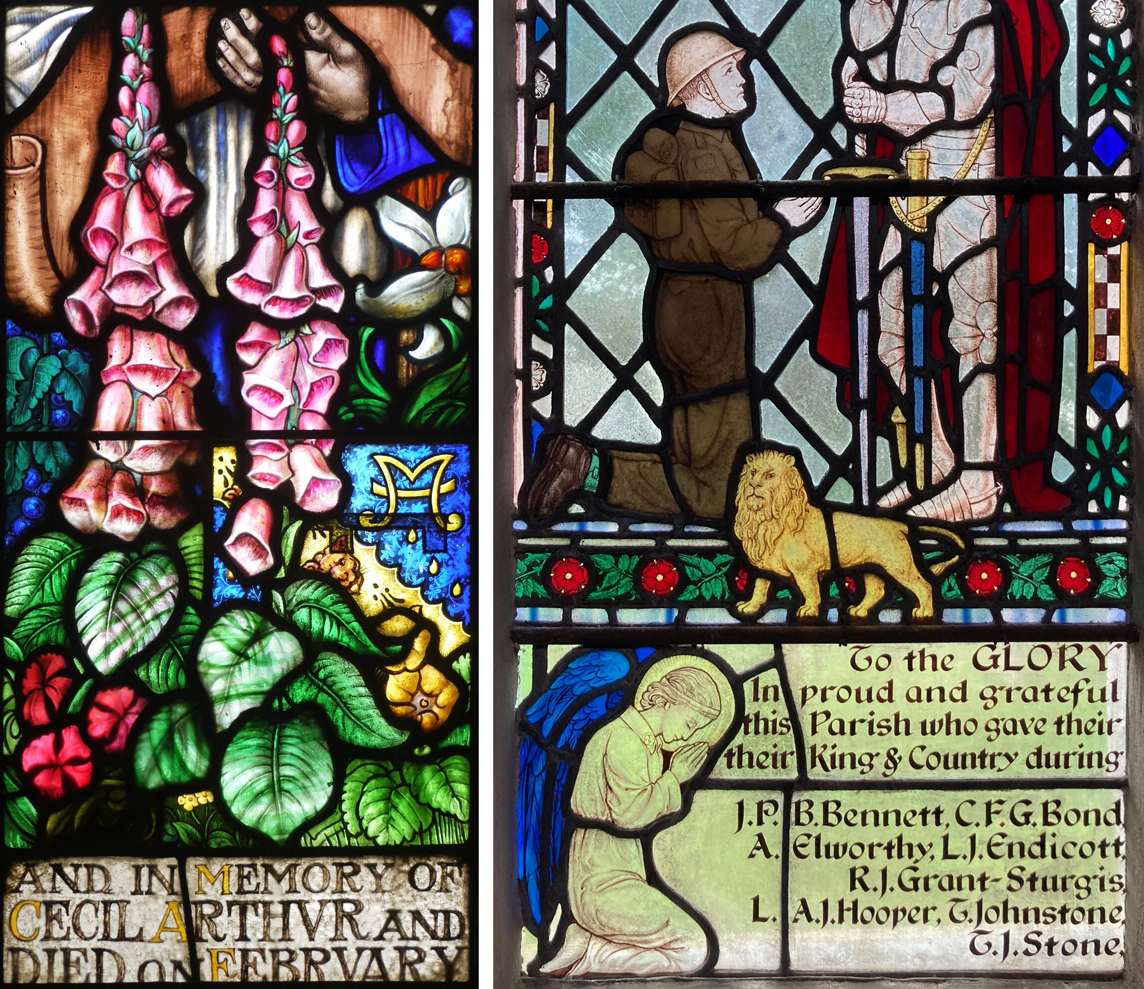
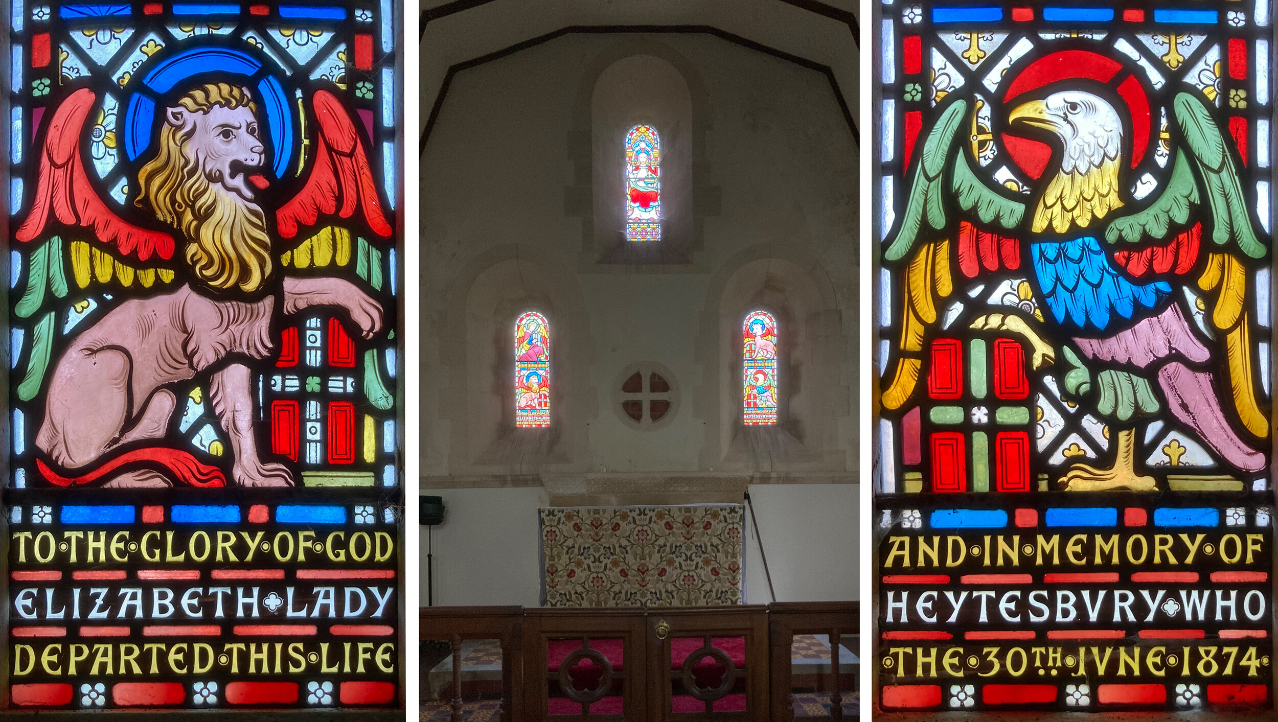
As well as a tidy up, the weekend prompted me to make a display of my work in the windows and work out what I wanted to say about it. Of course I’d rather say nothing at all, but that doesn’t get you anywhere. I’ve also put up a couple of displays on the wall which I think will stay there for a while, one is a map of the UK marked with the location and photos of ten commissions from 2008 - 2019, the other is a group of old photos of me at work on commissions from 1990 - 2014 (below left and right). For anyone who hasn’t visited our studio, I hope you enjoy looking at the photos of it, and please feel free to make an appointment to visit while there is work out to see.

Wall displays of commissions and photographs.

New Front Door Window by Sasha Ward

I’ve just installed a design for an actual window, the first in quite a while. It felt good to be working out a design for the constraints of a shape, long and thin, and the clients’ preferences, simple, blue and with a touch of the organic. Once I got back into the stride of architectural glass design as opposed to making exhibition pieces, all went well. You can see the final design as it progressed in the drawings on my studio wall below.

Full size designs, 1320 x 150 mm, drawn in this order (from left to right) 5, 4, 1, 2, 3

Samples, enamel and sandblasting on glass.

The glass samples (above) I made at the end of this stage show the basic idea, a pattern of triangles with two stems of plants growing in the gaps between them. The detail comes from the intersection of the stems and the triangle points, you get thin lines of clear glass in the outlines of the leaves while the white triangles are sandblasted and therefore opaque.

The window is in a front door and is double glazed. We realised that you could get a more interesting effect by using both panes of glass with parts of the design on each pane, something I’ve done before, so that the two layers shift against each other as you move around, as in the two layered samples I made next (below).

Samples on two layers of glass.

Front door with design in vinyl - left: first layer inside, centre: second layer outside, right: both layers from the inside.

However, our plans had to change with the news that we couldn’t change the double glazed unit in the front door without getting a whole new front door (because of warranty not technical issues). We decided it was fine to go with the design printed on vinyl, that is adhesive window film, instead. As you can see above, the new window looks completely different from the outside and the inside, with a different part of the design printed on the interior and the exterior film. Although the colour printed on the vinyl is not as transparent as the blue and green enamels would have been the window does the job of providing privacy in the hallway while letting you know who is at the front door.

Details of completed window, 2 layers of vinyl.

Stained Glass Inscriptions by Sasha Ward

Whenever I see beautiful lettering decorating the walls of a church I think what a good idea it is to use meaningful texts to embellish a church interior. The inscriptions on stained glass windows however, are rarely as interesting to me, usually being an account of who commissioned the window and when they died placed in a predella type panel at the bottom.

Left: St Winifred’s Church, Manaton, Devon. Detail of window by Frank Brangwyn 1927                                                                   Right: St Andrew’s Church, Cullompton, Devon. Detail of window by GER Smith c 1950

Left: St Winifred’s Church, Manaton, Devon. Detail of window by Frank Brangwyn 1927 Right: St Andrew’s Church, Cullompton, Devon. Detail of window by GER Smith c 1950

Some examples from twentieth century windows seen on recent church visits (above and below) show a variety of lettering style with borders and backgrounds, and a tendency to run the sentences across the two or three lights in each window so it is hard to make sense of the narrative. I prefer the inscription, light on a dark ground, by Robert Anning Bell (below left) where you read a complete sentence in one pane and find out when the person commemorated was born.

Left: St Paul de Leon Church, Paul, Cornwall. Detail of window by Robert Anning Bell 1917                                           Right: St.Matthew’s Church, Midgham, Berkshire. Detail of window by Francis Skeat 1955

Left: St Paul de Leon Church, Paul, Cornwall. Detail of window by Robert Anning Bell 1917 Right: St.Matthew’s Church, Midgham, Berkshire. Detail of window by Francis Skeat 1955

St Margaret’s Church, Knook, Wiltshire. East windows by Alexander Gibbs 1874.

St Margaret’s Church, Knook, Wiltshire. East windows by Alexander Gibbs 1874.

This wall of windows (above) in a tiny church restored by William Butterfield in 1874 with windows made by Alexander Gibbs, shows how far apart the parts of the sentence can be, with Lady Heytesbury’s name split either side of the altar. The lettering, in rows separated by bars of red glass, is truly a part of the design, colourful and legible from a distance.

At Heytesbury in the same parish is the large church of St Peter and St Paul, also restored by William Butterfield with windows made to his designs by Gibbs. Here, the panel of text is truly spectacular (below) in departure board style, with triple rows of coloured glass between the lines of white and yellow writing.

St Peter and Paul Church, Heytesbury, Wiltshire. Detail of north window by Alexander Gibbs, 1867

St Peter and Paul Church, Heytesbury, Wiltshire. Detail of north window by Alexander Gibbs, 1867

The arrangement of these stripes of writing, taking up vertical space in one narrow window light, reminded me of the one in St Nicholas, East Grafton (below). Here there are coloured bands at the bottom of the panel and patterns at the top, the script is surprisingly easy to read and the message is meaningful as well as decorative.

St Nicholas Church, East Grafton, Wiltshire. Detail of East window by Heaton, Butler and Baine 1888.

St Nicholas Church, East Grafton, Wiltshire. Detail of East window by Heaton, Butler and Baine 1888.

Melting glass by Sasha Ward

Dalles de verre, stored outside for 50 years and in my garden

Dalles de verre, stored outside for 50 years and in my garden

I’ve had a pile of thick glass slabs for a while waiting for the right project, something that hasn’t come along yet. They are dalles de verre, used since the mid twentieth century to make windows where chunks of the glass are set in concrete or resin. My slabs are not great, they have weathered badly having been stored outside for decades and most of the colours are so dark, browns and greens mostly, that they look black in daylight. I had a go at firing them down in my big kiln, hoping to end up with thinner, larger pieces full off interesting impurities.

After firing I still didn’t know what to do with them, until I realised that one grey piece was a lovely thing - in shape, surface texture and inner markings. I leaded it up along with some complementary pieces of glass to make a panel (below).

Melted Grey 310 x 280mm, on the lightbox and in the window

Melted Grey 310 x 280mm, on the lightbox and in the window

Fragments of dalle, on the lightbox and in the kiln before firing

Fragments of dalle, on the lightbox and in the kiln before firing

Fragments after firing. Left, top left & bottom right fragments in the kiln. Right, other two pieces fused together.

Fragments after firing. Left, top left & bottom right fragments in the kiln. Right, other two pieces fused together.

In the second firing the smaller scraps came out best, and the ones I put on a bed of loose plaster had a texture on the back that looked quite good. You can see the glass before and after firing above, including the two triangular pieces that fused together as they were just close enough on the kiln shelf to reach each other as they melted. These were the next pieces I chose to lead up (below).

Accidentally on Purpose 300 x 410 mm on the lightbox.

Accidentally on Purpose 300 x 410 mm on the lightbox.

tiles.jpg

The shapes, some leaded and some painted, that surround these melted chunks of glass are placed so that they could join up with a shape on the opposite edge of the panel, giving the idea of a repeating pattern, as above.

Frank Brangwyn Windows by Sasha Ward

Left: St Winifred’s, Manaton, Devon.  Right: Exterior of Brangwyn window, it’s the one on the left in the church photo.

Left: St Winifred’s, Manaton, Devon. Right: Exterior of Brangwyn window, it’s the one on the left in the church photo.

St Winifred’s in the Dartmoor village of Manaton is a beautiful church with an amazing fifteenth century rood screen that stretches right across the church. I was there to see a Frank Brangwyn window that is strange, incongruous and therefore, to me, very interesting. It is in the south aisle, a good position as it is away from the delicate chancel screen and easy to see close up from the inside and the outside. From the outside the glass is an astonishing sight, with layers of streaks and opalescence that masks the faces of the singers (above right).

From the inside, the faces are alarming - partly it’s the open mouths although even the violin player looks sinister. The design of the window, with layers building up from the dedication at the bottom to the flowers, coats of arms, figures, village scenes and apple tree with birds at the top, has no borders or decorative devices to link the stained glass panels or frame them in the tracery. I can’t help thinking it’s this design rather than the pale figures themselves that makes them so unsettling - the way they seem to be cut off at the waist as they emerge from the crowded foreground.

Manaton, south aisle window, 1927.

Manaton, south aisle window, 1927.

Frank Brangwyn was an artist with a vast output in many different art forms, his commissioned work encompassed interior design schemes and included murals, mosaics and stained glass. This window was made by James Silvester Sparrow who chose and painted the glass. You can see how extraordinary - thick and layered with a variety of translucent pale pieces - this is when you compare the glass from the inside and the outside (below). The quality of the glass itself gives this window its strange beauty.

Detail from the inside and the outside.

Detail from the inside and the outside.

Left: St Mary’s, Bucklebury, Berkshire.  Right: North aisle window by Brangwyn 1917.

Left: St Mary’s, Bucklebury, Berkshire. Right: North aisle window by Brangwyn 1917.

One of Brangwyn’s most significant church commissions, also executed by Silvester Sparrow, is a series of windows in St Mary’s church in the village of Bucklebury, Berkshire. Entering through the south porch the first one you see is the nativity window (above right). This has many of the same design features as the Manaton window - over sized figures popping out of the frame with distant landscapes in a band behind the heads (below) and a canopy that projects forwards overhead. This low window, which glows brightly and incongruously in the north aisle, is the latest of the set.

Detail from north aisle window.

Detail from north aisle window.

Bucklebury, east window, 1912.

Bucklebury, east window, 1912.

The other three windows are together in the sanctuary, a large crucifixion scene in the east window (above) flanked by two little beauties on the side walls. The design of the east window is similar again, with its spectacular rich streaky glass at the top, distant landscapes and pale faced figures. The characters that crowd the bottom section are really expressive with sorrowful faces and hands, here you are looking at a top quality passage of stained glass composition and painting in a perfectly sombre colour palette.

The small windows (below) are great, maybe because you are able to take in all the contrasts of scale and subject matter in one glance. I love the landscapes at the back with decorative plants in front of them and the changes in scale where the same figures are seen in the distance and then close up at the bottom. The one that illustrates ‘The lesson of the widow’s mite’ (below left) is my favourite of all the Brangwyn I’ve seen so far, with a lovely row of little painted figures across the middle. On a sunny afternoon the even north light dimmed the contrast between the very dark and very light glass sections making this window easier to read than the ‘Anne teaching Mary to read’ window opposite, where sun blazed through the lilies at the top. What a treat to have these four windows together in such a beautiful location, but beware - there is a really annoying light that comes on automatically as you move around the church, shines on the east window and completely ruins the effect while you wait for it to go off again.

North and south chancel windows, 1912.

North and south chancel windows, 1912.