Chelsea Flower Show by Sasha Ward

The pavilion of the SSAFA Sanctuary garden at Chelsea Flower Show 2022

It was exciting making a screen for a garden at The Chelsea Flower Show, a garden designed by Amanda Waring of Catfoot Garden Design, for the armed forces charity SSAFA and destined to move to a space in their rehabilitation facility at Norton House in Leicestershire. The excitement was put on hold for two years as 2000’s show was cancelled and 2001’s moved to the autumn, while the first 20 odd pages of my black and white design lay in a drawer, unresolved and uncertain of completion.

Design development, 2020 - 2022

Final design drawing

The screen consists of five acrylic panels around a corner of the pavilion, they are there to mask the view rather than to block it out. The design is sandblasted on both sides of the acrylic, in some lights the sandblasting looks white, in others it looks dark. It was always hard to imagine how the panels would look installed under the pavilion roof, so I concentrated on getting the right feel for the design - something cloudy and sparkly to compliment the planting rather than illustrate it. The drawing above is the first one I was happy with, then used as the basis for lots of sandblasted acrylic samples. The design is a repeat, rotated on panels 2 and 4, and with different cloud shaped sections marked out on the front of the acrylic, while the rest is sandblasted on the back, as shown in the strip below. You can see how the overlaps work in the photos (below) that show the work in progress and finally taken out into the light where the clear lines sparkle and show the colours of the garden behind.

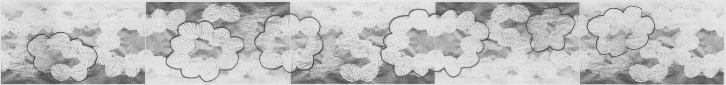
Design drawing repeated, rotated and marked out.

Work in progress, cutting the template, sandblasting and detail of completed acrylic panel.

Close up of the panels installed in the pavilion.

The panels fitted in the pavilion and helped give the illusion of the floating triangular roof above, looking good with the planting and the outline of the Royal Hospital behind. I like the view behind the panels - as there is more light on their surface you can really see whether the cloudy shapes are on the back or the front (below). I was sent some photos of unexpected light effects, with shadows in the morning and a complimentary orange sky in the evening (bottom). When it rains the sandblasting disappears, but I get the feeling that a lot of people didn’t notice it at all anyway. That’s not a bad thing in the Chelsea context, where I found so many of the structures and ornamental details in the other gardens to be ugly and intrusive on the planting. This is a place where the essence of good design may well be that you don’t notice it.

Back of the panels in the pavilion.

Shadows through the acrylic, orange sky at sunset.

New Window by Sasha Ward

Left, window before the stained glass. Right, melting glass in the kiln.

I have just installed a new window, the first one that uses the slab glass that I’ve been melting down in my kiln (above right). I’d put some of the pieces too close together so that they touched and fused together during the firing. These pieces happened to be the same combination of colours, peach and pale yellow, and when I put them next to each other they made a slightly butterflyish pair which became the basis for the new window design (below). From there, the window practically designed itself, the different sized and coloured pieces are arranged so they look as if they float up to the top.

Window design - Left, arranging the glass. Right, glass laid on top of the design.

Left, background pieces cut. Right, background pieces sandblasted.

The background is a blue green enamel, the colour of the edges of float glass, which I sandblasted off to create a halo around each coloured slab (above right). I then painted an approximation of each glass slab colour in enamel around each piece and in a ring over the blue green background (below), you get some unexpected results where the two colours of enamel overlap.

Details from top and bottom showing background pieces painted and fired.

New window installed, 1150 x 400 mm.

The new window (still without a title) looks good in its space, and according to its owner, as if it had always been there. People have said they are reminded of pairs of glasses, but as you can see in the detail below, the slabs are opaque and textured often with a block in the centre that is a record of the size of the original slab. The backgrounds are transparent, apart from the top which I’ve sandblasted to hide the eaves and the centre piece which covers the glazing bar - a feature of the original window which bothered me, but which has now become a vital part of the design.

Kitchens in Churches by Sasha Ward

The sloping cover at Winterbourne Earls and Great Cheverell.

The first time I opened one of those church cabinets with sloping covers I was astonished to find a fitted kitchen inside and to realise that the slope was to accommodate a new shiny tap. Usually the fitted kitchen is no more than a sink, a draining board and a huge amount of storage space in a prime position in front of a window or a monument. These four sloping examples (above and below) are all from Wiltshire, and the slope means that they’re not useful for climbing on to take good close ups of the windows they block.

The sloping cover at Seend and West Lavington.

The alternative to the slope is the sink and tap cover I found in the lovely church at Hatherop (below) that makes you wonder why a source of water should be so ugly that you need to cover it up.

Discrete tap cover at Hatherop, Gloucestershire.

I have found more ramshackle examples of kitchens in churches. At Brinklow you have everything you need in a small wooden cabinet dwarfed by the organ and at Savernake there is a modesty curtain around a very substantial counter. At Shipton under Wychwood there was no attempt to hide the perfect combination of welcome note, water in a bottle for the kettle, tea bags and a plastic tray for your cups (left to right below).

Left to right: Brinklow, Leicestershire; Savernake, Wiltshire; Shipton under Wychwood, Oxfordshire.

The Wantage church kitchen is in the north transept and the huge amount of storage space here - including a fridge and wall units - means that the folding doors cut across the stained glass window. There are no cookers in these kitchens that I can see, and as yet no extractor fans set into the stained glass above.

Open and shut at Wantage, Oxfordshire.

The kitchen at Middleton Cheney church was in use when I visited and I see from my photo (below left) that so was the toilet. These facilities are installed in the west end of the church, directly underneath the most beautiful Burne Jones window, which I’ve described previously on my blog (link here). On my first visit I was shocked that a banner on the balustrade blocked a clear view of this important window, on my second visit I was invited up on to the bellringing platform to get a really good look at the stained glass.

West wall at Middleton Cheney, Oxfordshire with window by Edward Burne-Jones.

My conclusion from these examples is that kitchens and stained glass don’t look good together, if kitchens in churches is a craze I hope it ends soon.

intersections by Sasha Ward

Thick slabs of coloured glass on the lightbox

I’ve been using melted glass slabs for a commission - still in progress - in a gorgeous colour range. Working to commission is always slow, so in the meantime I decided to make a spontaneous smaller panel using the spare slabs. It’s very simple, four colours that look great together, the intersections of the slabs cut off and filled with another colour that is close to what I imagined the combined glass colour could be (below left). I had intended to give it a contrasting pale blue background, but then chickened out as I didn’t want to ruin the colour balance I’d achieved so used a clear textured glass instead. You can see this during the cementing process (below right) and in daylight with the lawn behind (lower right). I did also cut a background in swirling bright blue glass to check the effect (lower right). The panel measures 315 x 285 mm.

As I’m not keen on wasting glass, I used those background blues to make an alternative composition, here the darkest area is the background and the intersections are in clear glass. It’s more about textures than colours, using up the last scraps of my favourite pressed glass that’s covered in little reflective triangles and some painted pieces with intersecting circles that have been wheel cut and filled with blue enamel. The photos (clockwise from top left) show the glass pieces cut and on the lightbox, the composition with a clear background just to see, the finished panel in daylight (with the lawn behind) and my favourite photo, showing the centre detail cleaned and ready for soldering.

It still bothered me that I hadn’t carried out my original intention, so I found small leftovers of the original four colours and fitted them together with a contrasting pale blue background and a little yellow halo around the glass flower (below).

Glass flower on the lightbox and in daylight, 180 x 190 mm.

Paris Windows by Sasha Ward

Left to right: courtyard at Hotel de la Marine, dome of Bourse de Commerce, dome of Galeries Lafayettes.

A trip to Paris, the first time out of England for more than two years, left me with snapshots of windows as I was led around a succession of beautiful interiors lit by a bright blue spring sky.

As well as museums, galleries, shops and cafes, there were of course churches. All were open, busy and awe inspiring with a wealth of art - paintings, sculpture, stained glass - in every one.

Left to right: window in St Jean de Montmartre, inside St Sulplice, door detail at Ste Odile.

The church I knew I wanted to visit was Ste Odile, north of the city centre. Built from 1935-46 in Romanesque-Byzantine style, it was designed by Jacques Barge, made of reinforced concrete and filled with wonderful architectural details in brick, stone and glass. The three huge windows are the work of Francois Decorchement and are made entirely of pate de verre set in cement blocks. The detail (below right) shows the characteristics of the technique quite well, it is astonishing to see it used on this scale, the effect is of a multicoloured riot of figures, symbols and everyday scenes.

Ste Odile, windows by Francois Decorchement 1935-38

The church that surprised me the most was Sacre Coeur, I’d never thought of going inside before because I’d regarded it principally as a landmark. All around the basilica are the most wonderful stained glass windows, 33 in total, designed by Theo Hanssen and made by L Gouffault from 1949. Here, the colour combinations are rich but beautifully judged and the figures are unmistakably of their period.

Sacre Coeur, windows by Theodore Gerard Hanssen 1949

The church that most needs to be seen in real life is St Severin, one of the oldest still standing on Paris’ left bank. A set of seven windows by Jean Bazaine all around the apse harmonises perfectly with this fifteenth century gothic interior, something that’s impossible to judge from photos. Each piece of glass looks like a coloured brushstroke, I think due to the light, skilful grisaille paintwork. The subject matter is the seven sacraments of the church.

St Severin, windows by Jean Bazaine 1965-70

My last three windows (below) all show a glimpse of something beyond the glass, part of a rich and intriguing snapshot of the city.

Left to right: interior at Hotel de la Marine, door at Giacometti Institute, window at Institut du Monde Arabe.