Playmobil window by Sasha Ward

Stained glass playmobil style.

My ideal customer wrote to me with an idea for a commission, based on what he described as ‘plastic glass from a toy’. Imagine my delight when I looked at the photos attached (above) and realised that we were talking playmobil, and that these playmobil stained glass windows are better, in terms of simplicity, colour and design, than most of the ones that I see of a similar date commissioned for churches and other buildings.

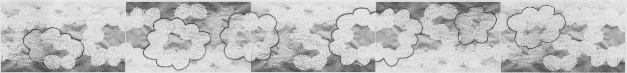
Inspiration also came from a photo story about the commissioning of the playmobil stained glass (above). I particularly like pictures 1 and 2 showing two figures looking and listening for inspiration on site, followed by drawing up plans, ‘meeting the world renowned stained glass artist Philipp and his wife Amelie in their alpine home’ (picture 4) and then, rather less convincingly, Philipp looking at stones and gems for colour ideas. The windows arrive properly packed in time for installation at Christmas when Bishop Paul says mass at dawn (last picture).
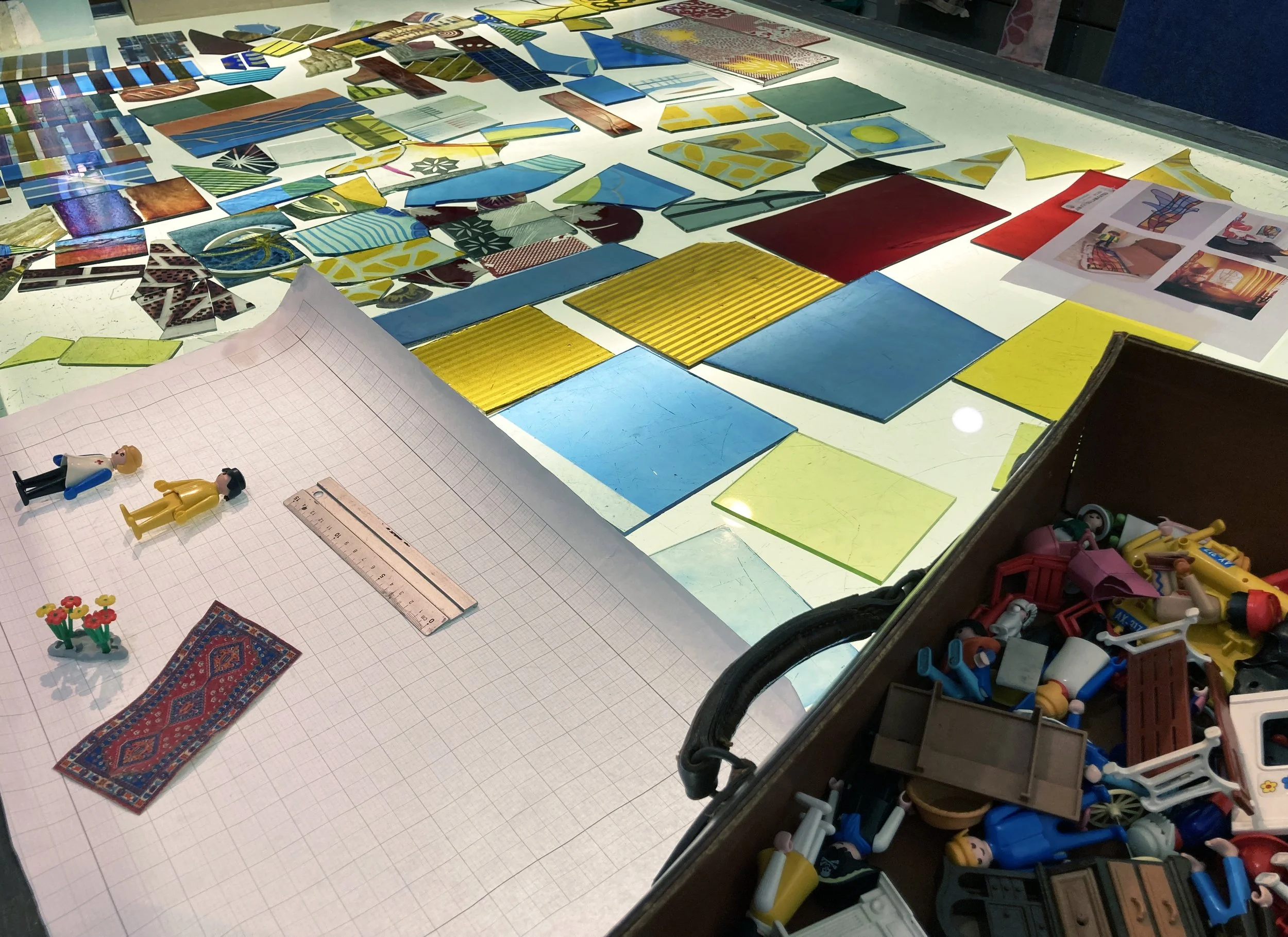
My studio lightbox

Inspiration in the studio came from the suitcase of playmobil that my children and now my grandchildren play with and scraps of leftover glass laid out on the lightbox (above). The palette follows the predominantly primary colours of the plastic toys, especially the stained glass, and the idea that I went with for the design is based on a house with arched windows at the top, flower boxes at the bottom and figures, just bigger than life size (i.e. playmobil life size), standing inside and outside it.

Top left: Design work with glass scraps. Top right: Design, colour version 1. Bottom left: Design, colour version 2. Bottom right: Window in progress.

I worked out the details with scraps of glass over my cutline (above left), the subsequent changes mostly related to blocks of colour and light and dark. The pale orange streaky glass I had chosen for the lower wall of the house changed completely during the firing, becoming so dark that the two main figures, an old one with integral hands and a new one who features in the playmobil photo story, just looked like shadows. I recut and painted them on a pale mottled yellow instead.

Above, finished playmobil panel, 255 x 485 mm.

Detail showing the two main figures.

The originals on the orange streaky glass and the initial samples where I tried out figures on red flashed glass and on pale enamelled glass, left me with enough pieces to make a sample panel (below). A happy ending to pretty much my ideal small commission.

Ewelme and North Stoke, Oxfordshire by Sasha Ward

Between chancel and chapel, tomb of Alice de la Pole.

St Mary’s church, Ewelme, is full of many beautiful things including fifteenth century decorations spared from destruction during the civil war and the famous alabaster tomb of Alice de la Pole, Geoffrey Chaucer’s grand daughter and Duchess of Suffolk. The tomb (above) is spectacular, her full length figure is lying above her full length cadaver in a shroud and carved angels rise on columns above it.

The wall painting at the east end of the church is simple, decorative, meaningful but illegible and I’ve no idea how heavily it has been restored. My favourite corners are up above the Clayton and Bell east window (below) where exotic plant tendrils underline the writing on the wall making a gorgeous pattern from a distance.

St Mary Ewelme, chancel and detail of east window.

The chapel on the other side of Alice de la Pole’s tomb has a paler window containing fragments of medieval glass, mostly yellow (silverstain) that is well complimented by the rerodos and altar frontal by Ninian Comper. In these two wall and window combinations I love to see the contrast between different ages and styles, in both of them there is a good balance of light and colour so you feel as if you are surrounded by a world of rich, subtle detail.

St Mary Ewelme, chapel window and detail.

St Mary, North Stoke, looking east. Painting beside pulpit showing murder of Thomas a Becket.

On the same day I visited St Mary the Virgin, North Stoke, a church close to the river Thames where the ridgeway path runs through the churchyard. It has a lovely interior with a beamed barn like roof, and plenty of light inside through windows that are either plain glazing or figures on a plain background. The tiers of fourteenth century wall painting around the walls of the nave are elaborate with recognisable, though fragmented, scenes including the murder of Thomas a Becket (above) and Christ’s betrayal (below right). In trying to get a photo that showed the wall and window combination here, it was obvious that the windows were letting in too much light for this to work using the phone camera. But I like the way these windows, with their patches of primary colour on odd parts of the saints’ bodies, have a fragmentary appearance similar to the painted figures on the walls. They are understated and subtle in the manner of the patchwork of medieval fragments at Ewelme, and are a style of nineteenth and twentieth century church window that I have never really admired before.

Chelsea Flower Show by Sasha Ward

The pavilion of the SSAFA Sanctuary garden at Chelsea Flower Show 2022

It was exciting making a screen for a garden at The Chelsea Flower Show, a garden designed by Amanda Waring of Catfoot Garden Design, for the armed forces charity SSAFA and destined to move to a space in their rehabilitation facility at Norton House in Leicestershire. The excitement was put on hold for two years as 2000’s show was cancelled and 2001’s moved to the autumn, while the first 20 odd pages of my black and white design lay in a drawer, unresolved and uncertain of completion.

Design development, 2020 - 2022

Final design drawing

The screen consists of five acrylic panels around a corner of the pavilion, they are there to mask the view rather than to block it out. The design is sandblasted on both sides of the acrylic, in some lights the sandblasting looks white, in others it looks dark. It was always hard to imagine how the panels would look installed under the pavilion roof, so I concentrated on getting the right feel for the design - something cloudy and sparkly to compliment the planting rather than illustrate it. The drawing above is the first one I was happy with, then used as the basis for lots of sandblasted acrylic samples. The design is a repeat, rotated on panels 2 and 4, and with different cloud shaped sections marked out on the front of the acrylic, while the rest is sandblasted on the back, as shown in the strip below. You can see how the overlaps work in the photos (below) that show the work in progress and finally taken out into the light where the clear lines sparkle and show the colours of the garden behind.

Design drawing repeated, rotated and marked out.

Work in progress, cutting the template, sandblasting and detail of completed acrylic panel.

Close up of the panels installed in the pavilion.

The panels fitted in the pavilion and helped give the illusion of the floating triangular roof above, looking good with the planting and the outline of the Royal Hospital behind. I like the view behind the panels - as there is more light on their surface you can really see whether the cloudy shapes are on the back or the front (below). I was sent some photos of unexpected light effects, with shadows in the morning and a complimentary orange sky in the evening (bottom). When it rains the sandblasting disappears, but I get the feeling that a lot of people didn’t notice it at all anyway. That’s not a bad thing in the Chelsea context, where I found so many of the structures and ornamental details in the other gardens to be ugly and intrusive on the planting. This is a place where the essence of good design may well be that you don’t notice it.

Back of the panels in the pavilion.

Shadows through the acrylic, orange sky at sunset.

New Window by Sasha Ward

Left, window before the stained glass. Right, melting glass in the kiln.

I have just installed a new window, the first one that uses the slab glass that I’ve been melting down in my kiln (above right). I’d put some of the pieces too close together so that they touched and fused together during the firing. These pieces happened to be the same combination of colours, peach and pale yellow, and when I put them next to each other they made a slightly butterflyish pair which became the basis for the new window design (below). From there, the window practically designed itself, the different sized and coloured pieces are arranged so they look as if they float up to the top.

Window design - Left, arranging the glass. Right, glass laid on top of the design.

Left, background pieces cut. Right, background pieces sandblasted.

The background is a blue green enamel, the colour of the edges of float glass, which I sandblasted off to create a halo around each coloured slab (above right). I then painted an approximation of each glass slab colour in enamel around each piece and in a ring over the blue green background (below), you get some unexpected results where the two colours of enamel overlap.

Details from top and bottom showing background pieces painted and fired.

New window installed, 1150 x 400 mm.

The new window (still without a title) looks good in its space, and according to its owner, as if it had always been there. People have said they are reminded of pairs of glasses, but as you can see in the detail below, the slabs are opaque and textured often with a block in the centre that is a record of the size of the original slab. The backgrounds are transparent, apart from the top which I’ve sandblasted to hide the eaves and the centre piece which covers the glazing bar - a feature of the original window which bothered me, but which has now become a vital part of the design.

Kitchens in Churches by Sasha Ward

The sloping cover at Winterbourne Earls and Great Cheverell.

The first time I opened one of those church cabinets with sloping covers I was astonished to find a fitted kitchen inside and to realise that the slope was to accommodate a new shiny tap. Usually the fitted kitchen is no more than a sink, a draining board and a huge amount of storage space in a prime position in front of a window or a monument. These four sloping examples (above and below) are all from Wiltshire, and the slope means that they’re not useful for climbing on to take good close ups of the windows they block.

The sloping cover at Seend and West Lavington.

The alternative to the slope is the sink and tap cover I found in the lovely church at Hatherop (below) that makes you wonder why a source of water should be so ugly that you need to cover it up.

Discrete tap cover at Hatherop, Gloucestershire.

I have found more ramshackle examples of kitchens in churches. At Brinklow you have everything you need in a small wooden cabinet dwarfed by the organ and at Savernake there is a modesty curtain around a very substantial counter. At Shipton under Wychwood there was no attempt to hide the perfect combination of welcome note, water in a bottle for the kettle, tea bags and a plastic tray for your cups (left to right below).

Left to right: Brinklow, Leicestershire; Savernake, Wiltshire; Shipton under Wychwood, Oxfordshire.

The Wantage church kitchen is in the north transept and the huge amount of storage space here - including a fridge and wall units - means that the folding doors cut across the stained glass window. There are no cookers in these kitchens that I can see, and as yet no extractor fans set into the stained glass above.

Open and shut at Wantage, Oxfordshire.

The kitchen at Middleton Cheney church was in use when I visited and I see from my photo (below left) that so was the toilet. These facilities are installed in the west end of the church, directly underneath the most beautiful Burne Jones window, which I’ve described previously on my blog (link here). On my first visit I was shocked that a banner on the balustrade blocked a clear view of this important window, on my second visit I was invited up on to the bellringing platform to get a really good look at the stained glass.

West wall at Middleton Cheney, Oxfordshire with window by Edward Burne-Jones.

My conclusion from these examples is that kitchens and stained glass don’t look good together, if kitchens in churches is a craze I hope it ends soon.